Interview with KEI HARADA / DO.DO.
what I want is simple, but also elegant with rich texture in designs
— Kei Harada / DO.DO.
photography : Takumi Ota (OYANE), Kazutaka Fujimoto (LONG LIFE DESIGN AWARD 2018), Masayuki Hayashi (TRUFFLE)
words : Reiji Yamakura/IDREIT
We made an interview with Kei Harada, a founder of Tokyo-based design studio DO.DO. established in 2015. They designed retail stores, restaurants, and spaces for exhibitions. For this article, we asked the concept of the shop ‘ŌYANE’ (means large roof in Japanese) in Hasami-Cho, Nagasaki Prefecture, and the temporary design for an exhibition named ‘LONG LIFE DESIGN AWARD 2018’.
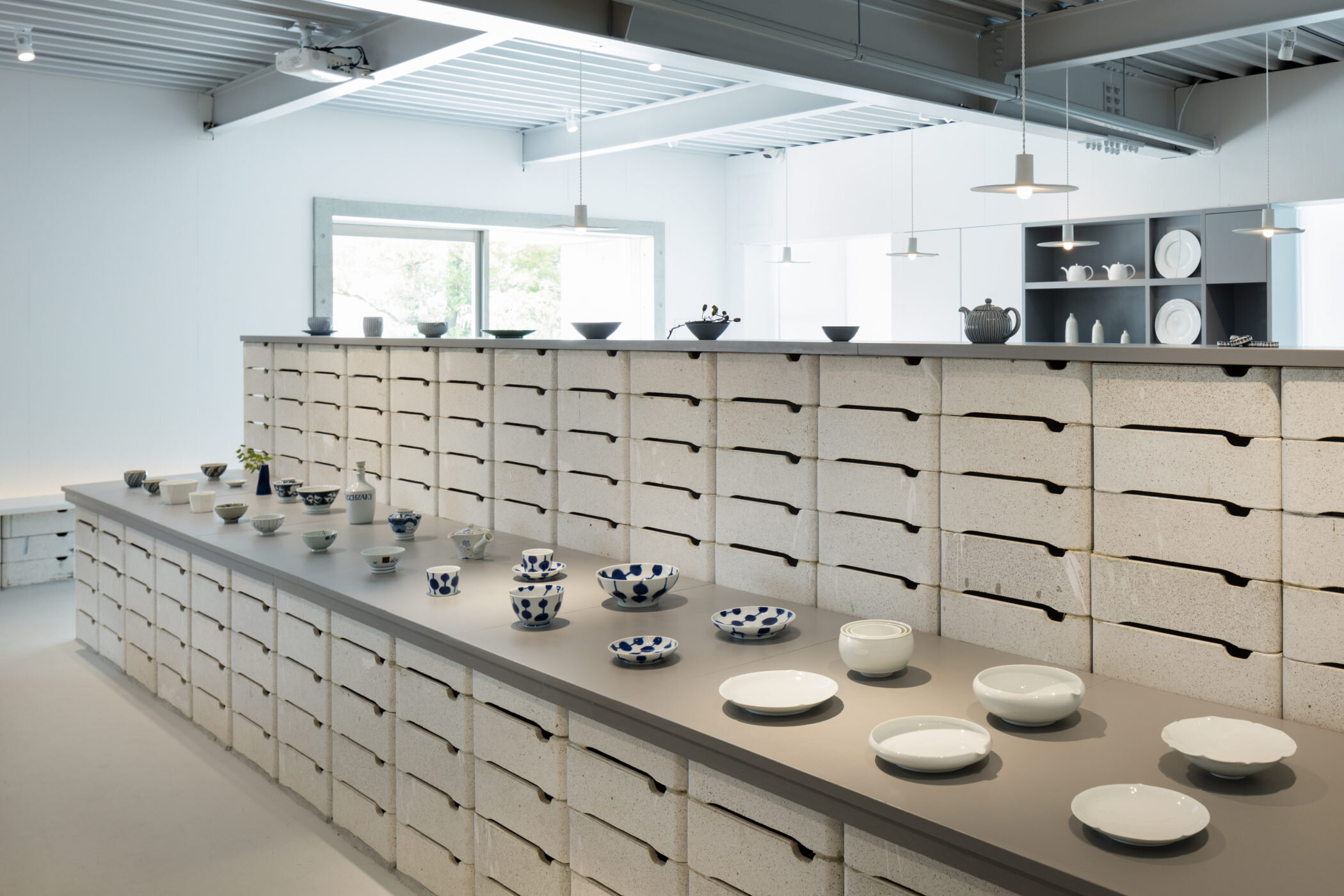
DO.DO. designs gallery shop ‘OYANE’ with for Saikai Toki, a porcelain tableware production and wholesale company. photography: Takumi Ota
Harada used saggars, a type of ceramic containers that used for ceramic production, to create display tables, shelves and the wall.
When we asked him about the process of ŌYANE, he said, “The first request was to increase the number of visitors to existing stores. Hasami is famous for its ceramics production area, so I wanted to create a space that can only be found here. During the factory inspection, I discovered that they have a large number of excess saggars called ‘Boshi’, a type of ceramic containers that used for porcelain production, so I decided to use that.” Boshi is no longer necessary with the current process. For the gallery and cafe space, the old containers having some glaze stains used for entire wall and display tables and shelves.
It is also interesting why the existing underground sales floor was left intact.
"The basement shop was an overcrowded store with lots of goods on shelves. However, I found it very interesting to search for good products like an explorer. But, because it alone tires the customers, I thought that if we created two places contrasting each other, like this basement store to search products and a place like a gallery to showcase ones, both would stand out, and the old basement store would also be effective.'' A gallery with a cafe counter on the upper floor has been newly established, leaving the existing store untouched.
Harada designed custom-made pendant lights made of Hasami porcelain.
Also, the originally designed pendant light was made from custom-design Hasami-Yaki porcelain. "Everyone in Hasami town is surprisingly keen on manufacturing. We have created ceramic-made pendant light reflecting the energy of the local team. The warm touch lampshade that Harada designed has a hand-made shape to add the image of clouds in the sky.
In front of the shop, a large roof structure was constructed for local market and event.
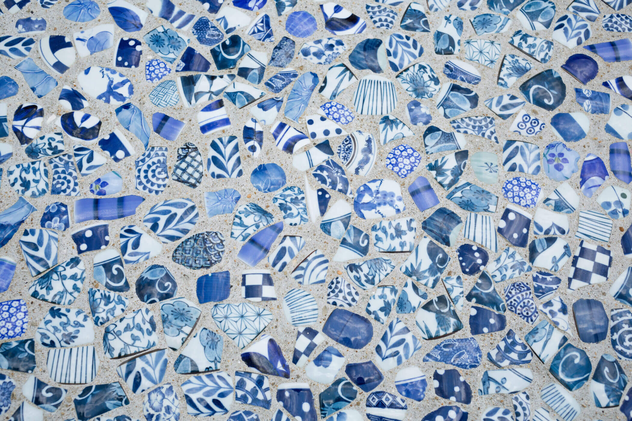
For the exterior staircase, blue and white ceramic shards were mixed into concrete.
At the front yard of the new store, a pavilion with a large roof structure was designed for the local market. For the outdoor staircase and the ground under the roof, lots of blue and white ceramic shards were mixed into concrete to show the beautiful pattern like patchwork fabrics.
Harada looked back this project and said, "we tried to discover the existing values and cultures as a historical a pottery town and created site-specific design telling their brand story with local craftsmanship." By DO.DO.'s creation utilising local materials and existing shop, new community place that representing locality has emerged.
DO.DO. developed a display system for the exhibition ‘Long Life Design Award 2018’ in Tokyo.
We talked about the temporary exhibition design for 'Long Life Design Award 2018', which was selected as a WINNER at the iF Design Awards 2020. Harada has developed a transparent display system by combining transparent acrylic round pipes and shelf boards with original wooden joints. The structural idea was based on paper tube furniture.
"I chose acrylic as our primary material because I thought that a neutral venue design would be appropriate for the purpose of the exhibition. And because it was a summer session, I wanted to show a sense of cool and refreshed. "
For the exhibition, laser-cut joint parts were created from 12-mm veneer to connect acrylic pipes.
He added, "I made five different parts by combining laser-cut elements of 12mm thick plywood for the sake of simplicity. Structurally, it strengthens important points with braces to achieve the necessary and sufficient strength. " The black joints and braces highlight the floating feeling of the transparent pipes and shelves.
Finally, we asked Harada, who often designs spaces with little decorations, about his preferences and his consciousness in designing.
Harada designed coffee table named ‘Truffle’ in 2013. The designer aimed to create unique and adorable shape that people want to touch. photography: Masayuki Hayashi
"Basically, I like simple things that use raw material without colouring. In Japan, simplicity is sometimes associated with plainness and stoic, but what I want is simple and elegant at the same time in designs. "
He is influenced by the works of overseas designers called minimalists, but he gets attracted by works which are simple but use warm and luxury materials for parts that people often touch.
When I asked him about his awareness of Japanese-style design, he told us about this experience.
"My thought for Japanese-style designs has changed in recent years. Until I went to Ryoanji temple and their rock garden in Kyoto, I thought that there was organized beauty there. However, when I went there, I had changed my mind. I was impressed not only by the organized beauty but also by the use of naturally bent trees and the sequence to the garden.
Until then, I thought that the traditional Japanese style was a beauty composed only of horizontal and vertical lines, but I realized that there was a beauty that allowed me to create the shape of natural objects. These points add complexity and depth to space, and I felt the traditional Japanese craftsmanship. ''
He also mentioned the change happened in his thought; "I've never tried to create something directly Japanese in design, but I'm conscious of the Japanese way of layout and the sequence that leads to the next place through an approach, and my designs are often affected. Also, when I started designing, I was worried about small deviations in both designs and construction. Still, recently I felt that it is important that not only the details but also the harmony of the design, I came to think of a solution that suits the situation."
ŌYANE is an excellent example of the redesign project that is having respect for the locality and existing context. Also, the developing process is fascinating because the designer Harada found out some key concepts and available materials from the perspective as an outsider. At present, the plan named COYANE, means 'small roof' in Japanese, the DODO-designed restaurant space on the same site is in progress and is scheduled to open in May 2020.
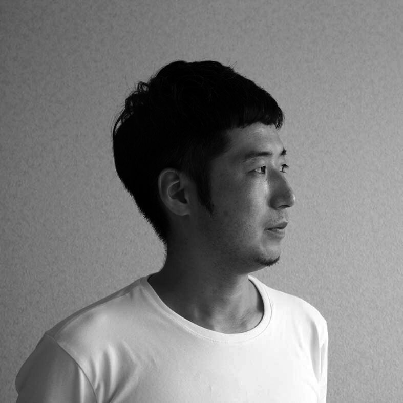
KEI HARADA
Born in Nagasaki in 1980. Graduated Musashino Art Univresity department of Arts Policy and Management in 2003. Worked at TONERICO: INC. with Hiroshi Yoneya, Ken Kimizuka, and Yumi Masuko from 2007 to 2014 as a chief designer. Established his own design studio DO.DO. in 2015. Centred in interior design field, DO.DO. offers interior, architecture, furniture, and product design. Received iF Design Award Gold, Iconic Design Award Best of Best, etc.
RELATED POST
>>> stories on IDREIT
>>> designed by DO.DO.


