Interview with HIROSHI YONEYA + KEN KIMIZUKA / TONERICO: INC. —part 2
2/2
strived to find an appropriate design language by blending in something intuitive
— Hiroshi Yoneya + Ken Kimizuka / TONERICO: INC.
photography : Satoshi Asakawa
words : Reiji Yamakura/IDREIT
continue from part 1
“Interview with HIROSHI YONEYA + KEN KIMIZUKA / TONERICO: INC. —part 1”
TONERICO: INC. arranged gallery spaces to face the atrium because they wanted to make it visible from the passerby.
Going against traditional museum architectonics which are perfectly isolated, the exhibition rooms on the fourth to sixth floors are created with rest stations from which we can see outside whilst exploring, and furthermore created in a way such that visitors can go back to or pass by various exhibits. According to his words, “I designed the space where visitors can feel outside halfway through and shows that the museum is open to the city, and not only just to walk around inside a box.”
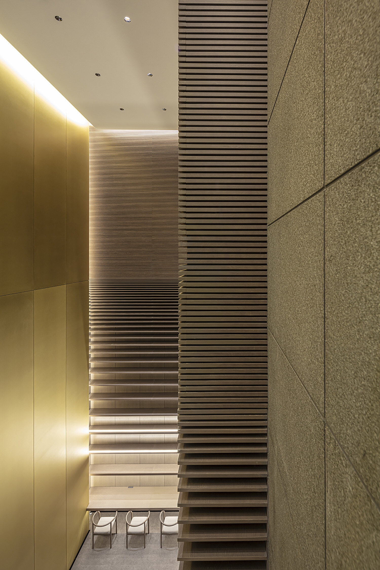
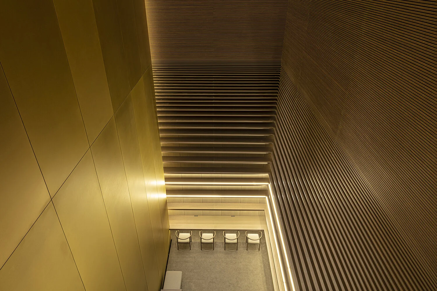
In the Info Room with its approximately 11-meter-high ceiling, visitor can browse previous catalogs.
The designer installed unique shelves that have different thickness. It becomes shallower and less spaced as they go up.
After exploring the exhibition, visitors can browse previous catalogs in the Info Room, that has a design inspired by the look of flipping through the pages in a book. The bookshelves along the walls are designed to reach all the way to the ceiling, eleven meters above. The bookshelves are elaborately designed so the shelves become shallower and less spaced as they go up.
The color of each of the six floors have a different grey as its basic color that affects the impression of each floor. This design is based on the different shades of water in a lake’s shallows and depths. The first floor has the brightest grey and the sixth floor has the darkest grey. In addition, custom-made brass panels reflect the faint redness of the EV hall.
Vibration polished brass panel was installed for the wall beside elevators and escalators. The panel was customised for the museum.
TONERICO: INC. designed original chair for the museum.
TONERICO: INC designed original wooden chairs paying homage to the steel made chair designed by Shigeru Uchida. Six variations are manufactured by Conde House.
Every element of the design was imbued with “design, material, and originality in everything”. The chairs and benches are bespoke to the museum.
The original wooden chairs were designed based on a steel chair series, that is one of Shigeru Uchida’s masterpieces, a mentor of Yoneya and Kimizuka. They used wood instead of steel to further develop Uchida’s original design. Conde House produced six models in several colors with and without armrests.
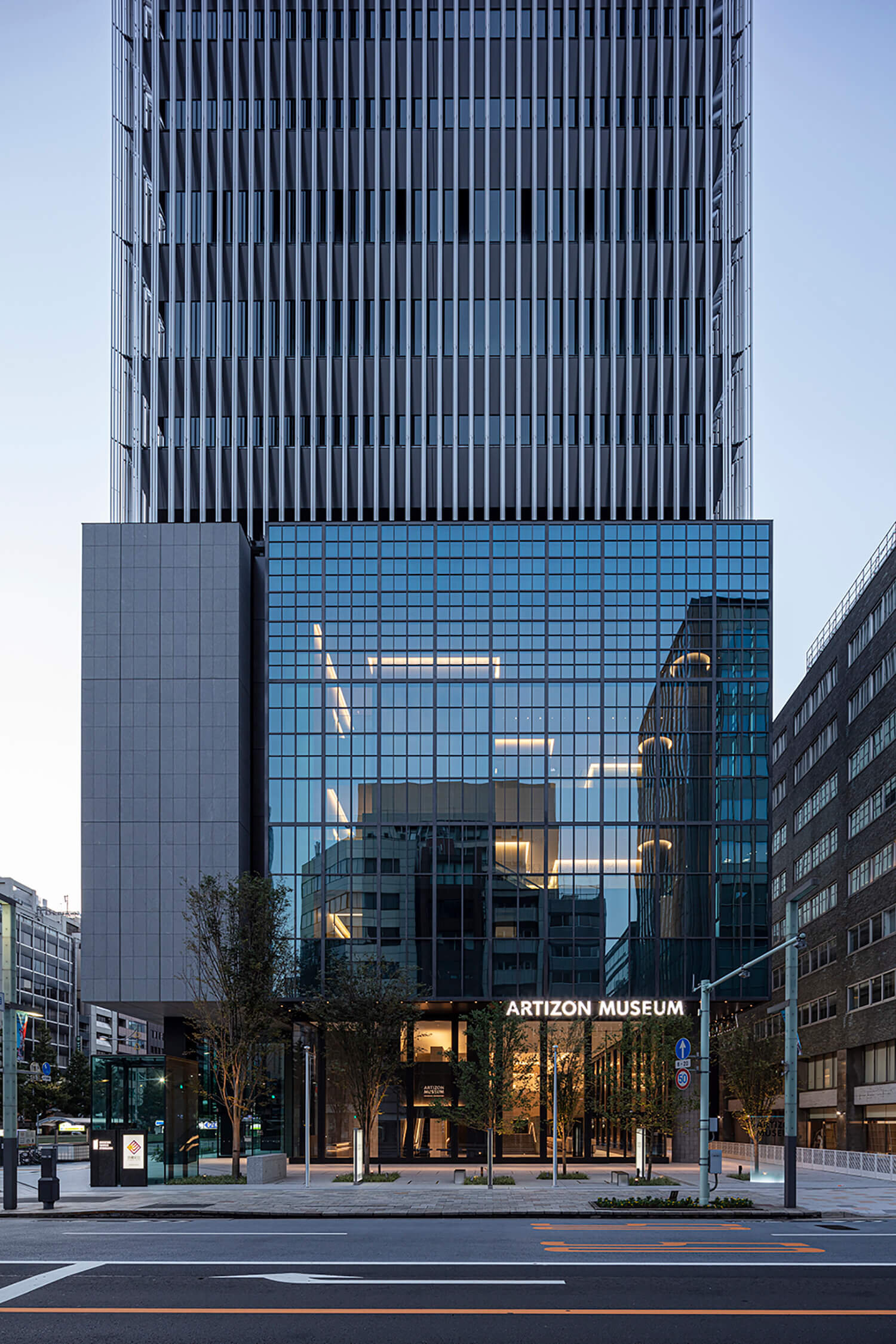
The Bridgestone Museum in Kyobashi was reborn in January 2020 as the Artizon Museum in Museum Tower Kyobashi. The tower was designed by Nikken Sekkei, constructed by Toda Corporation. While the new museum, located first six floors, was designed by TONERICO: INC., including exterior design.
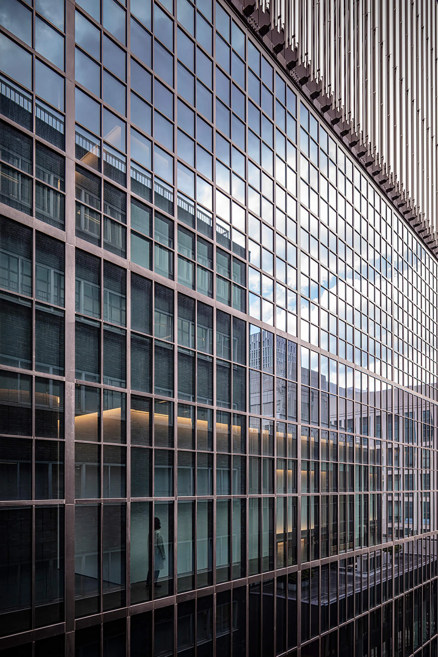
The designer create grilled window that have unique gradational proportion.
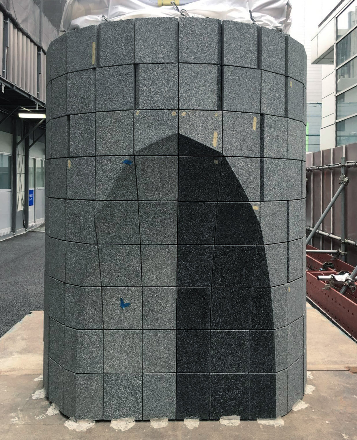
Pillars was designed with cut-off-line that represents the former site boundary.
The architectural facade consists of two contrasting elements; the grilled windows representing “a welcoming museum” and stone tiling on the walls which are windowless. The grilles suggest the universality of modern architecture and the big windows aim to make people feel the existence of exhibition rooms through the glass.
Moreover, the design of the exterior gives an individuality to the facade. In response to the request to preserve the memory of the boundary line of the former site, the design was created in which the pillars that were on the boundary were cut down on that line. “We happened upon the idea by accident, fortunately it didn't give us a construction problem, it did incorporate an echo of the city.”
Mockup of the part of pillar (photo by TONERICO: INC.)
Yoneya and Kimizuka reflect on the entire process of designing the museum, “The ordinary design process tends to result in a single well-calculated answer given different external conditions.
However, we thought that the museum needed to give a strong impression to ‘experience’ the art and not only follow the rules of design, and thus we strived to find an appropriate design language for the new museum by blending in something intuitive.
As a result, the spatial design, which is quite abstract, like the Info Room and FOAM, was created. Our creativity was trusted to see us through the long design period. This was a rare project where even though there were constant iterations, we were able to be uncompromising in the design, materials, and construction accuracy.”
The Artizon Museum is a project which evolved out of the huge space of about 6700 square meters in which TONERICO: INC. has been pursuing the methods of ‘enclosure’ and ‘partition’ in detail in their own way. “The welcoming museum” was created to try to infuse art into our daily lives, whilst incorporating the history of the Bridgestone Museum which opened in Kyobashi in 1952, as well as pay their respect to Shiro Kuramata and Shigeru Uchida, who were pioneers of Japanese interior design.
TONERICO: INC.
A design studio founded by Hiroshi Yoneya, Ken Kimizuka and Yumi Masuko. Their design field includes architectures, interiors, furnitures and products and they regularly present conceptual project at home and abroad.
Awards: Salone Satellite Design Report Awards grand prix in Milan, JCD Design Award gold prize, Good Design Award, JID Interior Space Award, Interior Product Award, The Mainichi Design Prize nominees. Broadcasted in Top Runner by NHK / Works: Artizon Museum, Ginza Tsutaya Shoten, Loft store development, Ikebukuro Seibu “Hikari no tokei” Gate, Hanakikyou, Aoyama Mihoncho, Amahare, Taneya head office, Sawadaya, DNP Cafeteria, Klockworx, 4℃, Kanebo Lunasol, Wa Exhibition, Cassina IXC. Memento, arflex Aun, Rattan furniture ami series etc.
RELATED POST
>>> designed by TONERICO: INC.
>>> stories on IDREIT

