Interview with HISAAKI HIRAWATA + TOMOHIRO WATABE/MOMENT —part 1
1/2
the stores should be like a "bridge" to deliver the BRAND philosophy to the CUSTOMERS
— Hisaaki Hirawata + Tomohiro Watabe / MOMENT
photography : Fumio Araki
words : Reiji Yamakura/IDREIT
MOMENT is a design studio that designs everything from spaces to graphics, grasping the essence of the brand and the functions required. In this interview, we asked the two representatives of MOMENT about their approach to design based on the shops and a house they have recently worked on.
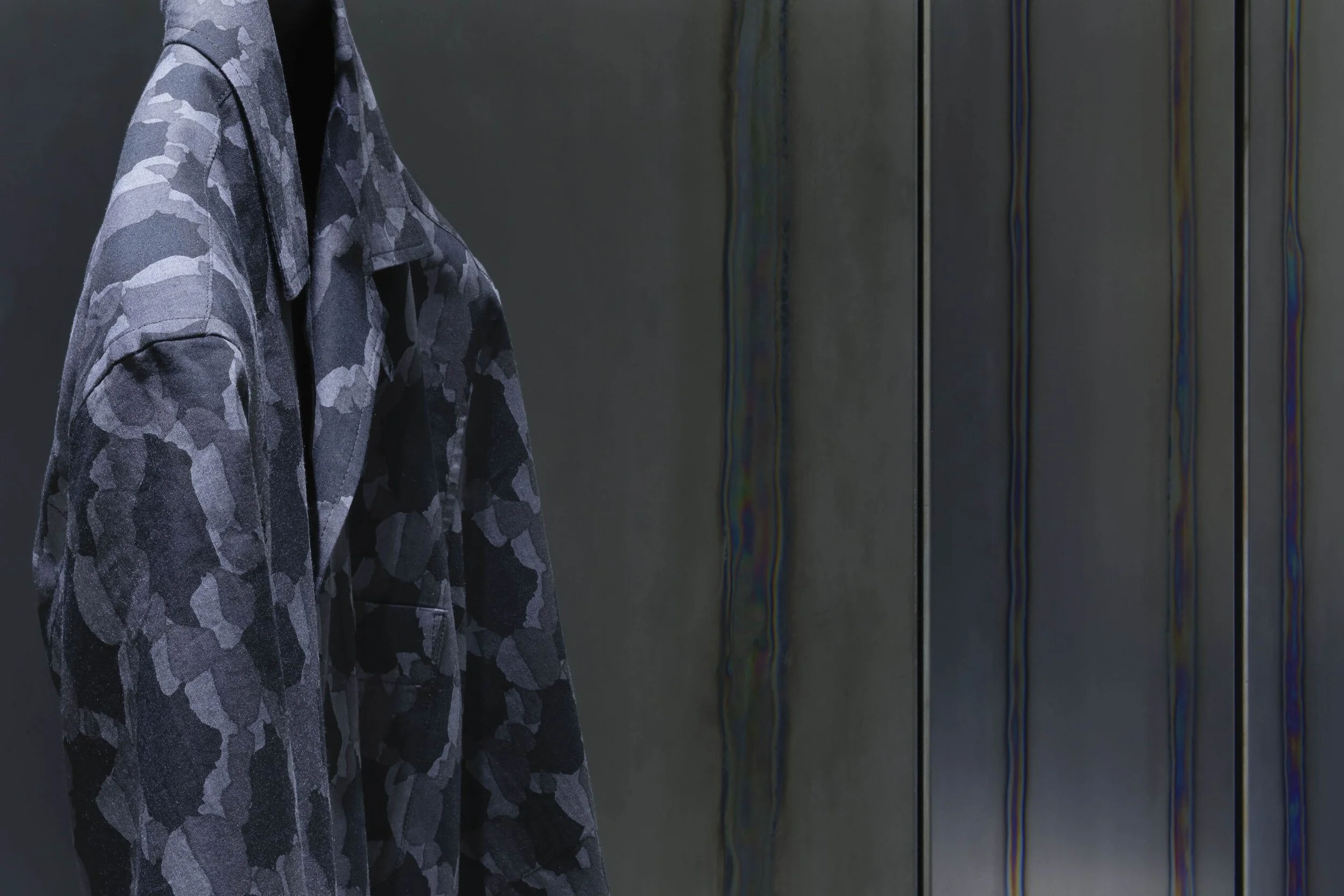
The designer installed custom-made steel plates for the wall of ISSEY MIYAKE Nagoya.
The heated lines looks blue or rainbow-coloured depending on the light. They used the materials as the backgrounds of clothes.
— Can I ask about ISSEY MIYAKE MEN, the fashion store that uses custom-made hot rolled steel plates? We know you have been worked on this brand, but how did you come up with this new design?
Every season we go to a clothing exhibition, and we were impressed by clothes that were inspired by nature, such as the earth and lava. This was different from their image of functional beauty, so we wanted to reflect this feeling on our shop. Also, we usually experiment with various materials, and as one of them, we thought the distortions that appear when the steel oxide layer is heated, might be a kind of "natural phenomenon" that forms the background of the clothes. Steel is a material that fits with their traditional concepts of strength and stoicism, and we thought it would be a step forward from the current minimalist design with only black and white.
— How is this pattern processed?
The whole surface of hot rolled steel is covered with an oxide layer, but when it is seared at high heat, it becomes distorted and looks blue or rainbow-coloured depending on the light it receives. In reality, it took a lot of time to adjust the best searing condition and to correct the distortions caused by heating.
The detail of the hot rolled steel plates. The design duo use custom-made clear coating to make the pattern visible.
The manufacturing process of the custom-made steel plates. (photography: MOMENT)
— Is the surface of the steel plate coated?
We applied a special clear coating because customers or clothes would touch it. It was difficult to make the burn marks visible, so we made an original coating agent with the help of the manufacturer.
We always think that, since ISSEY MIYAKE MEN has a high level of fashion perfection, the stores should be like a "bridge" to deliver the philosophy of the fashion brand to the customers without insisting something. Based on this idea, we focused on creating a background of the clothes by viewing the patterns on the steel plate as a natural phenomenon that can be expressed in the store.
MOMENT designed a cafe named ‘ROOTH 2-3-3’ in Omuta in Fukuoka Prefecture.
They left the wooden pillars and renovated old brick warehouse into a comfortable cafe.
— Next, tell us about the design of cafe ‘ROOTH 2-3-3’, a renovated 65-year-old brick building. What was the original request?
This began not with a request to build a typical cafe, but with a request from the owner who aimed for regional revitalization, to create a communal base for people to gather around. The owner found the old warehouse and the bricks on the exterior walls were reused from coal mines in Omuta. Also the original walls were very characteristic, lined with wood columns to prevent rice from touching the bricks. In order to succeed to the history and memory of the building, we began to design the cafe to use as much of the truss and wooden structure as possible.
— Was it structurally sound?
We had a very difficult time with structural reinforcement. To meet current regulations, we had to cover up the beams and framing for earthquake resistance. However, hiding everything would decrease the attractiveness of the warehouse, so we placed the reinforced beams and the air conditioning as close to the periphery as possible, and designed the cafe to make the center of the ceiling widely open while maintaining its strength. Also, we installed skylights to make it more comfortable during the day and night, and at the same time, to function as a smoke control system to meet the regulations. Since this is a restaurant, we installed underfloor heating to maintain comfort, and so on. All the efforts we put into the design were not visible after the completion of the project, haha.
The design team struggled to balance reinforcement and preservation of historicity. They added structural reinforcement in the ceiling to show as much of the original truss structure as possible.
A large 110cm wide table was set up in the seating area so that visitors could read the newspaper.
— As a result, you have made pleasant seats. There are a lot of newspapers hanging on the walls.
The operator was very particular about it, and collected more than 60 local newspapers from different regions. The seating area should be a place to encourage community, so we made the tables large enough to hold a newspaper on. Also, we made other seats movable to accommodate workshops. The design here was different from the usual one, as we thought thoroughly about how to preserve the legacy in its proper form, and the design that defied many constraints became the final form.
continue to part 2
“Interview with HISAAKI HIRAWATA + TOMOHIRO WATABE/ MOMENT —part 2”


