Interview with MAKOTO KOIZUMI / Koizumi Studio —part 1
1/2
We set the "figure" up with OnLY a few materials, and THEN carefully designed "ground"
— Makoto Koizumi / Koizumi Studio
photography : Nacasa & Partners
words : Reiji Yamakura/IDREIT
Makoto Koizumi designs a wide range of products, from furniture, residences to stores. Since 1999, he has been designing stores for fashion brand 'Plantation'.
We interviewed about the concept and intention of his designs for two stores ‘Plantation Aoyama’ and ‘Plantation Ginza.’
— Please tell me what your original idea about two stores was?
The Plantation is a brand with the concept “everyday clothes with a focus on real product and comfortability.” We have been consistently designing with the theme of “sustainability” for 20 years. We had many discussions with brand members for these two stores. The basic principle of using authentic materials is the same as before. Still, we decided to realise “everyday space takes a further step.”
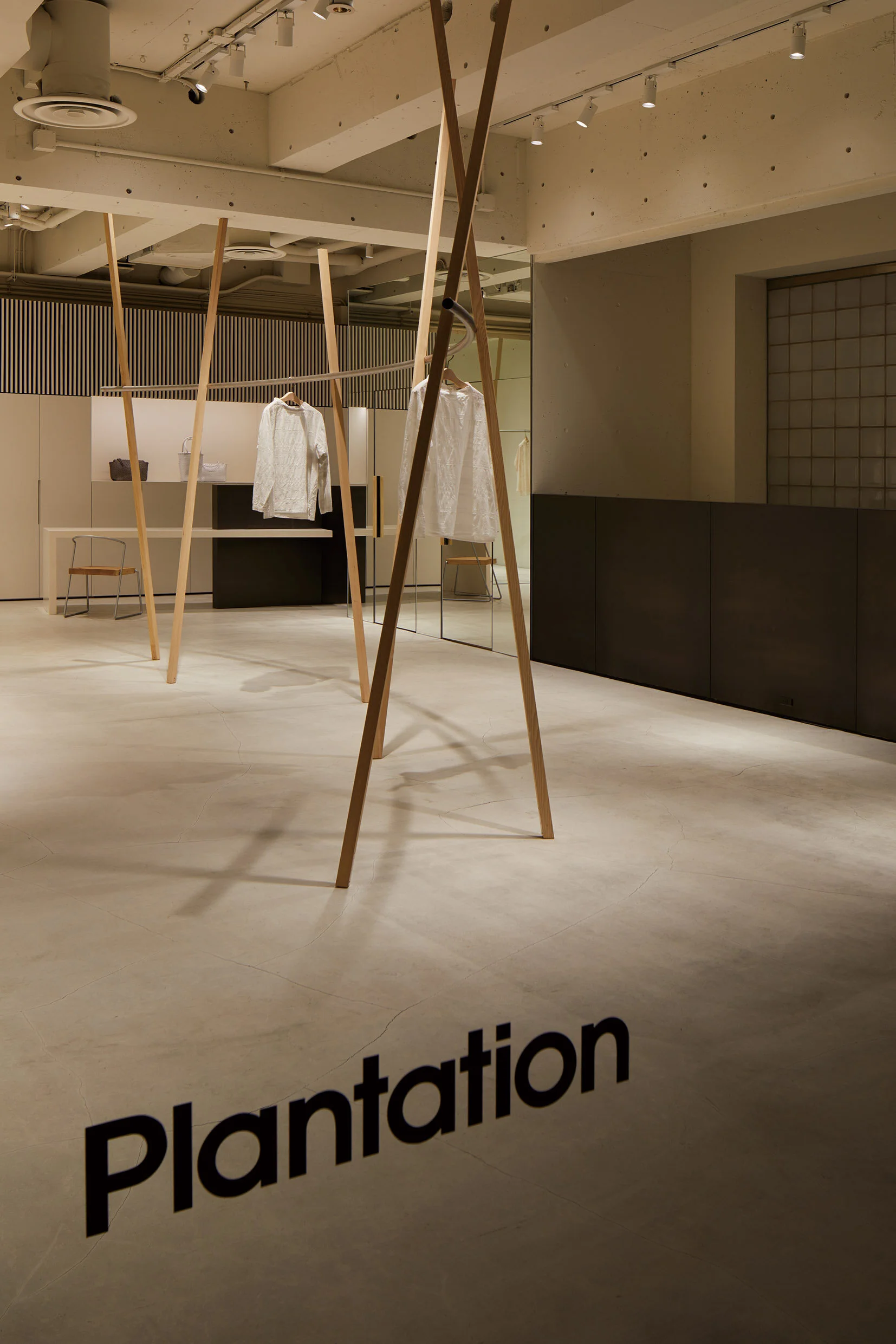
In Plantation Aoyama store, the designer Koizumi has designed minimal-style garment rack with round-shape hanger pipe and a few wooden legs. The chair is TETSUBO Chair designed by Makoto Koizumi for miyakonjo product.
— Tell me about the Aoyama store first.
I always design in consideration of the “figure-ground relationship” At the time of developing this store, there was a possibility that it would only be open for a short period of time, so we had to incorporate components that could be converted in the future and the budget was not much. We set the “figure” up with a few materials and carefully designed “ground,” a blank space.
The first floor is a plain space with only hanger pipes supported by thin wooden legs. We used 30mm x 30mm Japanese hemlock ‘Tsuga’ square timber as supporting materials. For the joint between the hanger pipe and legs, we designed pipe shape concave into the leg to increase the strength and stability. As a result, we were able to reduce twisting, although it was only a few legs.
For the sophisticated garment rack, Koizumi designed a pipe shape concave into the leg to increase stability.
The detail of joint for the garment rack. (courtesy of Koizumi Studio)
For the basement, they installed a wooden arbour-like structure made with 30mm x 30mm Japanese hemlock timber.
— What is the boxy space in the basement?
This wooden arbour-like structure was made of Japanese hemlock timber to create two area: inside and outside. It is a space where clerks can use freely, such as displaying seasonal styling.
Besides, we installed a raw steel sheet as a wall to connect the first floor and the basement. We haven't used steel for the brand so far, but we choose hot rolled steel this time because it fits their brand concept.
— The clothes rack near the wall is also unique.
It was actually designed for the exhibition for Plantation in 2001, and we newly made this time. They are knockdown racks, so I expect to use them at other stores even after the event ends. At the Plantation store, we always create a simple space and tried to avoid complex fit-out. Furniture such as a shelf has designed to reuse in the future.
In the Plantation Ginza store, knockdown hanger racks were used because the designer expected to use them at other stores. The garment racks are functional and can be connected together.
Details of the garment rack. They used stainless steel pipe and steel rod.
A hand drawing of the knockdown rack. (courtesy of Koizumi Studio)
— Then, please tell me about the Ginza store.
Since the space was very limited, we put a fitting room and stockroom in the back of the store as a "figure." We just hung the minimum-style clothes rack from the ceiling, leaving the rest of the space to go through. Except for the fitting room with raw steel sheets and furniture made of cedars, we left all areas white.
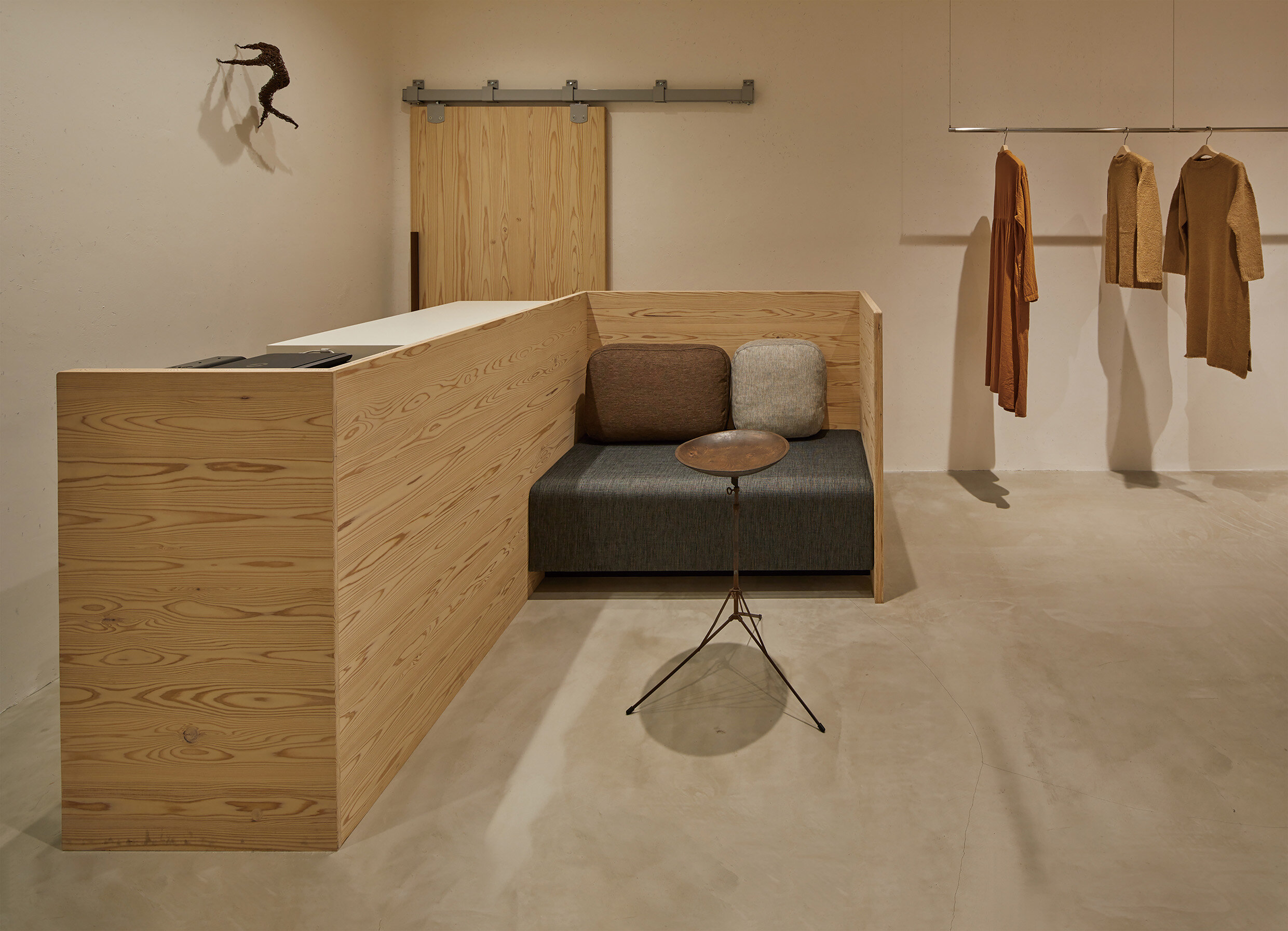
By integrating the cashier counter with the sofa, we were able to properly utilize the space and serve customers. I think such a design that combines two functions into one is very Japanese.
The Plantation Ginza was designed at the same time as the Aoyama store. The fitting room and stockroom was covered with raw steel sheet.
Makoto Koizumi, a well-known seasoned furniture designer, created cedar-made counter with sofa.
They hang an old iron-made fishing tools as antique display on the wall.
— Antiques in the store are also lovely.
Thanks. Koizumi Studio worked on the styling for the Ginza store. We displayed an old iron-made Japanese fishing tool 'unagi-kaki' on the wall. I explained the details and backstory of the interior to store staff after the completion of construction. The store staff was very pleased with that story.
continue to part 2


