Interview with KEIJI ASHIZAWA / Keiji Ashizawa Design —part 1
1/2
By the contrast of the materials, I intended to create a Little tension
— Keiji Ashizawa / Keiji Ashizawa Design
photography : Daici Ano(SUSHI MIZUKAMI), Jonas Bjerre-Poulse(KUFUKU±)
words : Reiji Yamakura/IDREIT translation: Richard Streeby
We talked to architect Keiji Ashizawa, a founder of Keiji Ashizawa Design, about the designs of two restaurants, ‘SUSHI MIZUKAMI’ and ‘KUFUKU±’. In the second half of the interview, I asked him about what he values in the design of spaces and about his thoughts on “Japaneseness.”
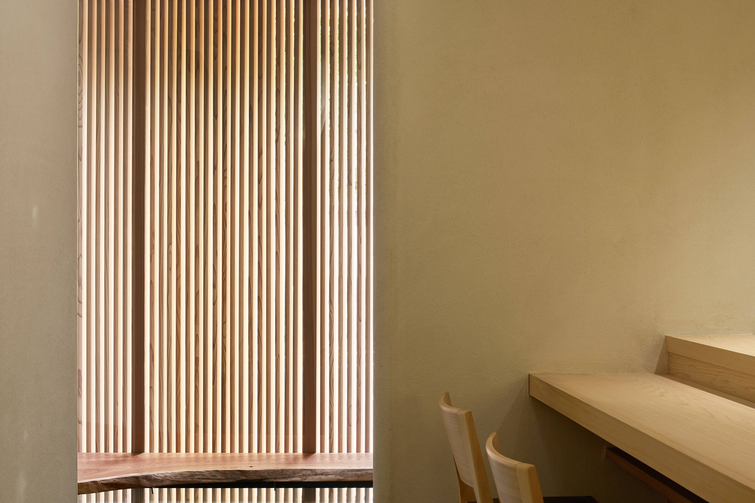
Ashizawa created the sophisticated facade of SUSHI MIZUKAMI by the combination of vertical elements. photography: Daici Ano
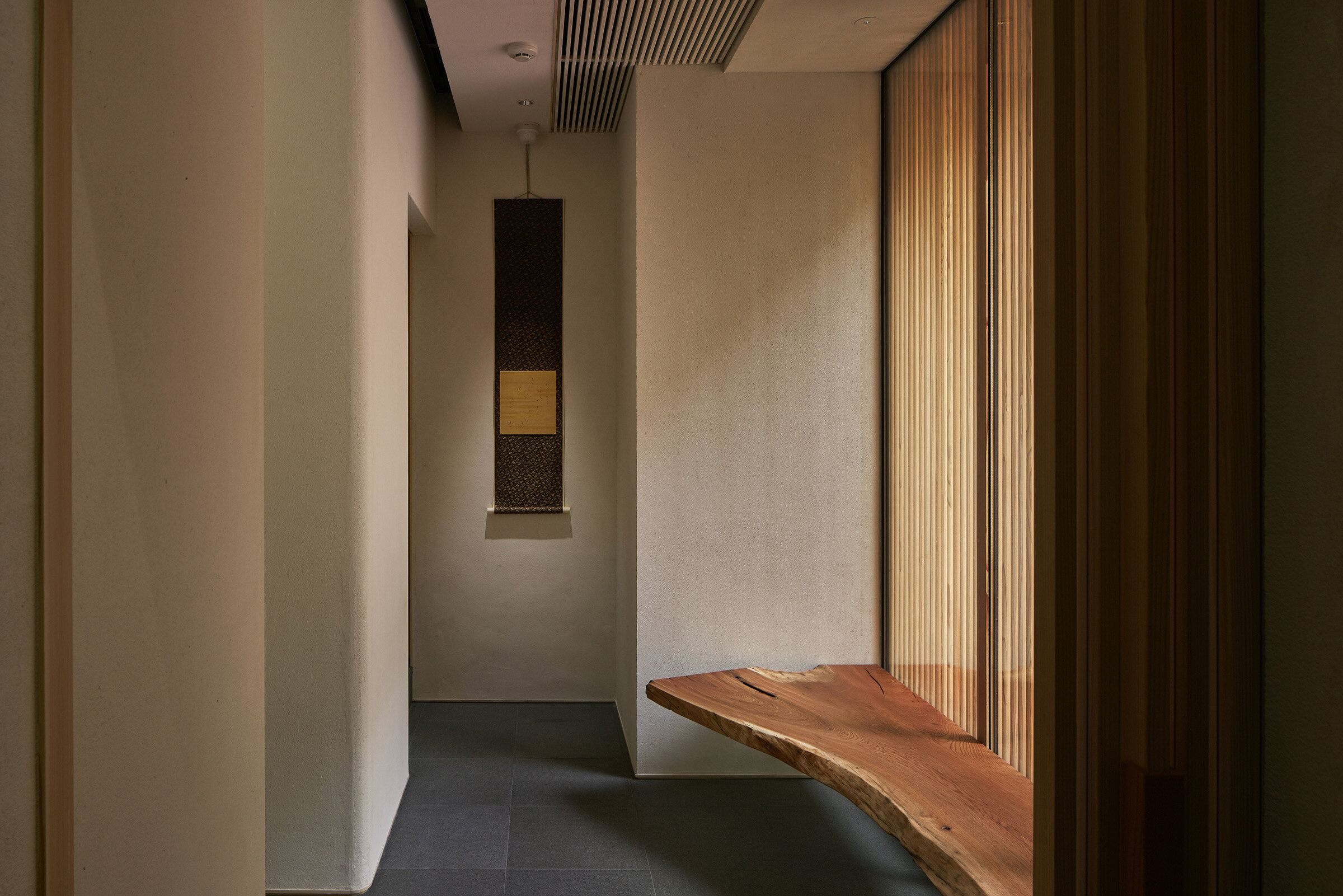
For the approach, live edge zelkova-made bench and flower vase table was installed to create a little tension.
— From SUSHI MIZUKAMI, I got the impression that it is an unadorned, orthodox sushi restaurant. What did the client ask of you when he made the request?
Functionally, he needed an eight-seat counter where two sushi chefs could stand. Regarding the design, he said he wanted it to convey Japanese tradition. Because it is a high-grade restaurant with a price per customer of over 20,000 yen at night, I aimed to create an environment where customers could focus on the sushi. To do so, though the restaurant is not in the full-fledged sukiya-style, I used the design budget on the center of the restaurant such as the sushi counter and kitchen equipment.
We were also asked to build a front room before the customer seating area to allow customers to avoid being distracted by the hustle and bustle of the city.
— The depth of the approach that includes the front room is emphasized by the flower vase table at the entrance and the display at the back, isn't it?
Yes. I made it to be compact but convey depth. I used rough, solid zelkova wood in the waiting room as a contrast to the straight, white Japanese cypress Hinoki-made sushi counter inside the restaurant. I intended it to create a little tension in the space. Also, I arranged the counter seats so that even if there is someone in the waiting room, it doesn't bother the other customers.
The straight Japanese cypress Hinoki-made counter was created for 8 guests. The arch shape that inspired from exist facade was used for back counter wall.
For the front room, a small arch shape window was designed to inform guest arrival to the sushi kitchen.
— The exterior, composed only of vertical lines, is beautiful. Is there anything you have to be careful about when using lattices?
There are no fixed rules that apply all the time, but I always check that they are subtle at full size. The important thing is the balance of proportions. Also, with the exterior, I left the existing arch shape in place. I believe it’s important to create a sense of unity between the inside and outside of a restaurant, so I used a similar arch on the wall behind the counter inside.
Looking back on the overall design, I think the two main points were that I considered the overall design, including the exterior, although it was mainly an interior design plan, and that I was able to decide at an early stage on a plan that met the functional requirements for a large kitchen and a front room.
The architect Ashizawa converted 70 year-old-house to a French Restaurant named ‘KUFUKU±’ in Tokyo. photography: Jonas Bjerre-Poulse
— Next, please tell me about KUFUKU±, for which you converted an old private house into a French restaurant.
This is a wonderful building, but there were problems with the structure because it is a 70-year-old house.
Because it would absolutely be wrong to weaken the building through this renovation, we made every effort not to. This included collaborating with a structural design office to reconstruct the foundation and reinforce the columns with rebar.
A large black concrete-made counter was installed for the dirt floor.
The original white tile fit-out was left for the former kitchen area to represent the history of the traditional Japanese house.
Thanks to your hard work, the dirt floor, which is the highlight, is a very comfortable space, isn't it?
This was created in response to the client's stated desire to allow passers-by to see the dining customers. Overall, we thought about the design as a reaction to the existing parts. For example, in the case of the dirt floor, we used a large space with a high ceiling and installed a black concrete counter with a strong presence. To provide functional support, I installed a suspended shelf.
I did my best to leave traces of daily life in the house from when it was a house. For example, in the part that was the kitchen, I intentionally left the tiled walls in place, and I used the storehouse in the back as a wine cellar.
For the lighting, I used Akari Ceiling Lamp designed by Isamu Noguchi, and for the seats I used stools designed by Norm Architects. I intended all the design here, including the choice of furniture, to share the context of traditional Japanese houses.
continue to part 2
Interview with KEIJI ASHIZAWA / Keiji Ashizawa Design —part 2


