AESOP Shinjuku by CASE-REAL
Retail store | Tokyo, Japan
AESOP Shinjuku | CASE-REAL | photography : Daisuke Shima
DESIGN NOTE
Contrast of mirror polished metal and rough plaster
Mirror image and reflection of the light
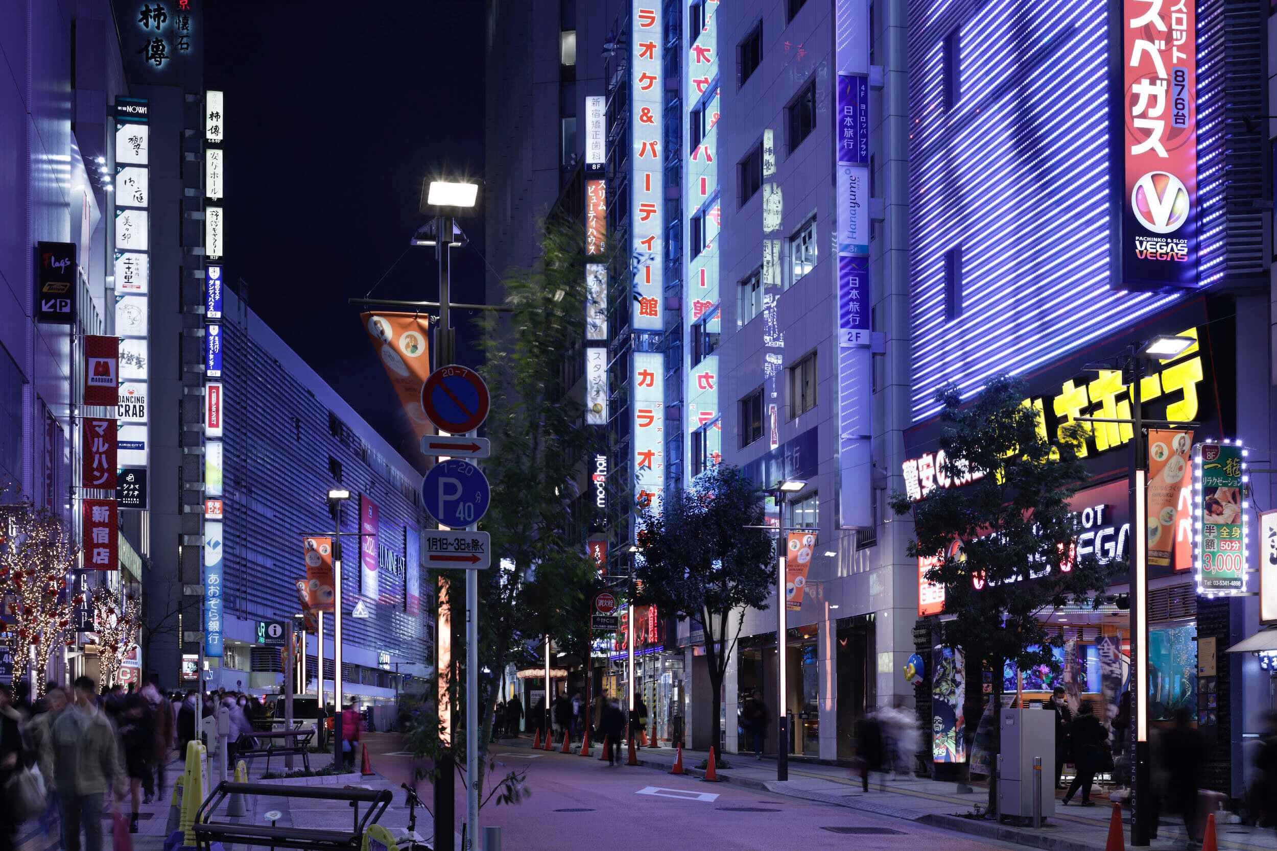
Site-specific design inspired from the location
photography : Daisuke Shima
words : Reiji Yamakura/IDREIT
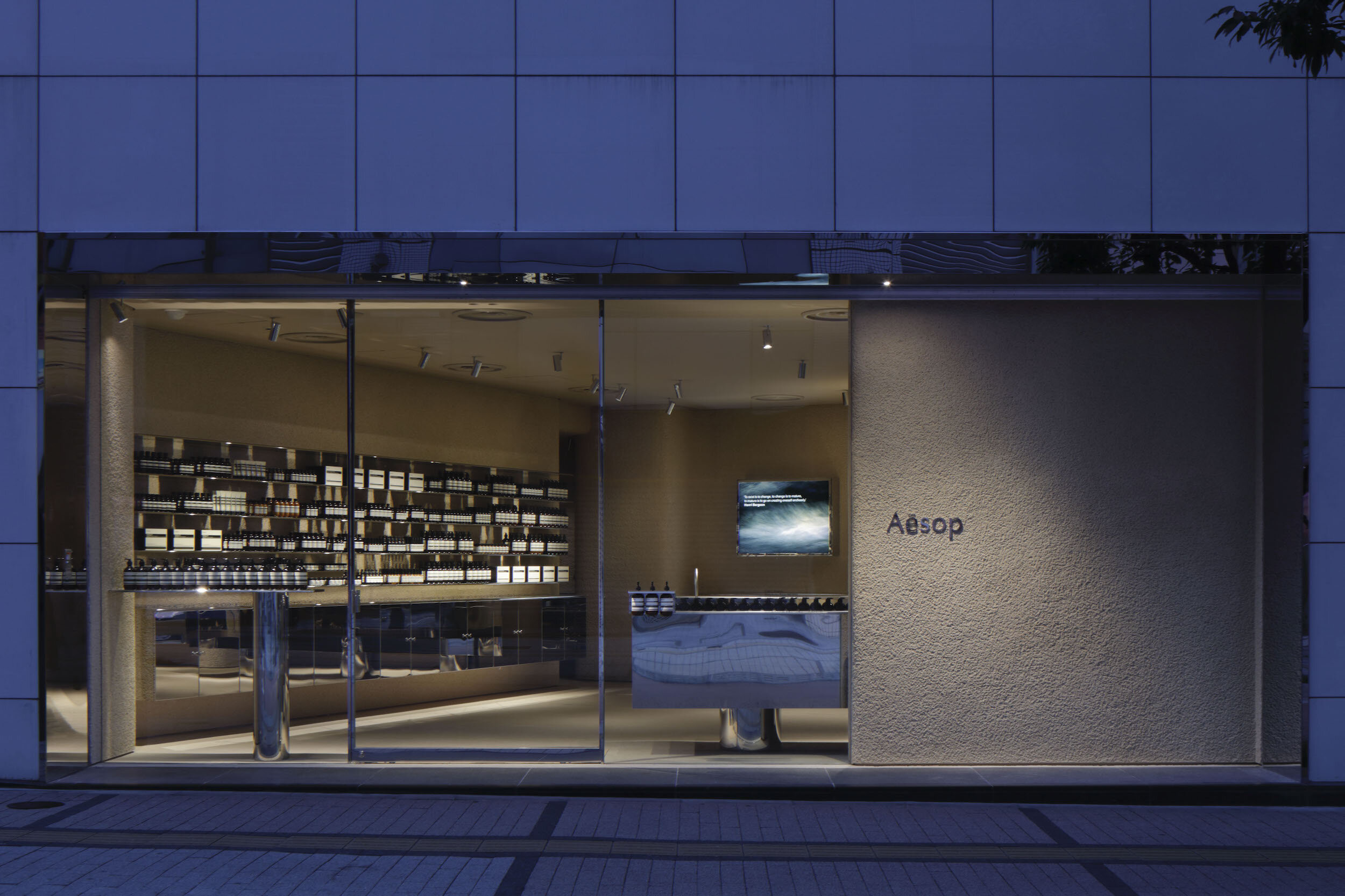
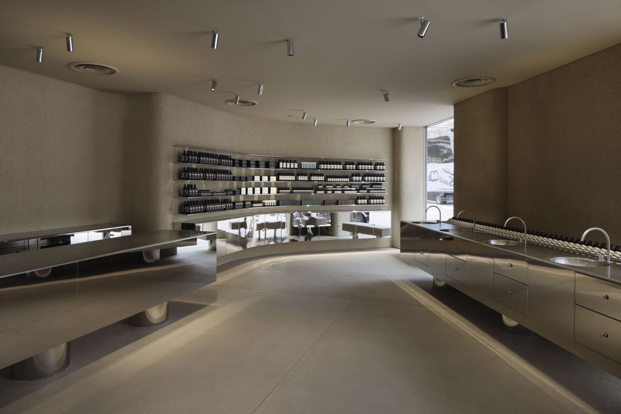
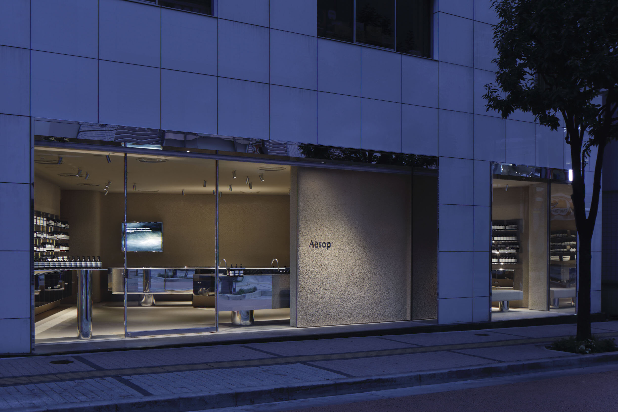
Case-Real has designed a standalone store of an Australian botanical skincare brand Aesop near Shinjuku station in the centre of Tokyo.
“We started to think about how to create a unique space that reflects the chaotic city filled with busy people and skyscrapers. At the same time, we tried to create a calm and comfortable store based on Aesop's natural and generous culture. Through the merging process of these different contexts, I thought of the mirror finish material came into my mind.” said the designer Futatsumata as he looked back on this case.
After investigations of some metals and colours, they decided to use stainless steel as the primary material.
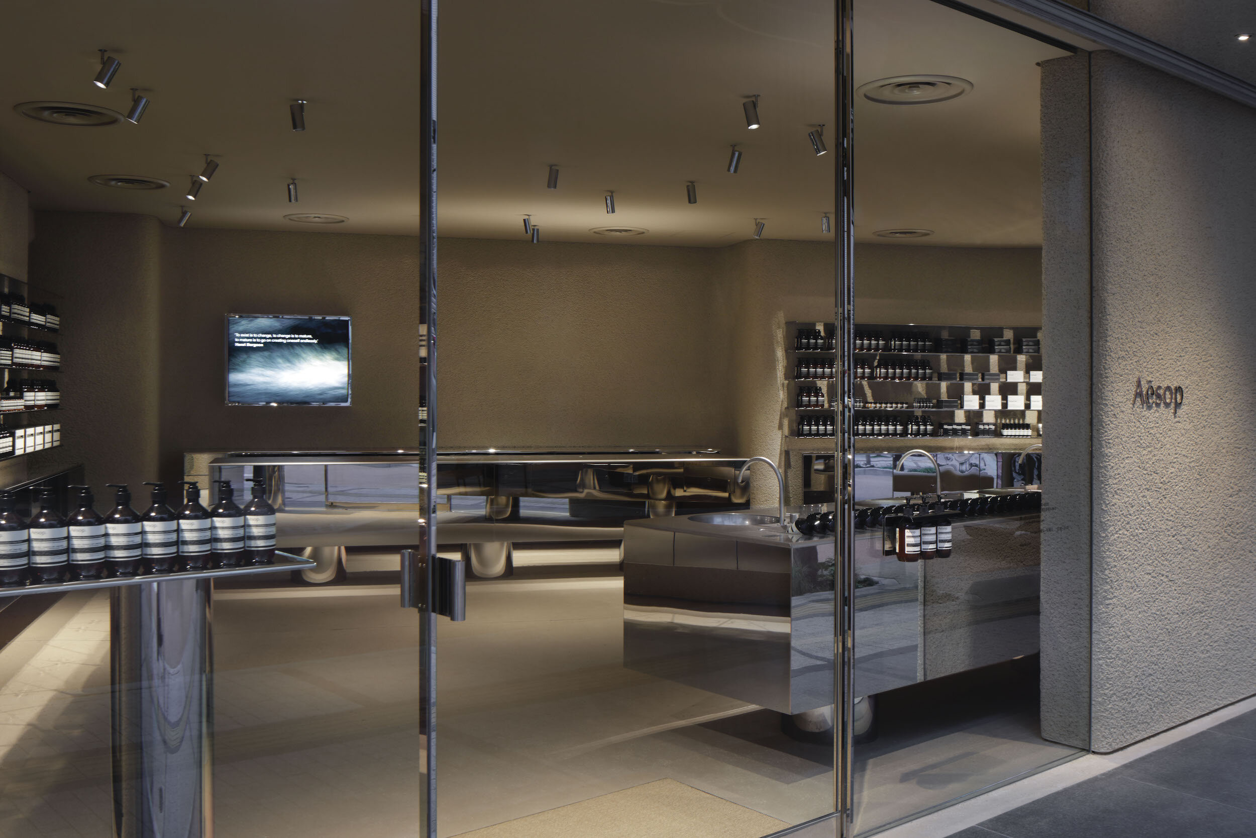
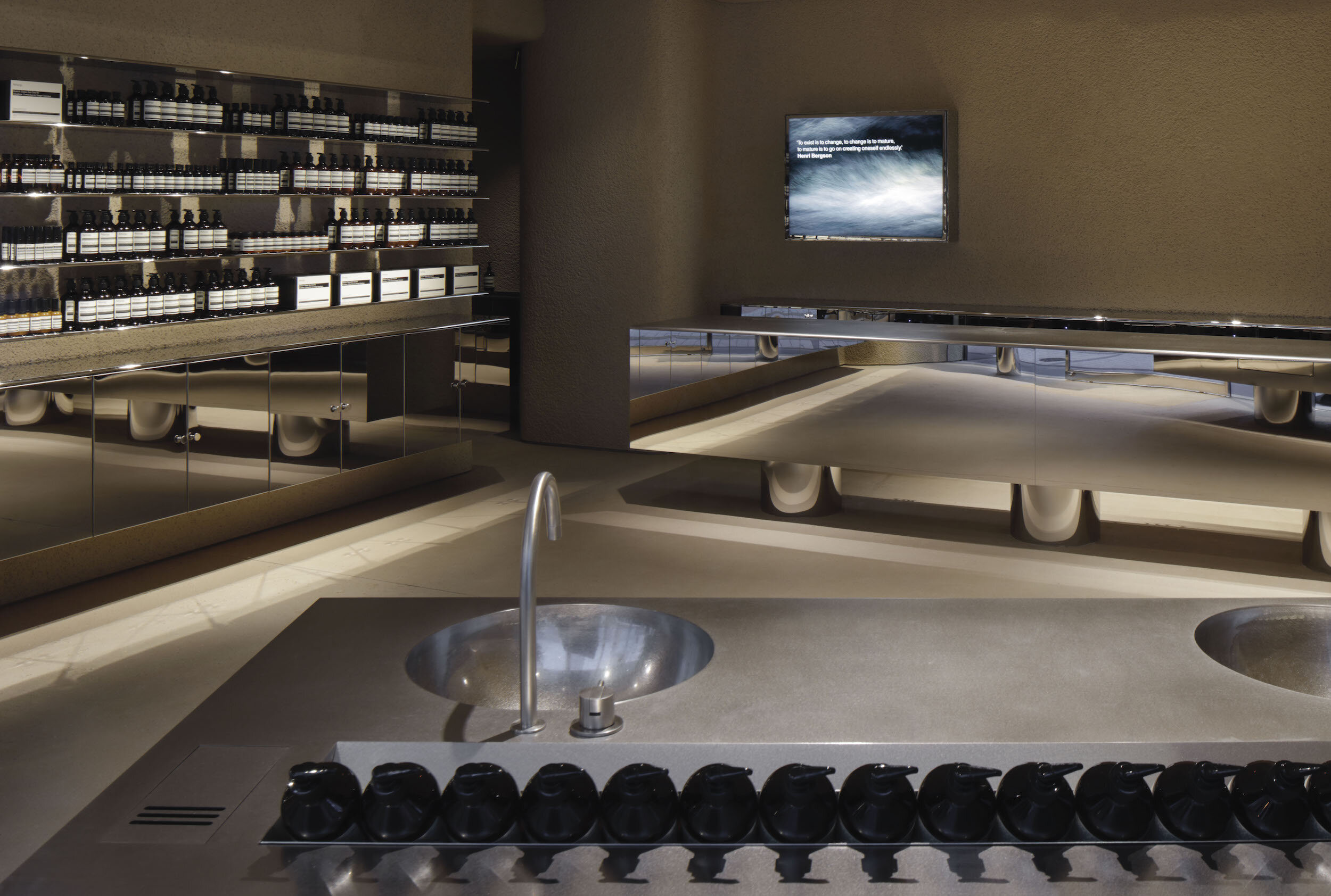
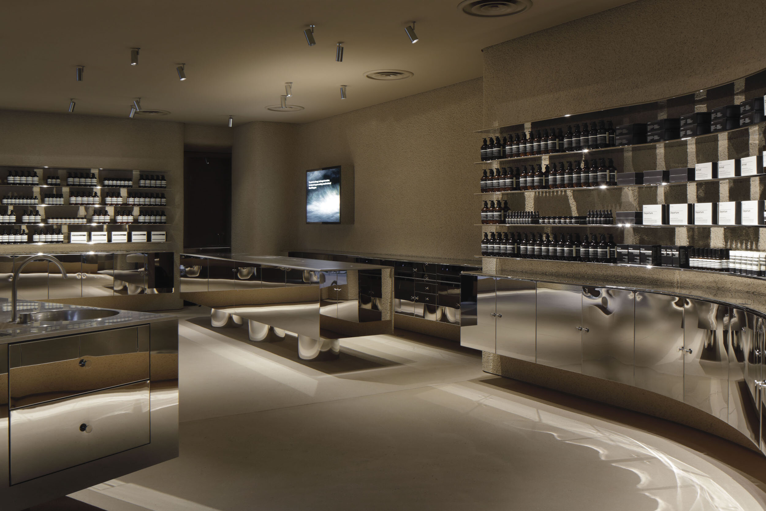
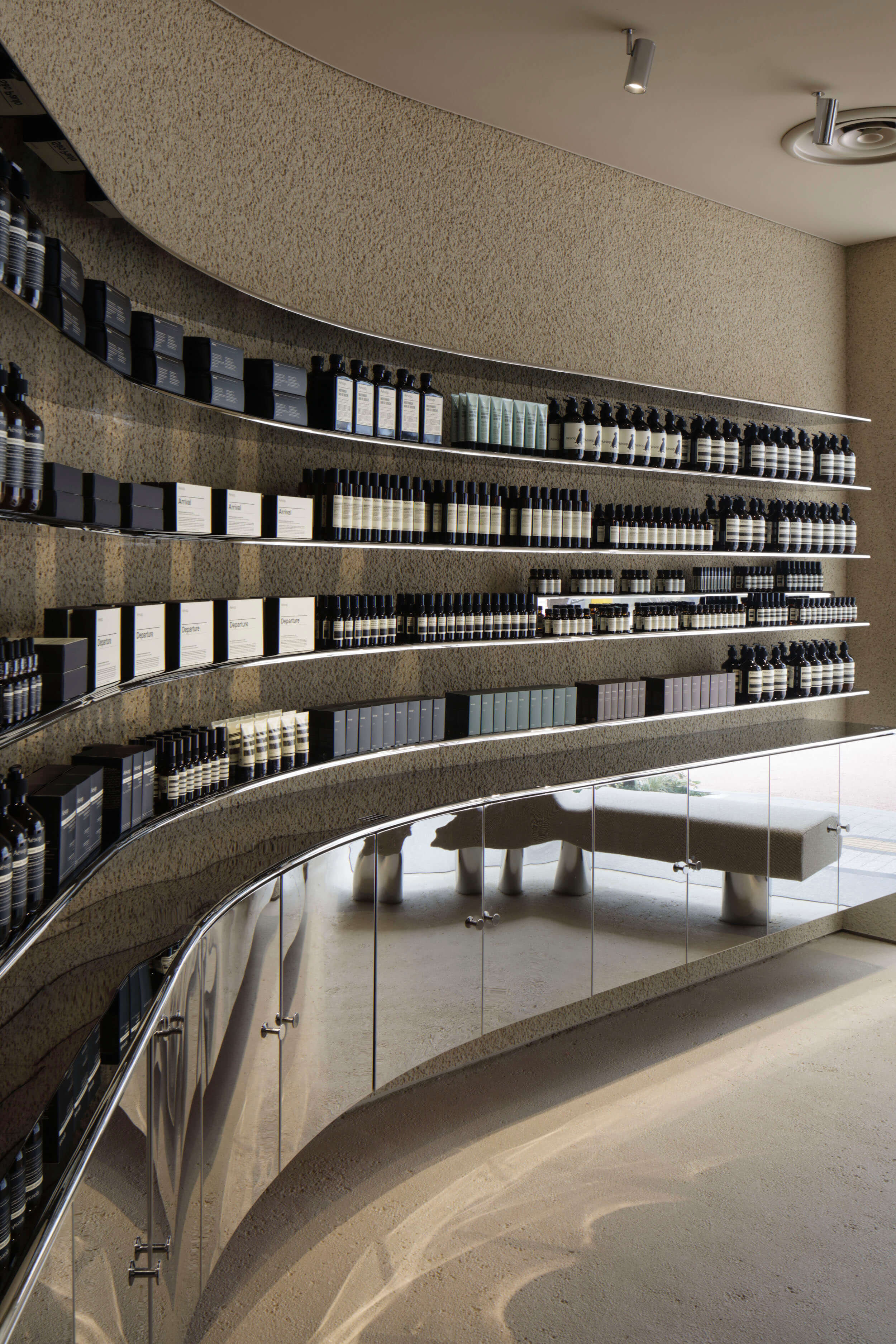
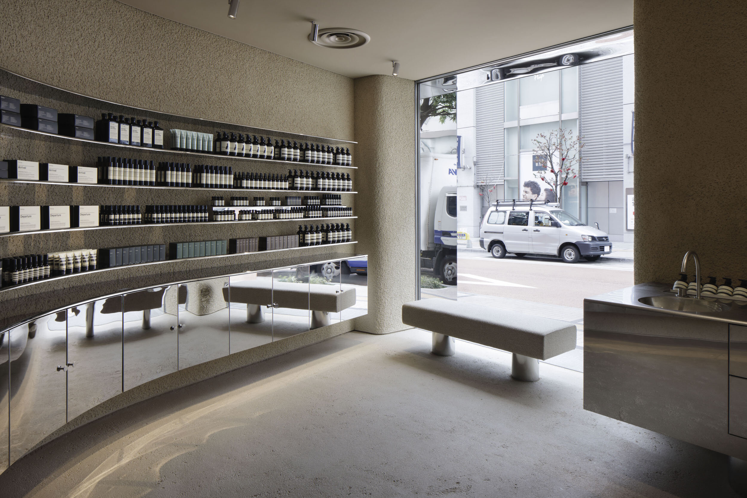
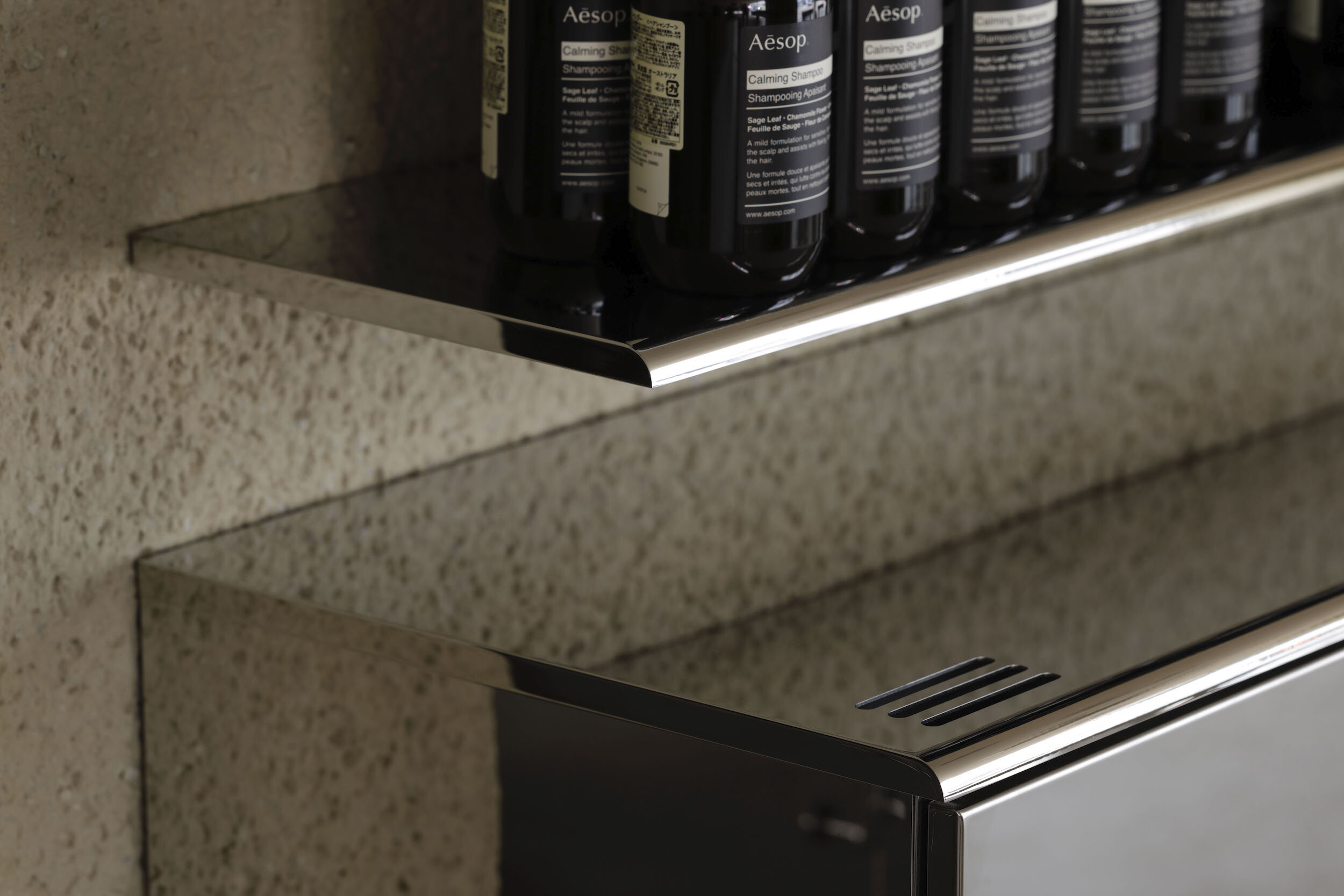
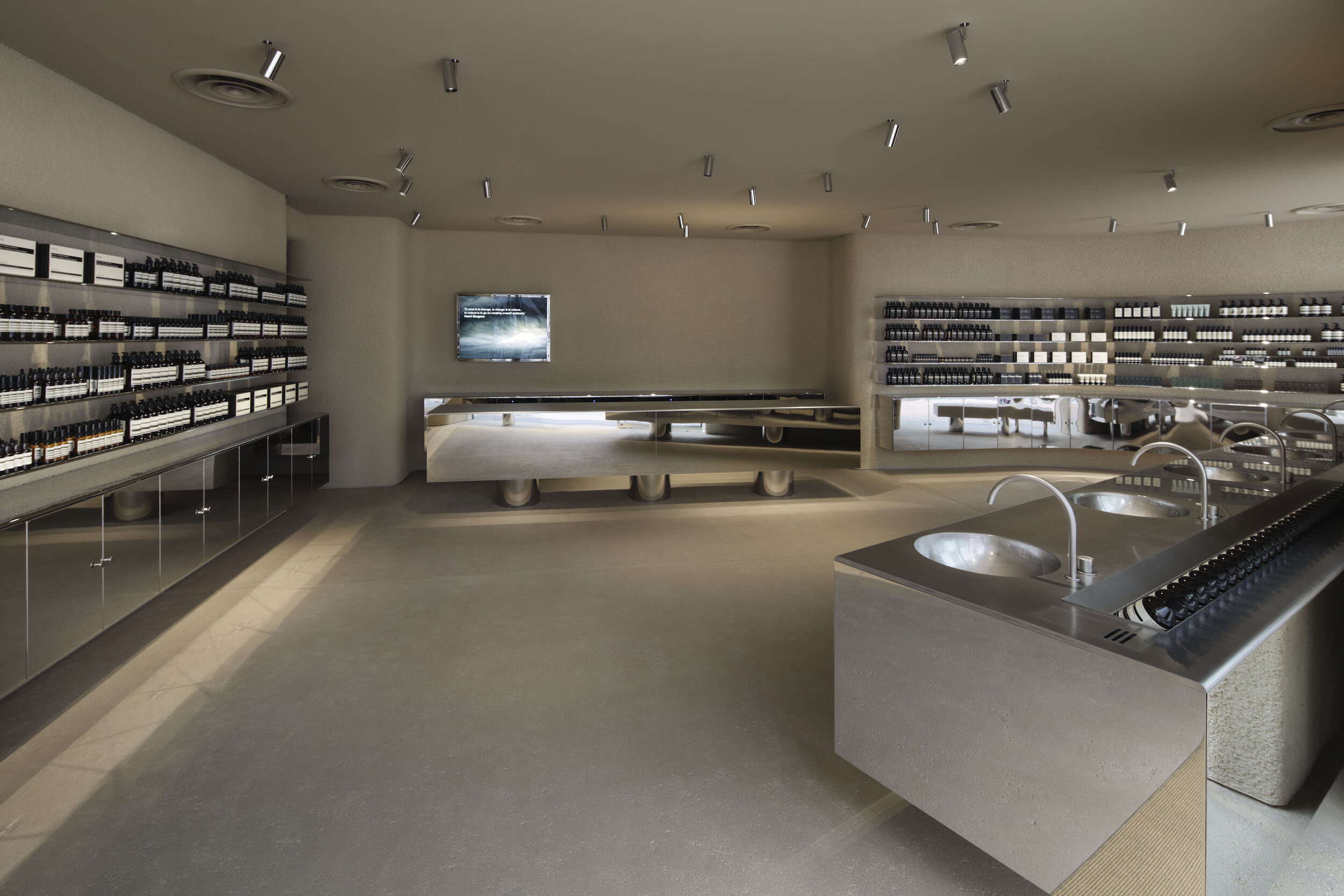
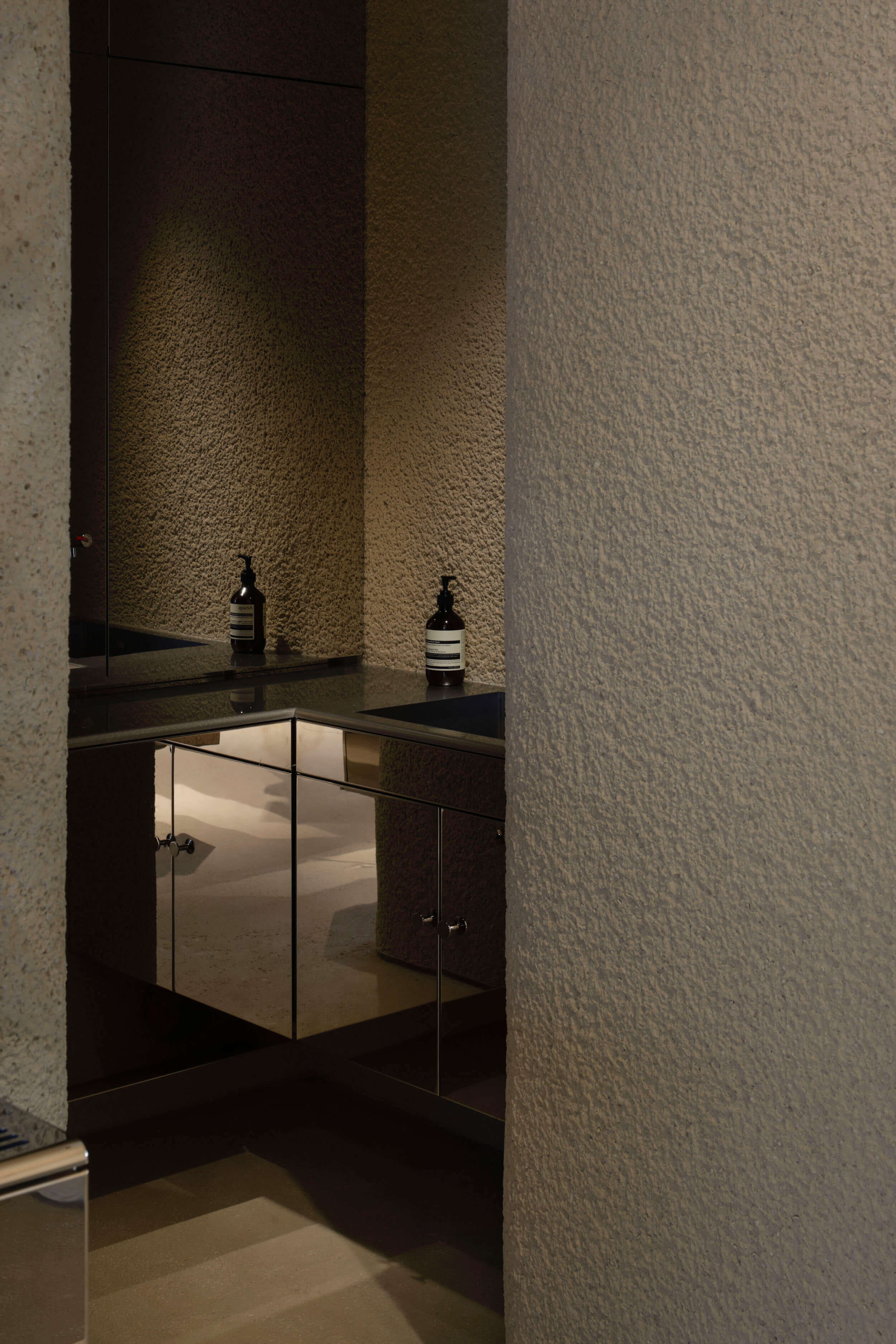
Case-Real designed elaborate display shelves made of mirror-polished stainless steel along a curved wall. For the upper part, the 15mm thickness shelf boards were installed with a half-round shape edge, while the lower part, mirror-finished cabinets were designed. They considered the details to achieve higher quality.
For the lighting, the spotlight was selected instead of downlight because the designer wants to achieve the fit-out that all function element created with polished mirror material. Collaborating with Branch Lighting Design, minimal style custom-made cylindrical spotlights were installed on the ceiling. Carefully designed details with the polished body, thin flange, and arms raise the level of completion as a sophisticated interior with fewer materials.
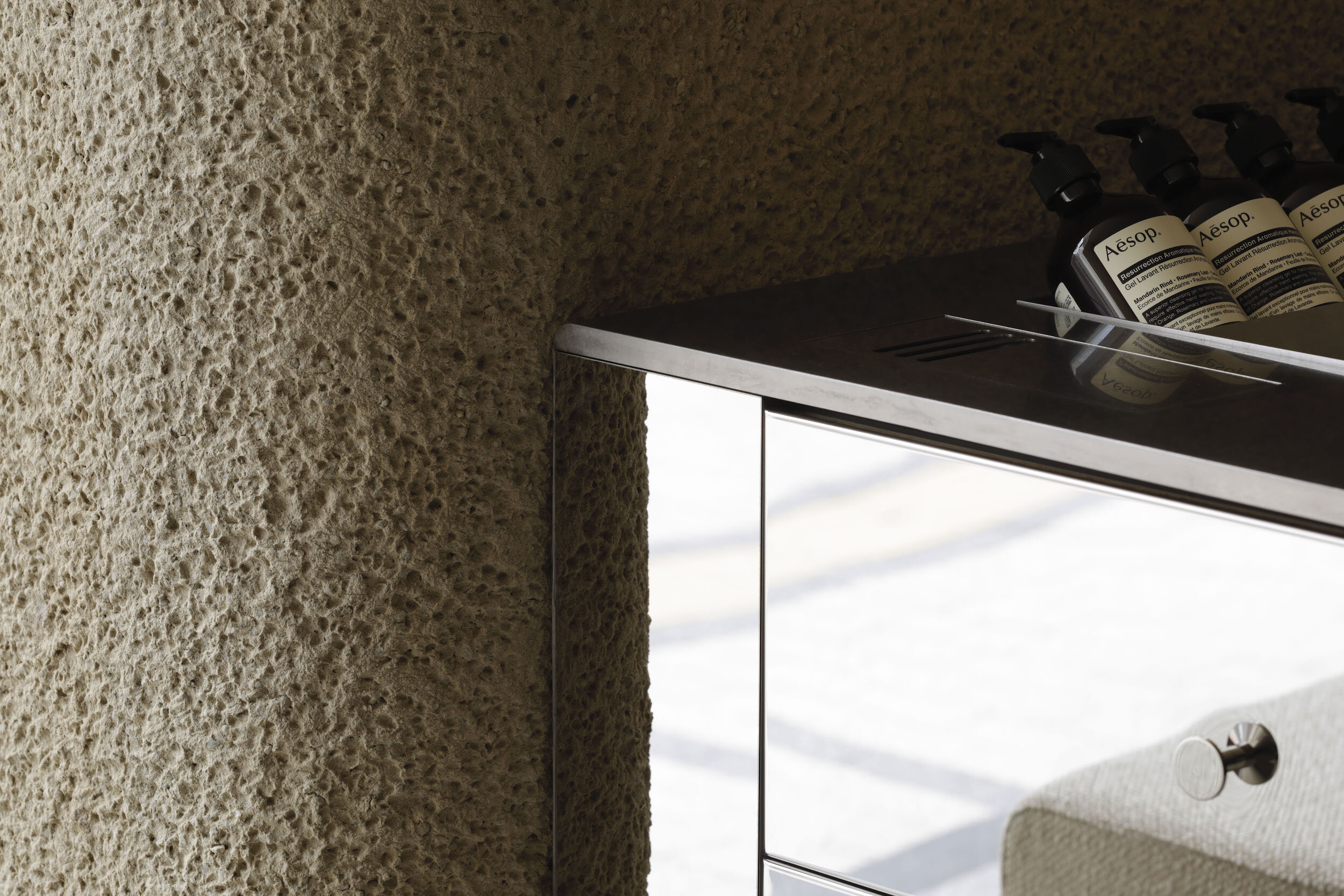
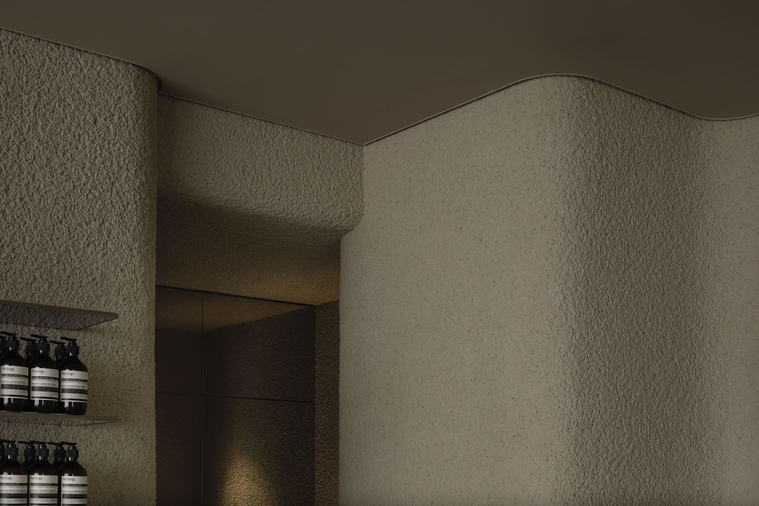
Chipped plaster having rough expression was used for the walls and floors as a material contrasting with a mirror finish stainless steel
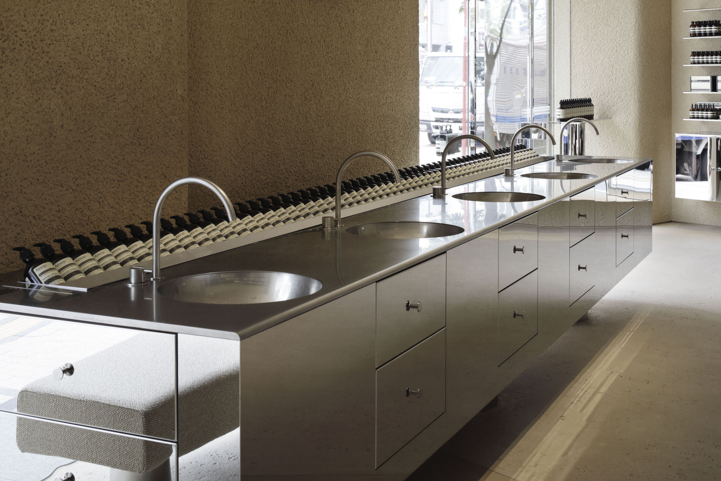
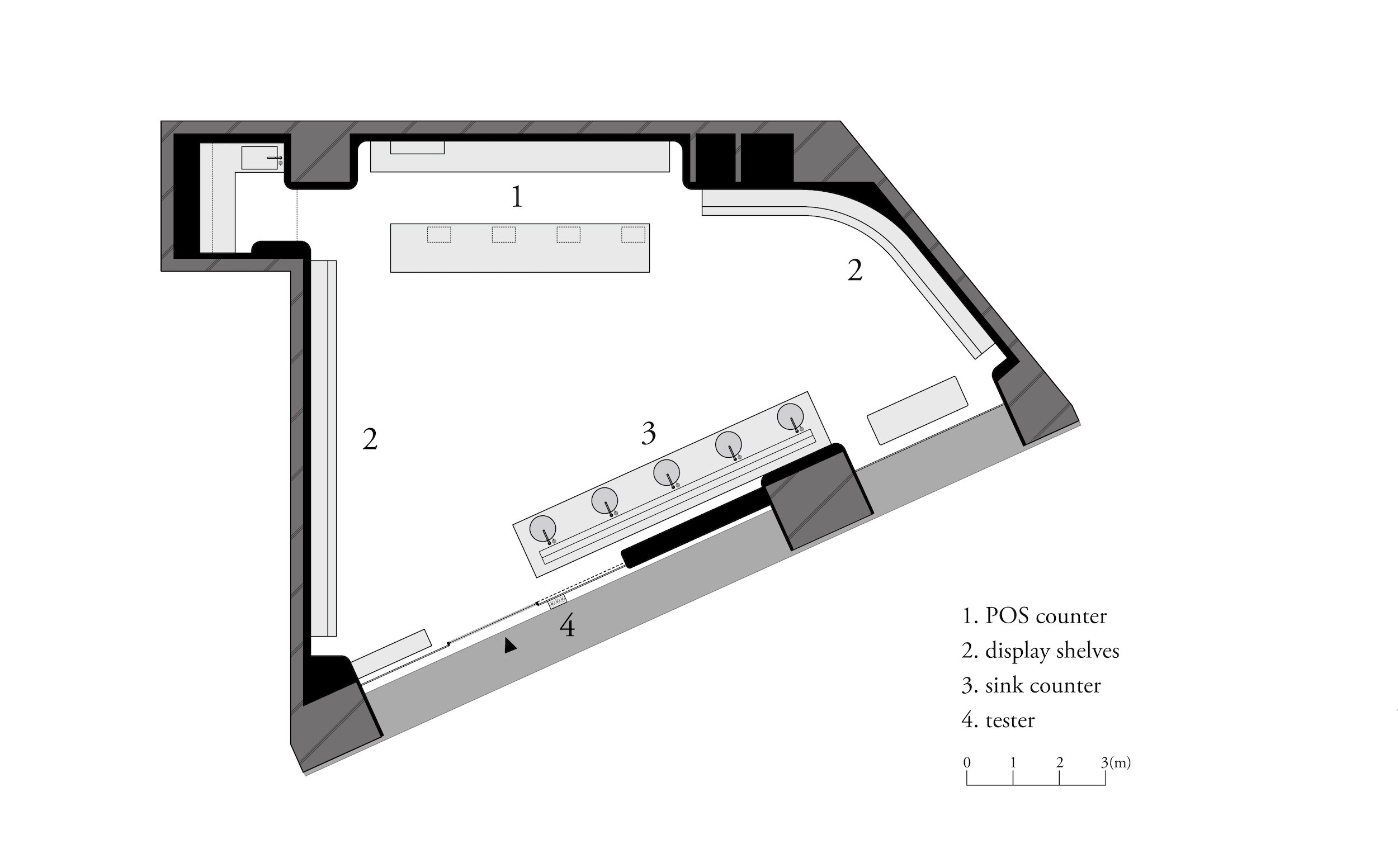
On the trapezoidal floor plan, counters and shelves faced each other in unparallel layout because the designer aimed to create unexpected mirror reflection. Futatsumata described that “Mirror sometimes looks conspicuous; at other times it looks invisible. So, when I walked into the store, I discovered a beautiful mirror effect than I imagined.”
Through their approach to the locality of Shinjuku and the Aesop’s brand philosophy, the site-specific store integrating two different elements such as the metallic volume comprised with glorious artificial stainless steel and chipped plaster walls has emerged.
DETAIL
Case-Real designed sophisticated wall shelves with mirror polished stainless steel.
For the wall, the chipped plaster finish was used in contrast to the mirror polished stainless steel. The wall shows rough expression.
All mirror-finished spotlights are customised for the store.
The designer chose chipped plaster for the floor, the same as the wall.
The entrance door handle was designed for the store with the similar mirror finished material.
CREDIT + INFO
Name : AESOP Shinjuku
Designer: Koichi Futatsumata, Yuki Onita / CASE-REAL
Construction: &S co.,ltd.
Lighting Plan: Tatsuki Nakamura / BRANCH LIGHTING DESIGN
Location: Shinjuku-ku, Tokyo, Japan
Main use: Shop
Completion date: January, 2020
Floor area: 82.1 sqm
Material:
floor&wall/chipped plaster
ceiling/LGS+PB+AEP
shelf/mirror polished stainless steel
sink counter/vibration finish stainless steel
lighting/custom-made spotlight
RELATED POST
>>> interview with CASE-REAL
>>> designed by CASE-REAL


