BEAUTIFUL PEOPLE pop-up store unseen archives during the pandemic by DAISUKE YAMAMOTO
Tokyo, Japan
beautiful people pop-up store unseen archives during the pandemic | DAISUKE YAMAMOTO/de:sign| photography: Kozo Takayama
DESIGN NOTE
A two-month POP-UP store created under pandemic
A programme to reuse building materials
Furniture and interiors made from Light gauge steel

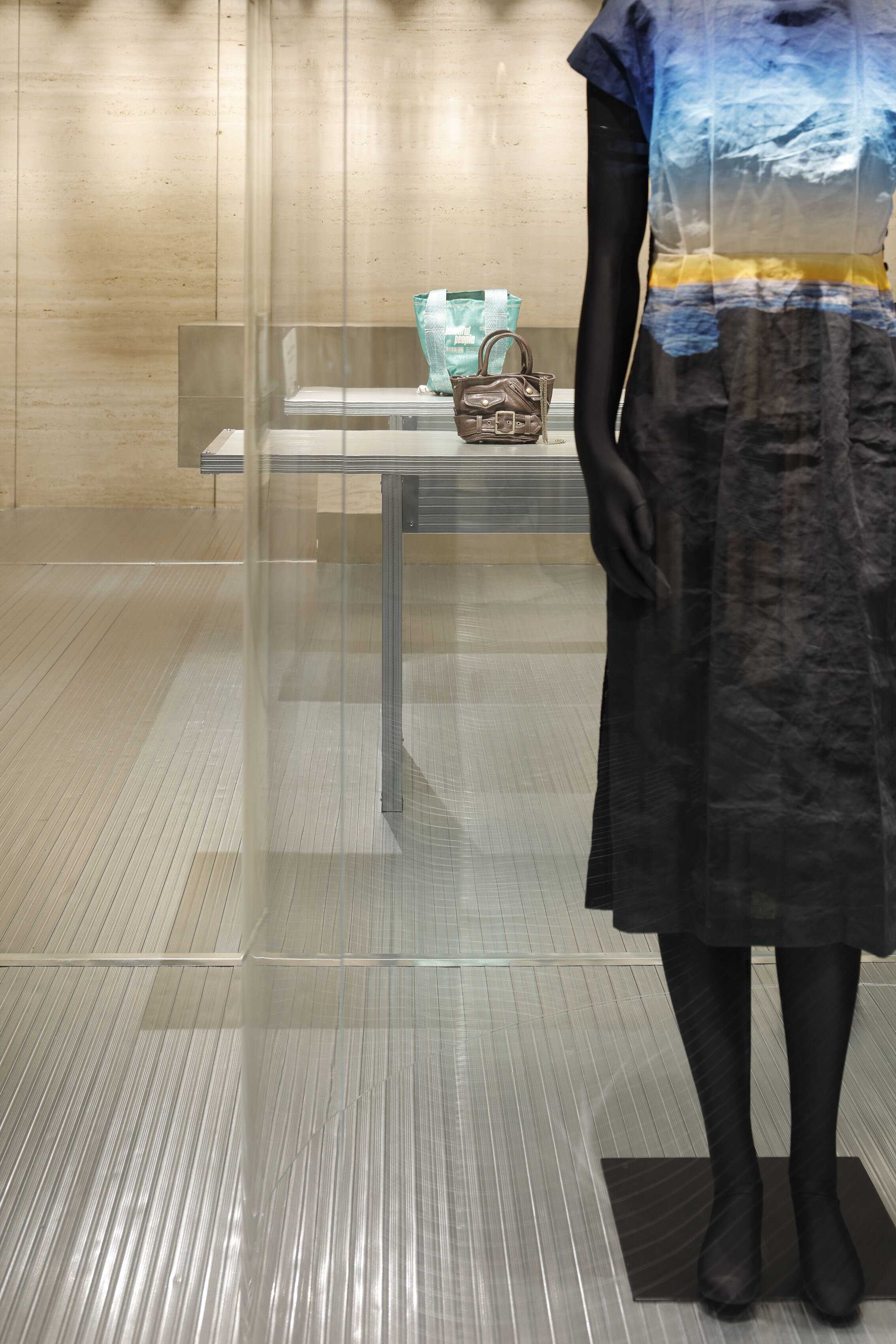
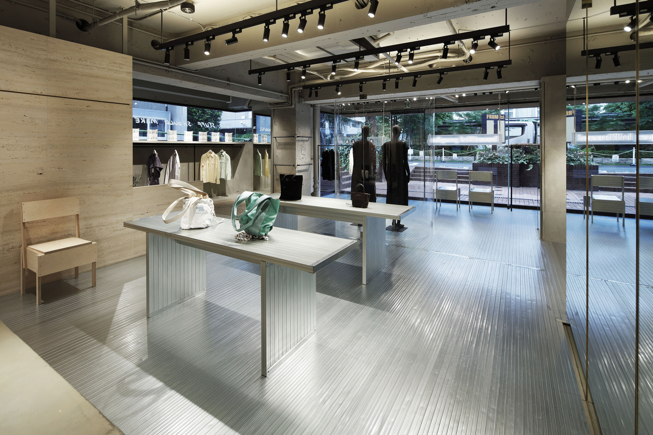
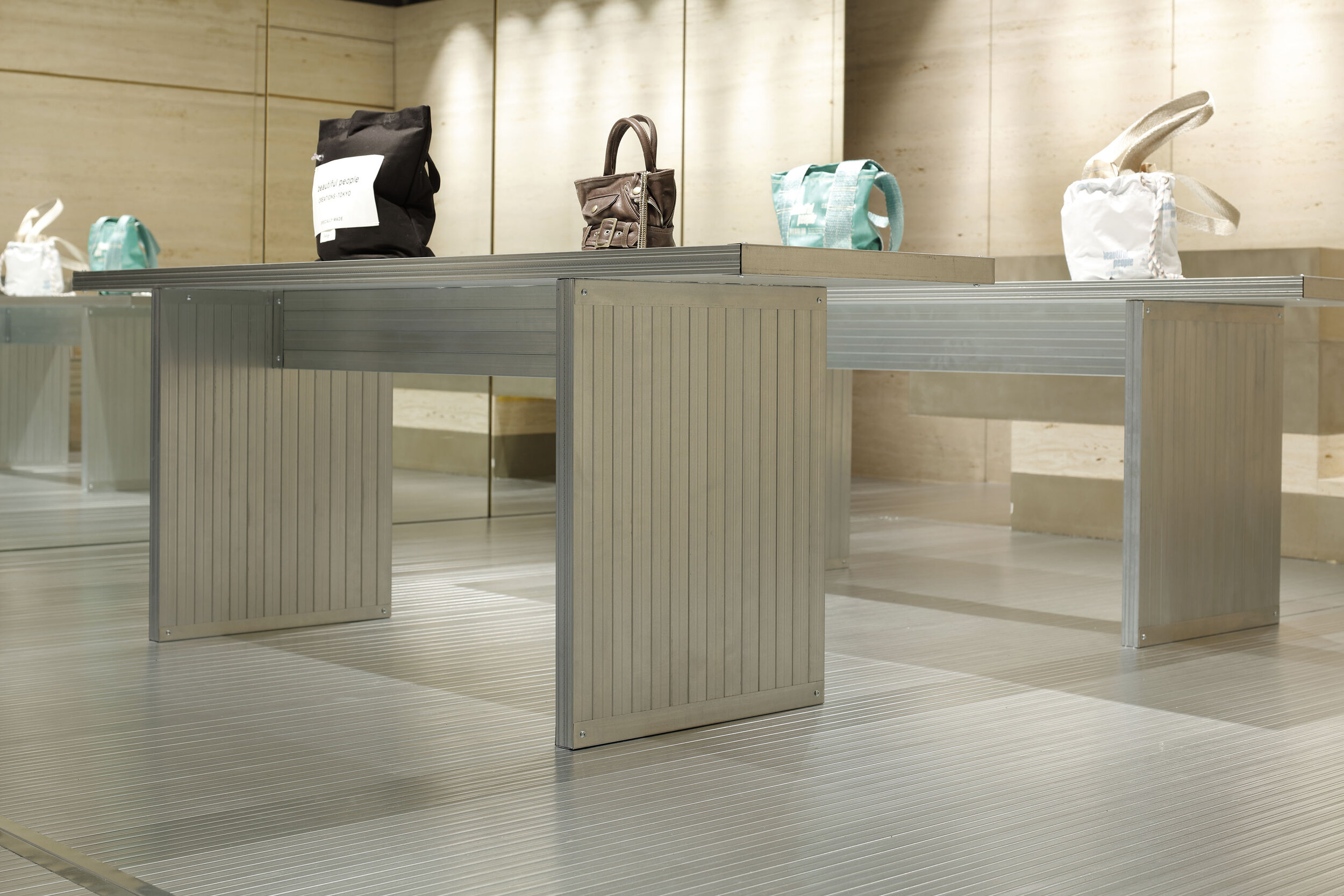
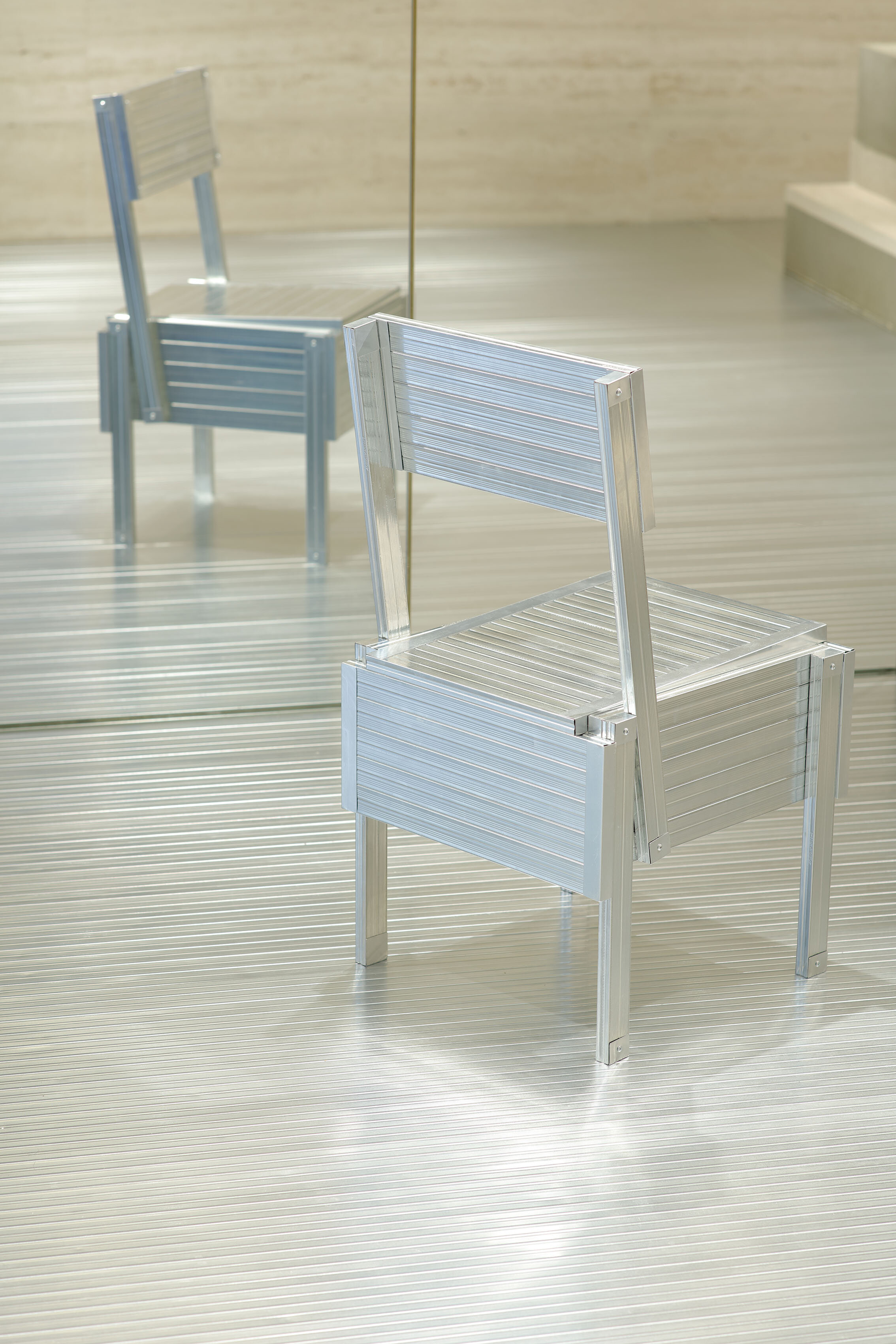
photography : Kozo Takayama
words : Reiji Yamakura/IDREIT
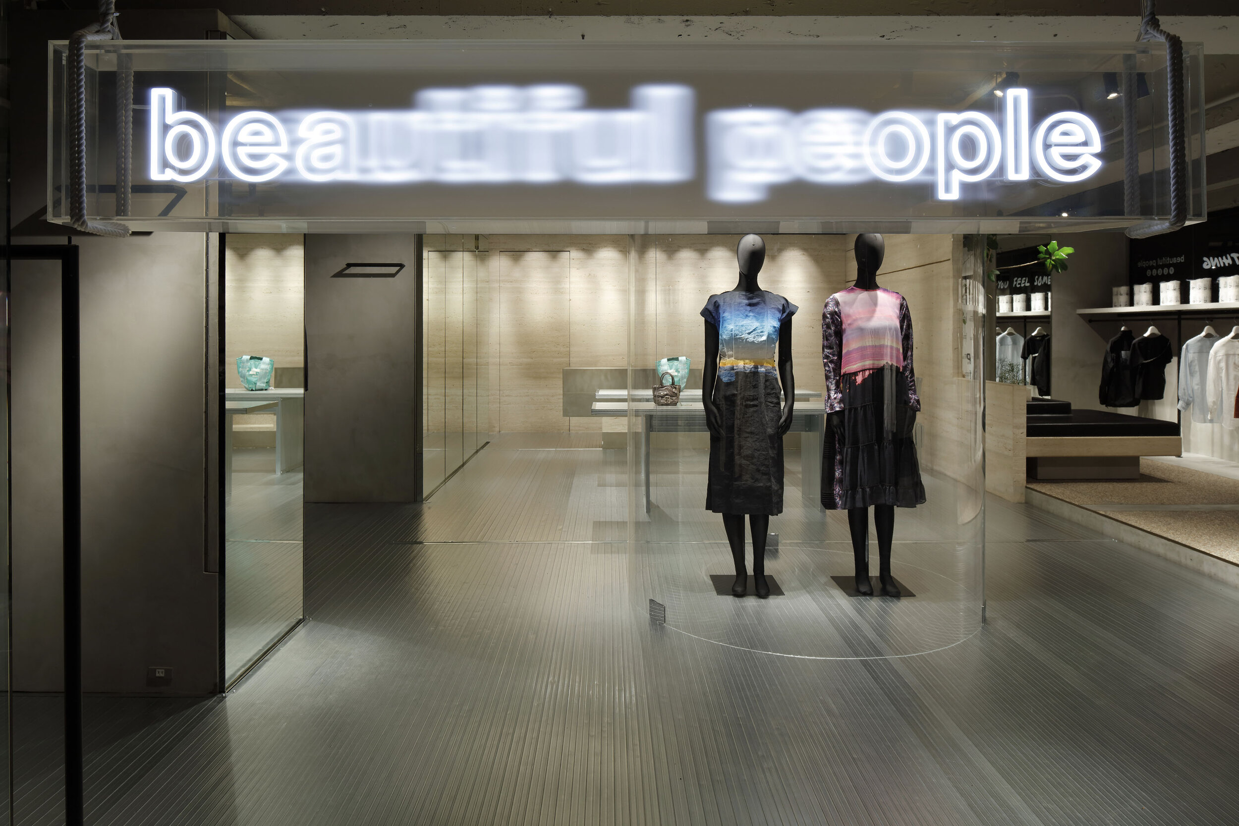
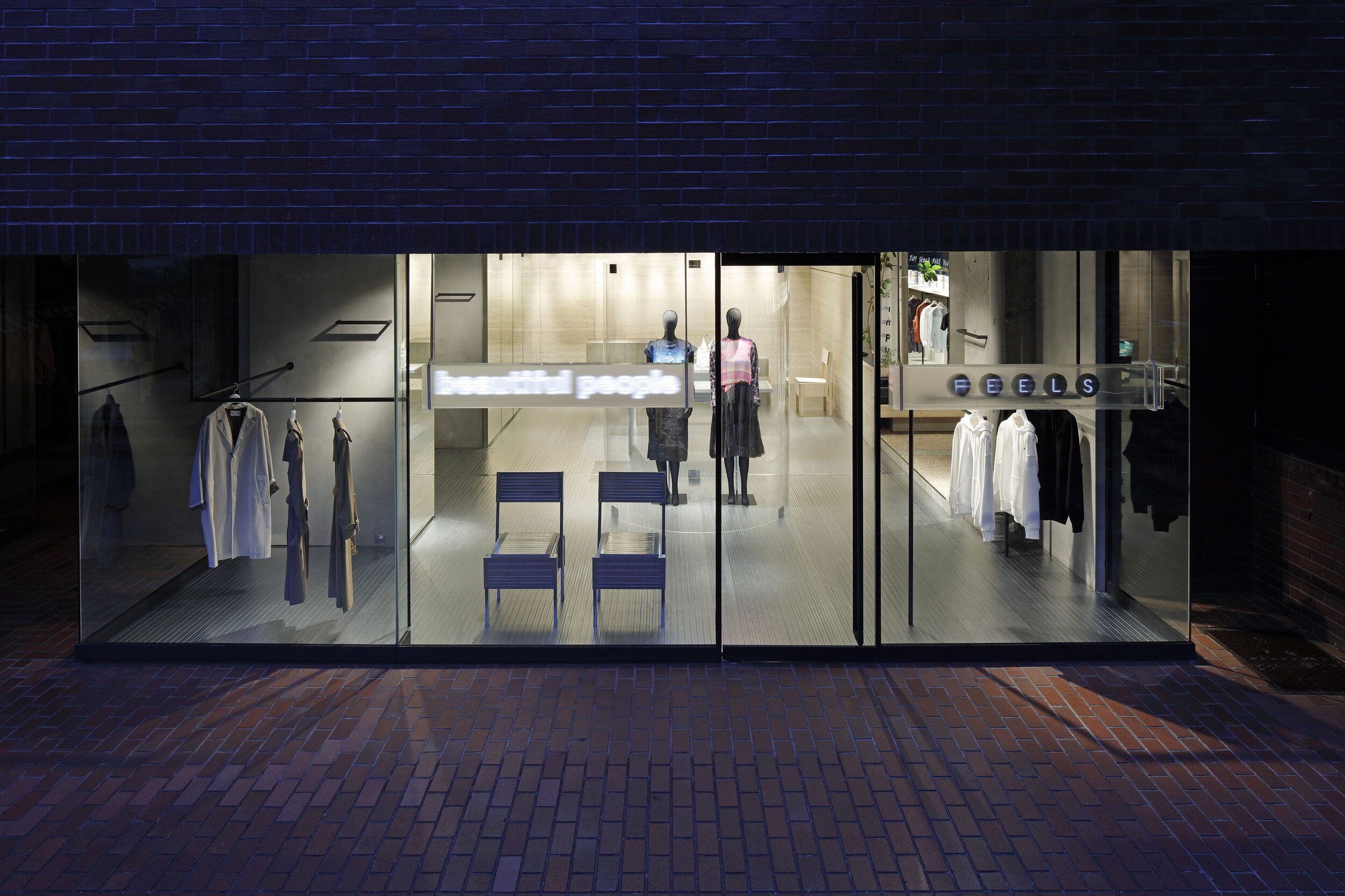
Tokyo-based design studio DAISUKE YAMAMOTO / de:sign has designed a pop-up store ‘beautiful people pop-up store unseen archives during the pandemic’ in Aoyama, Tokyo. The shop was planned for two months only to sell items for fashion brand ‘beautiful people’ that had lost their place of presentation during the pandemic.
“It was a normal cycle of showcasing and selling fashion, but due to the pandemic, department stores were unable to open, and clothes had to be discarded. So, together with the members of the brand, we came up with the idea of this archive store. The concept is to use all resources wisely with care”, said the designer Daisuke Yamamoto. He is not only involved in the design but also the brand building as a creative advisor.
He added that the design was also influenced by his personal concerns about the too fast scrap-and-build cycle. “These days, the contract between a brand and a commercial building often lasts only one to three years, and within three years, the building can be demolished and disposed. In such a situation, we wondered what we were designing for. Why do we build a shop, even though it will soon be demolished?”
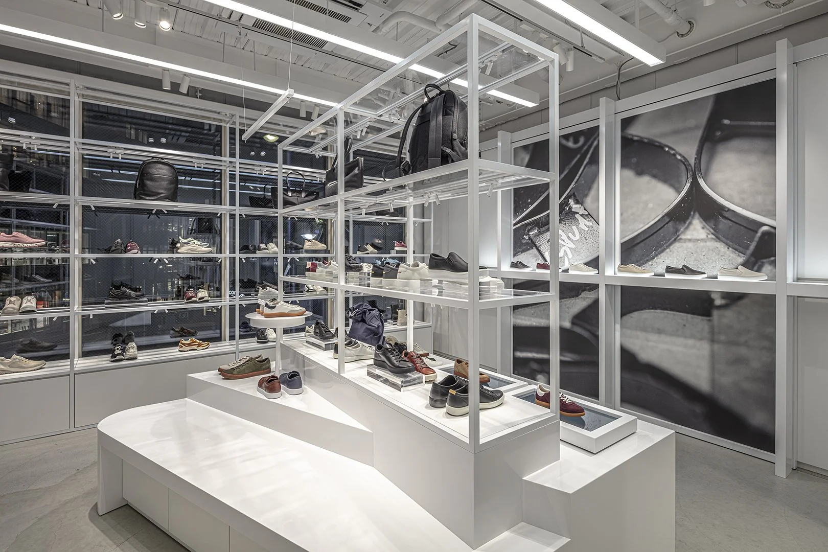
beautiful people Shibuya Parco photography: Kozo Takayama
After seeing the interior demolition work, Yamamoto came up with the idea of making the materials more sustainable by not covering them with paint or other surface finishes. To keep the pureness of the materials and sustainability, he designed the ‘beautiful people Shibuya Parco store’ in 2019. The walls are all screwed together with LGS (Light Gauge Steel) without using any adhesive. They have also created fixtures made of just piles of plasterboard and stools made of stacked wires. Customers can see Yamamoto’s unique interpretation of shop design using raw materials. After the Shibuya shop, the design team evolved a more flexible concept and created the Nagoya shop because they knew they would have to relocate in a year or two.
beautiful people Nagoya photography: Katsuhiro Aoki
After the two developments, this archive store was planned uniquely in terms of tenant selection. Instead of building the interior from scratch, they searched for a property that could be used as a fashion store after the lease expired but before it was demolished. Yamamoto said, “We thought that a way to make use of what’s there now, the context that’s already there, would be appropriate for this limited-time shop. We had the concept of thinking from the moment of demolition, but we accelerated this idea and designed backwards from the moment when the building would be gone in two months.”
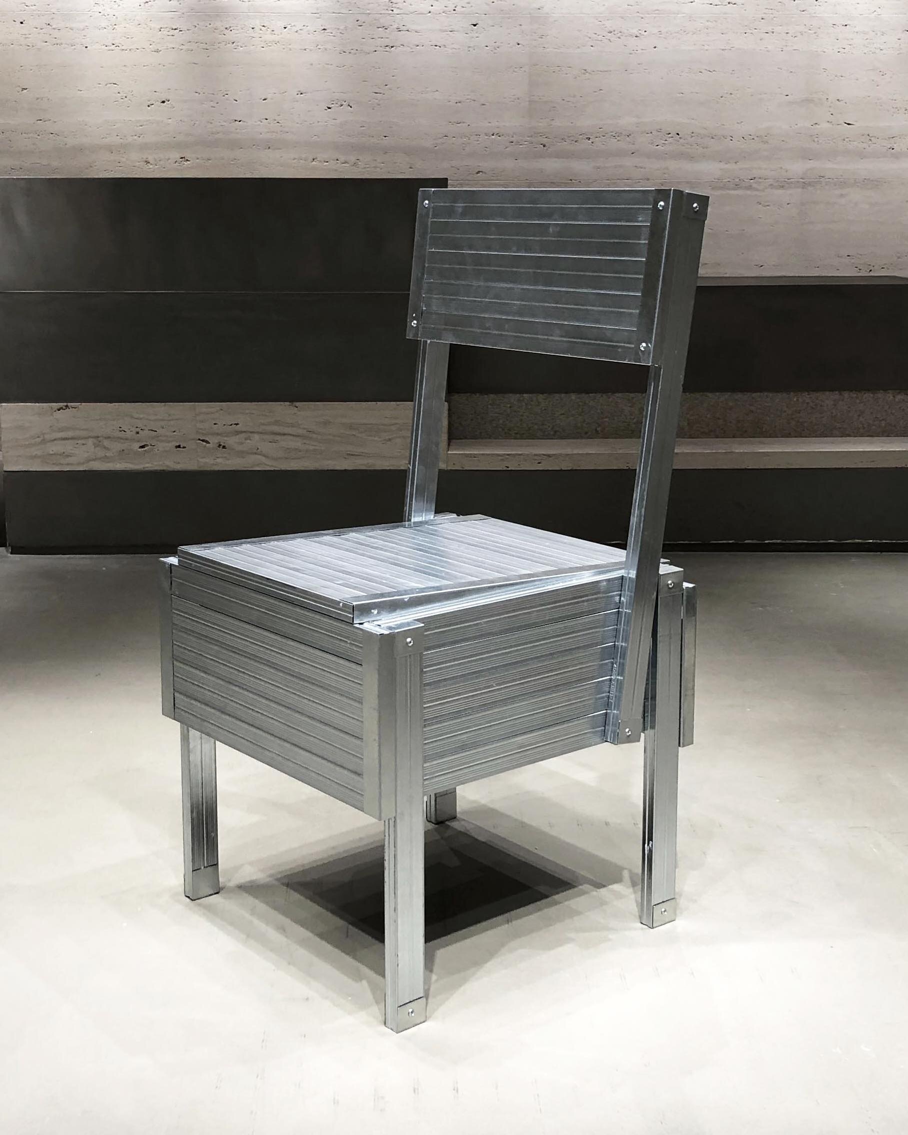
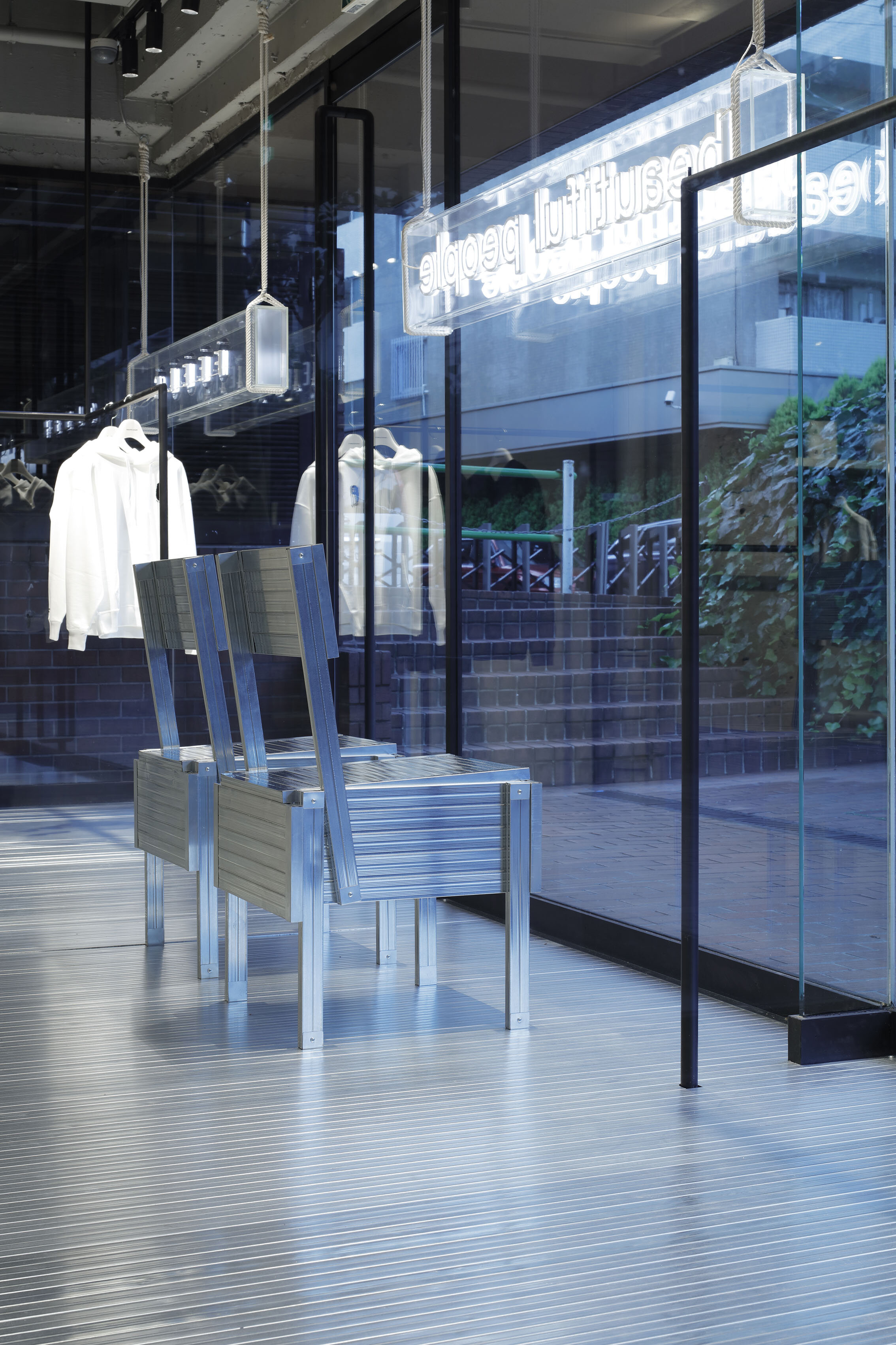
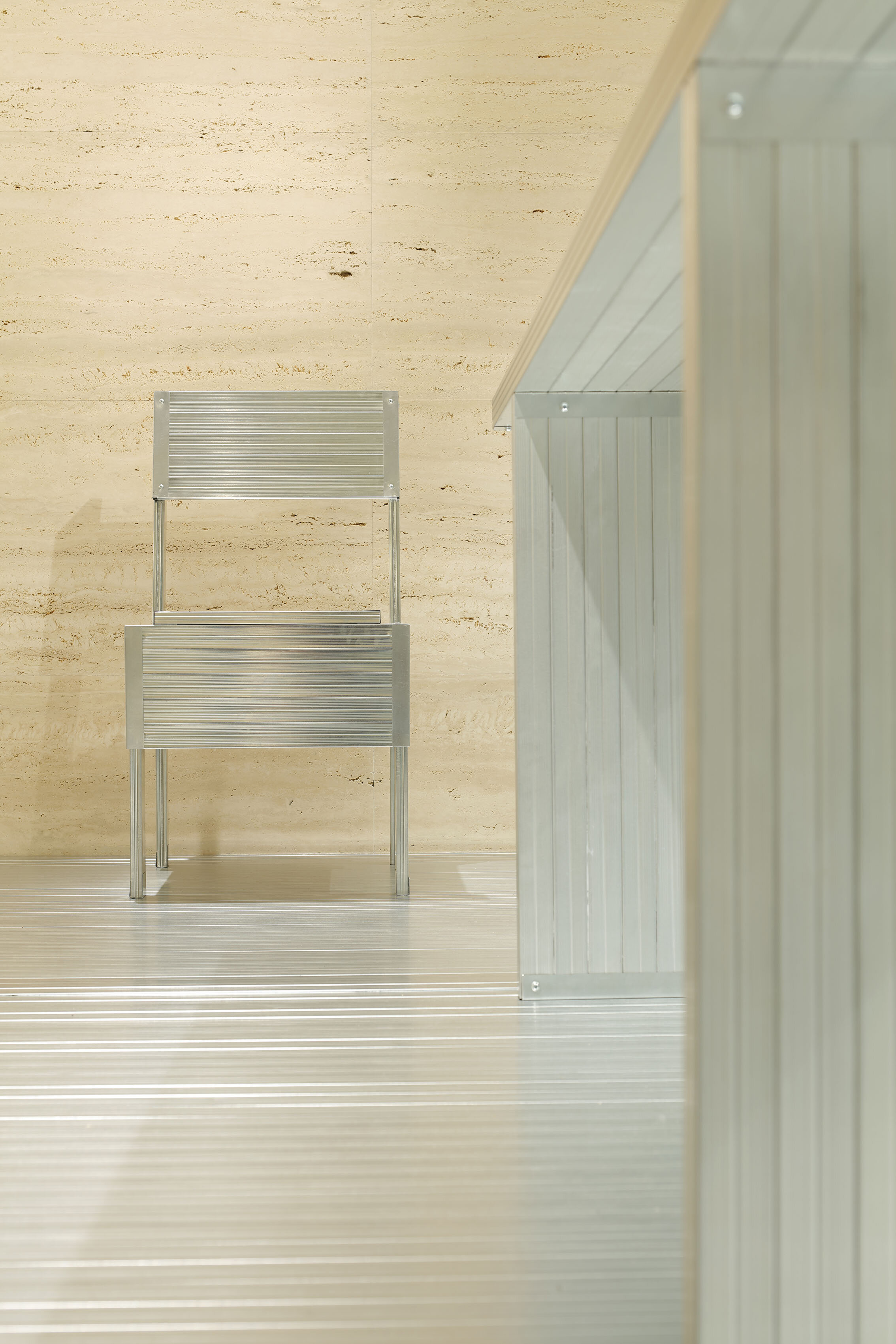
Yamamoto chose LGS, which is often used in the Shibuya store, as the primary interior material. The key idea for the LGS was a chair from the book’ autoprogettazione?’ (1974) by Italian designer Enzo Mari.
“The book was a collection of D.I.Y. furniture. I think that by publishing the drawings of D.I.Y. furniture, the author, Mari, wanted to show society that furniture design is something that everyone can work on, even if they are not professionals.
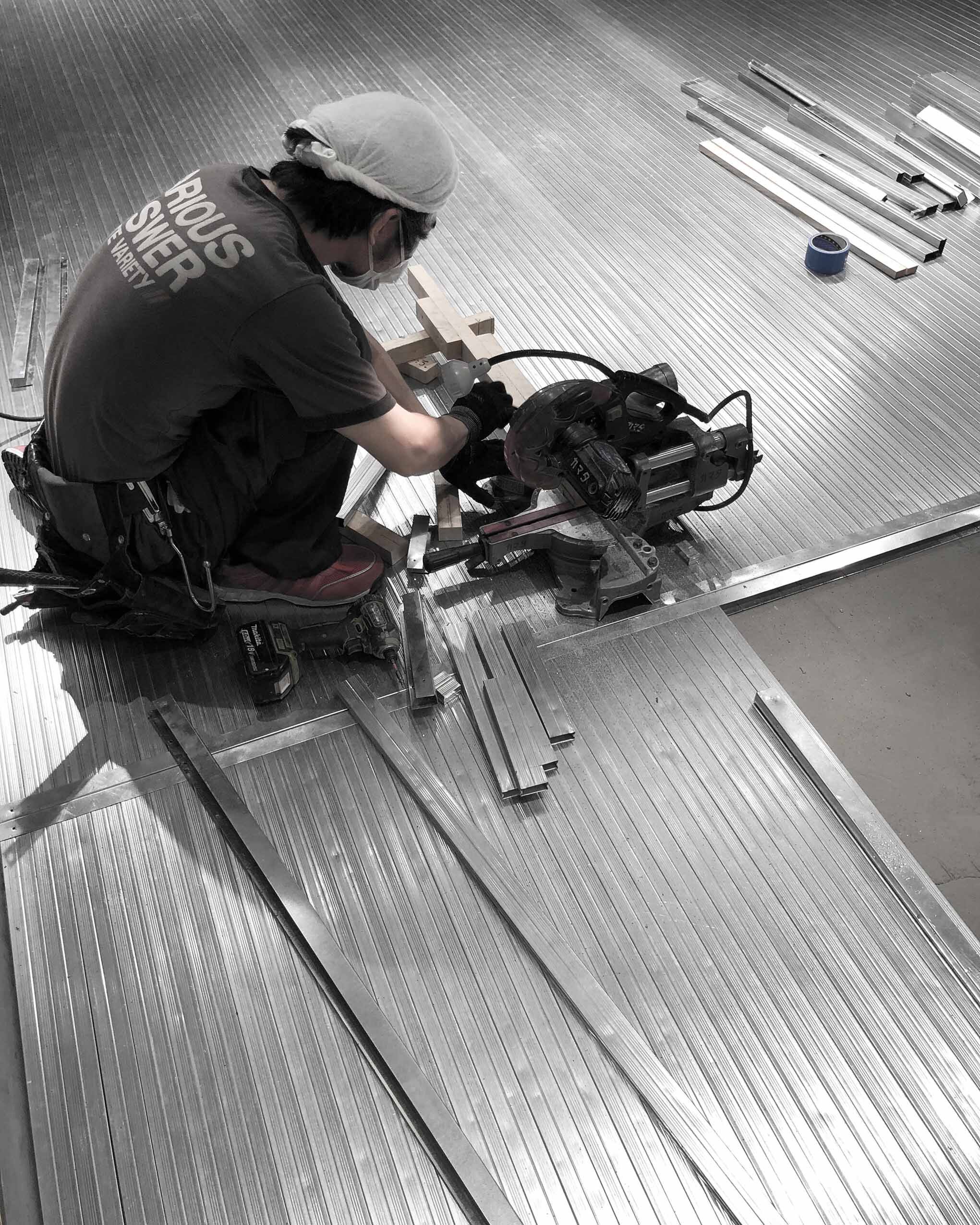
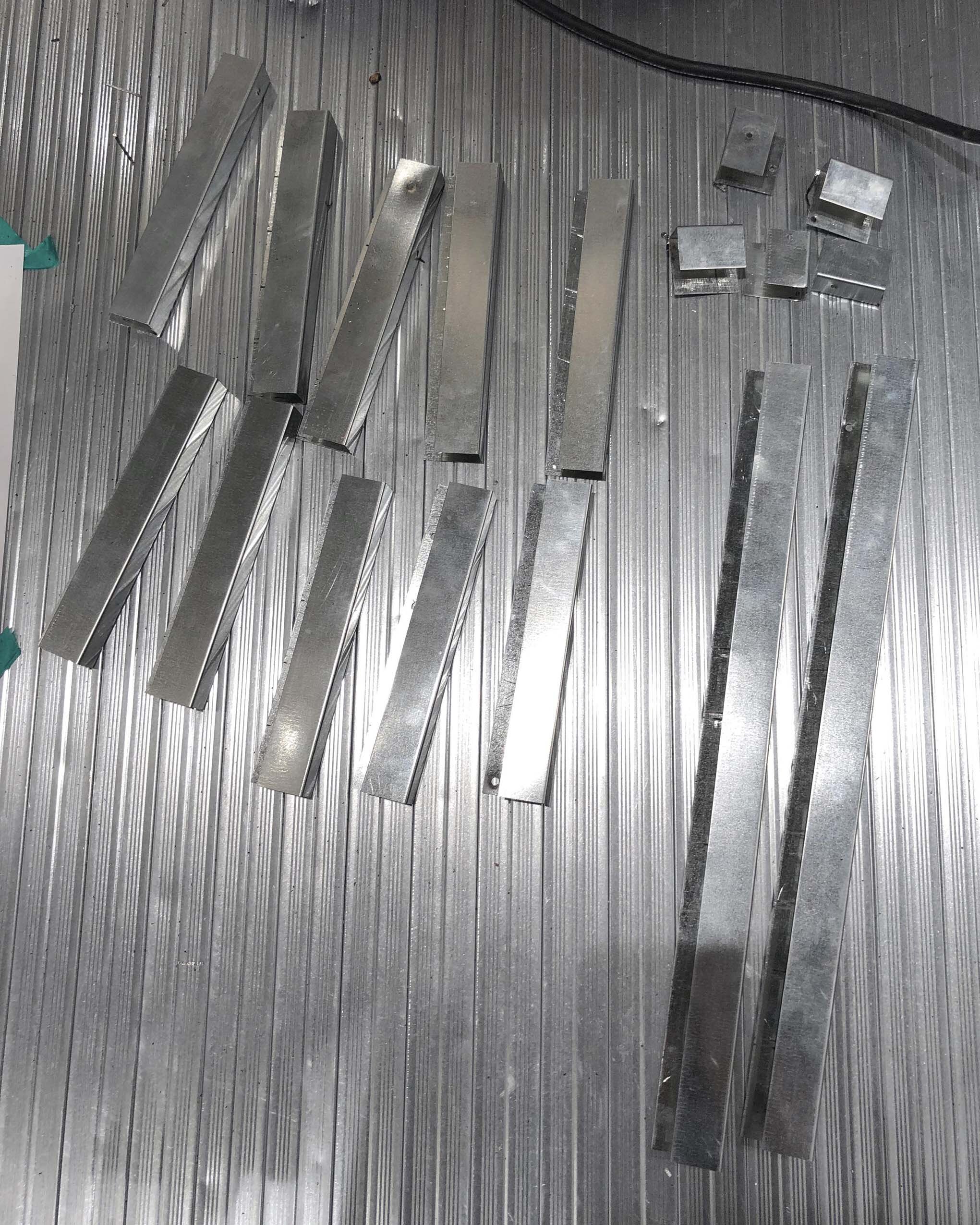
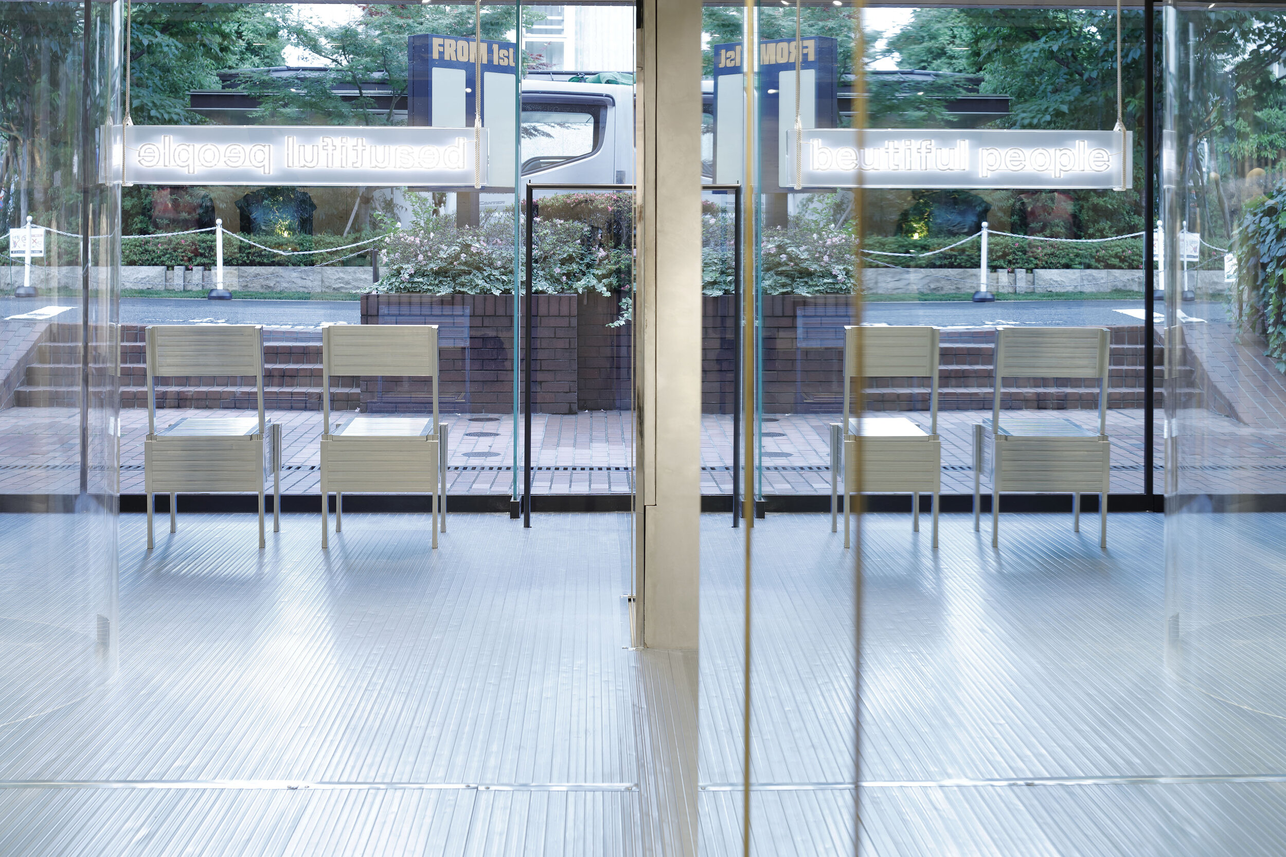
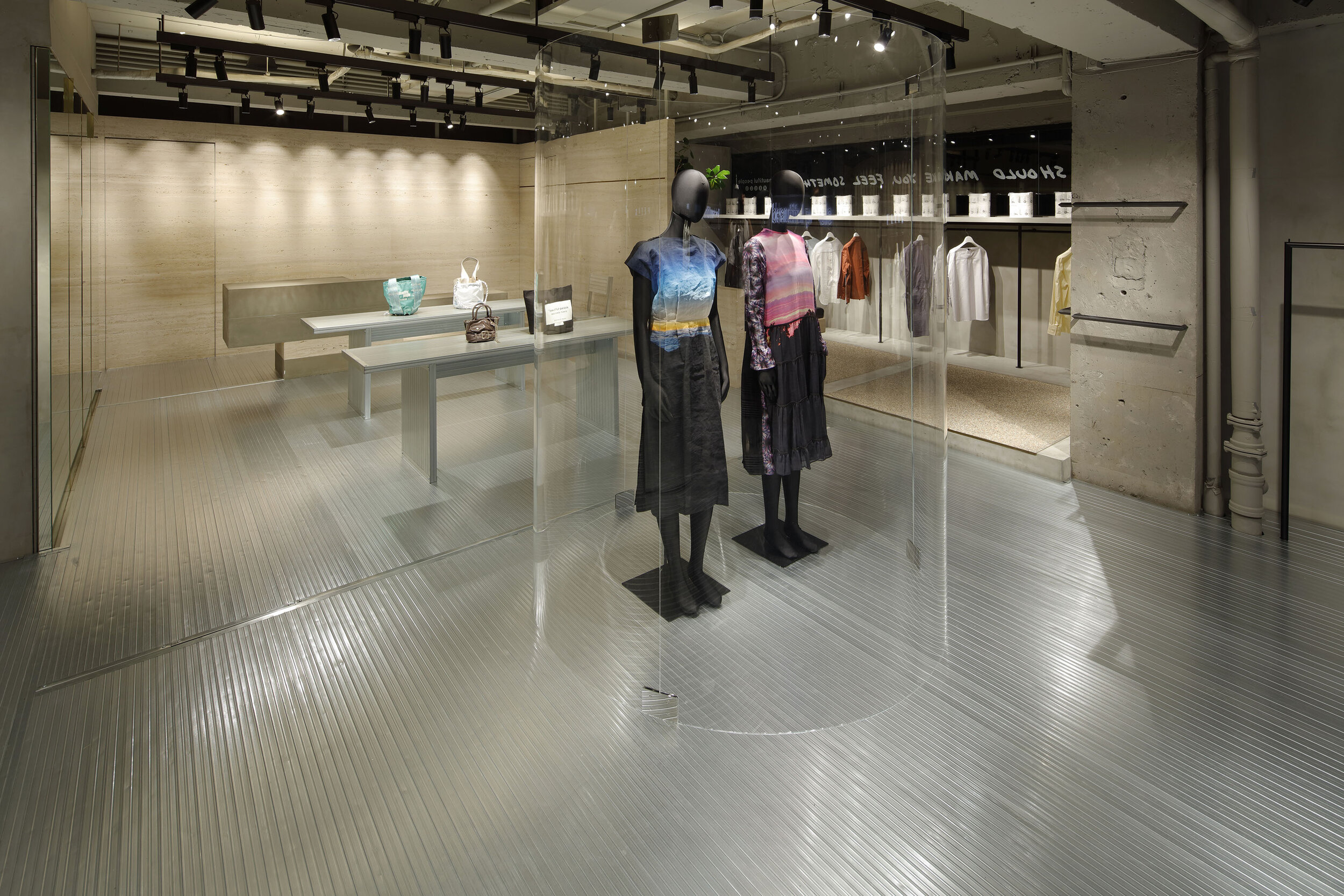
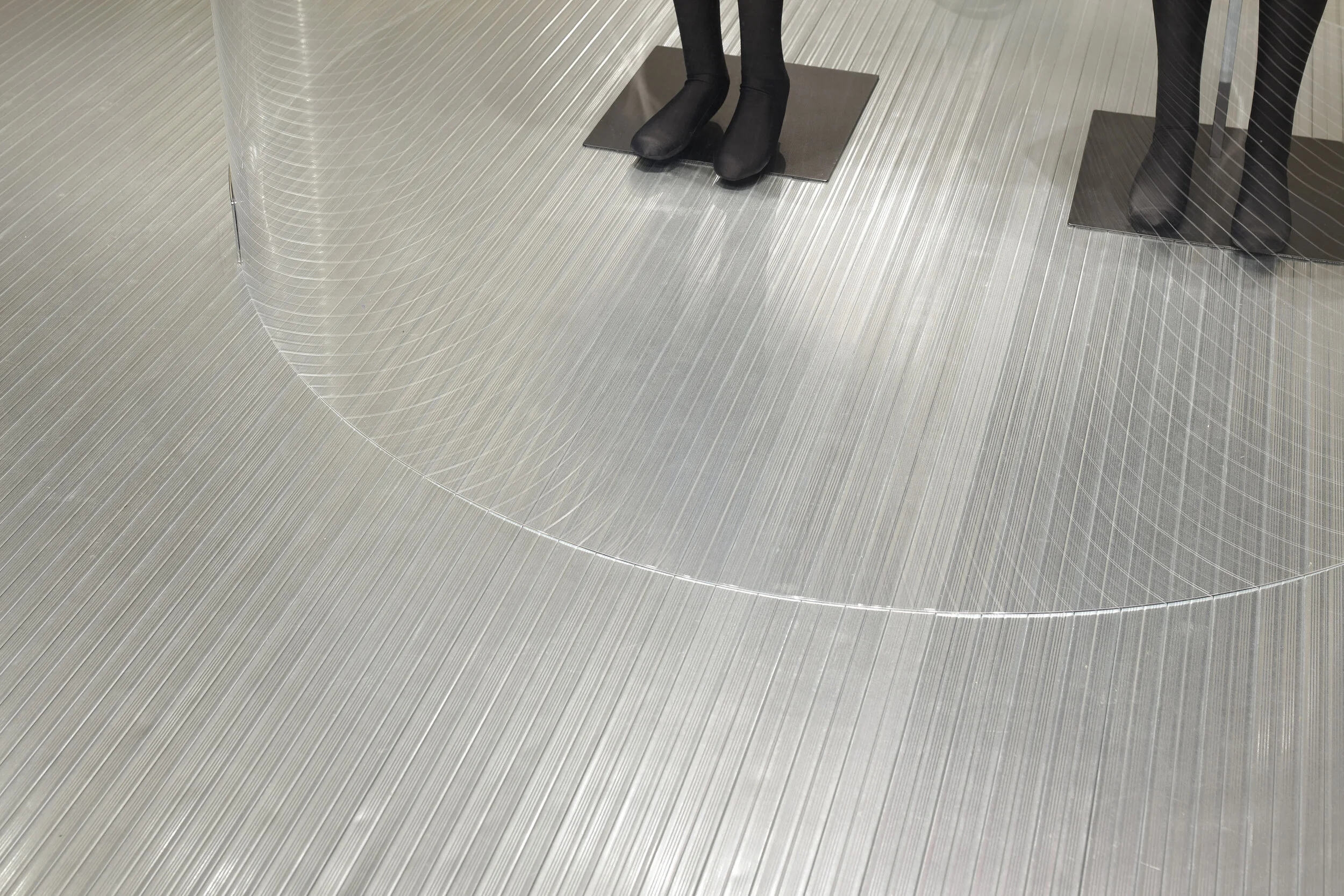
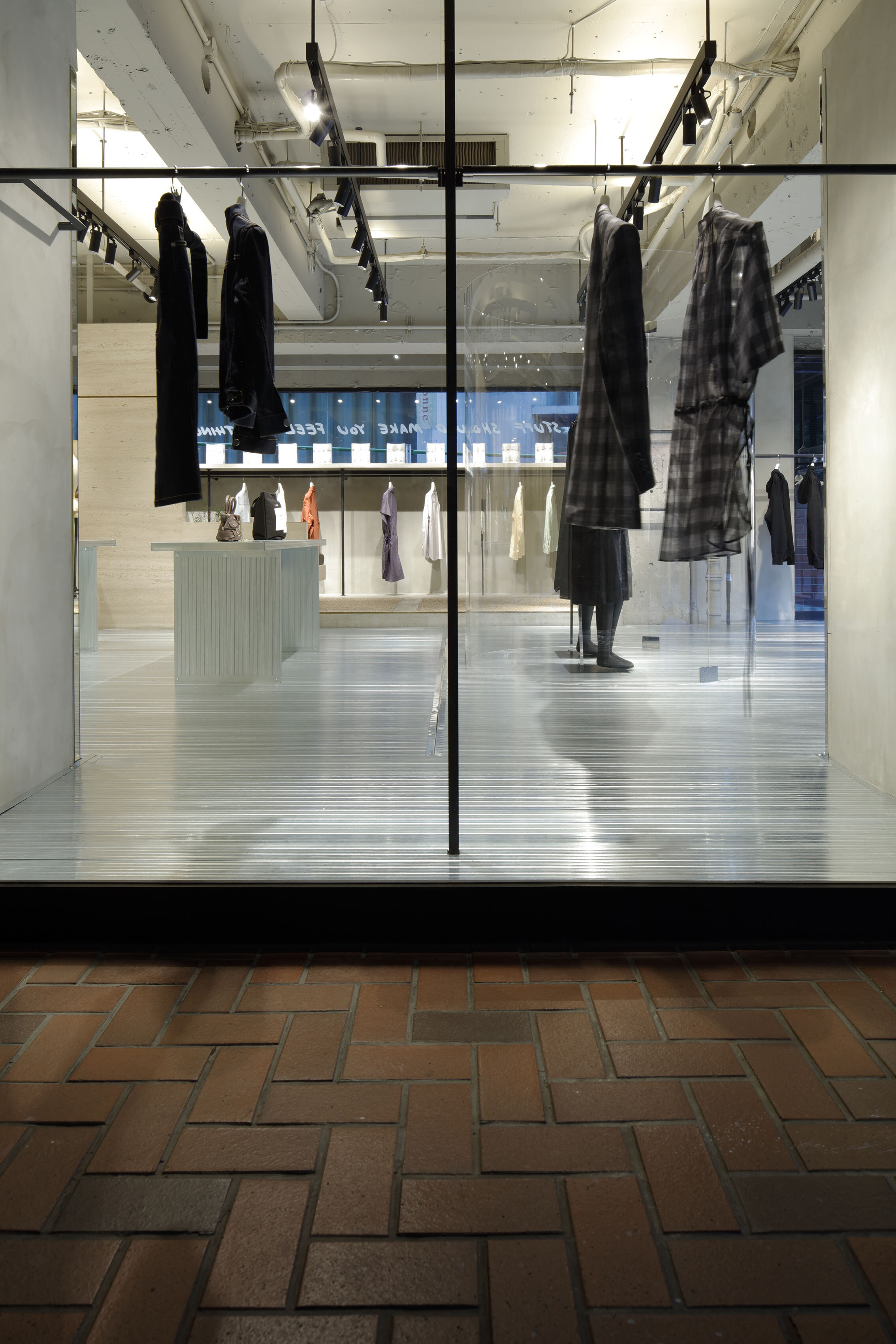
Although we live in different times, I am deeply inspired by his philosophy and believe that we should do what we can to make a difference, so I decided to adapt this chair as a statement of the new store,” he explained. The LGS used for the interior is planned to be re-made as ‘sedia 1’ chairs after the demolition. The floor was covered with LGS of 20 x 40 mm size, suitable for making the chairs.
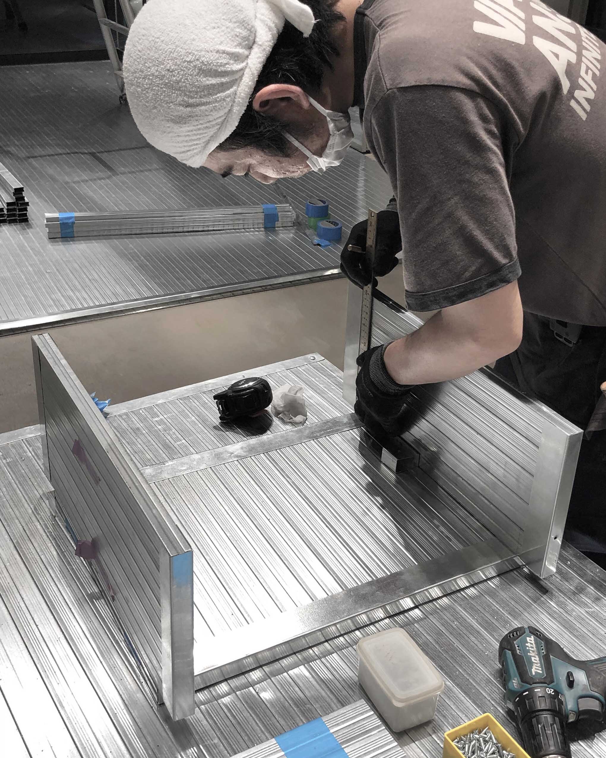
When we asked him about the difficulties during the construction, he replied: “LGS must not have any rough cuts when used in furniture, so we asked a carpenter who specialises in the woodwork to create the interior, carefully examining the details. In addition, the joints between the floor and the hanger fixtures were carefully covered, resulting in a highly accurate fit-out. Yamamoto, who is interested in the unique texture of LGS and the reflection of light, used the studs as if he were handling the grain of the wood, paying attention to the direction of the material.
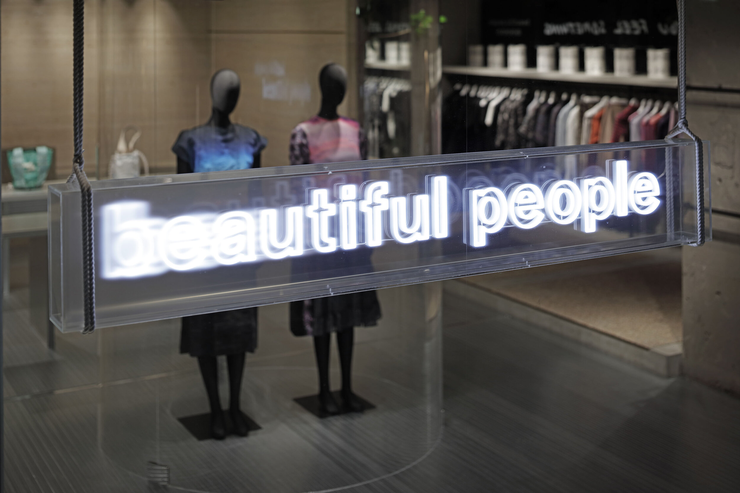
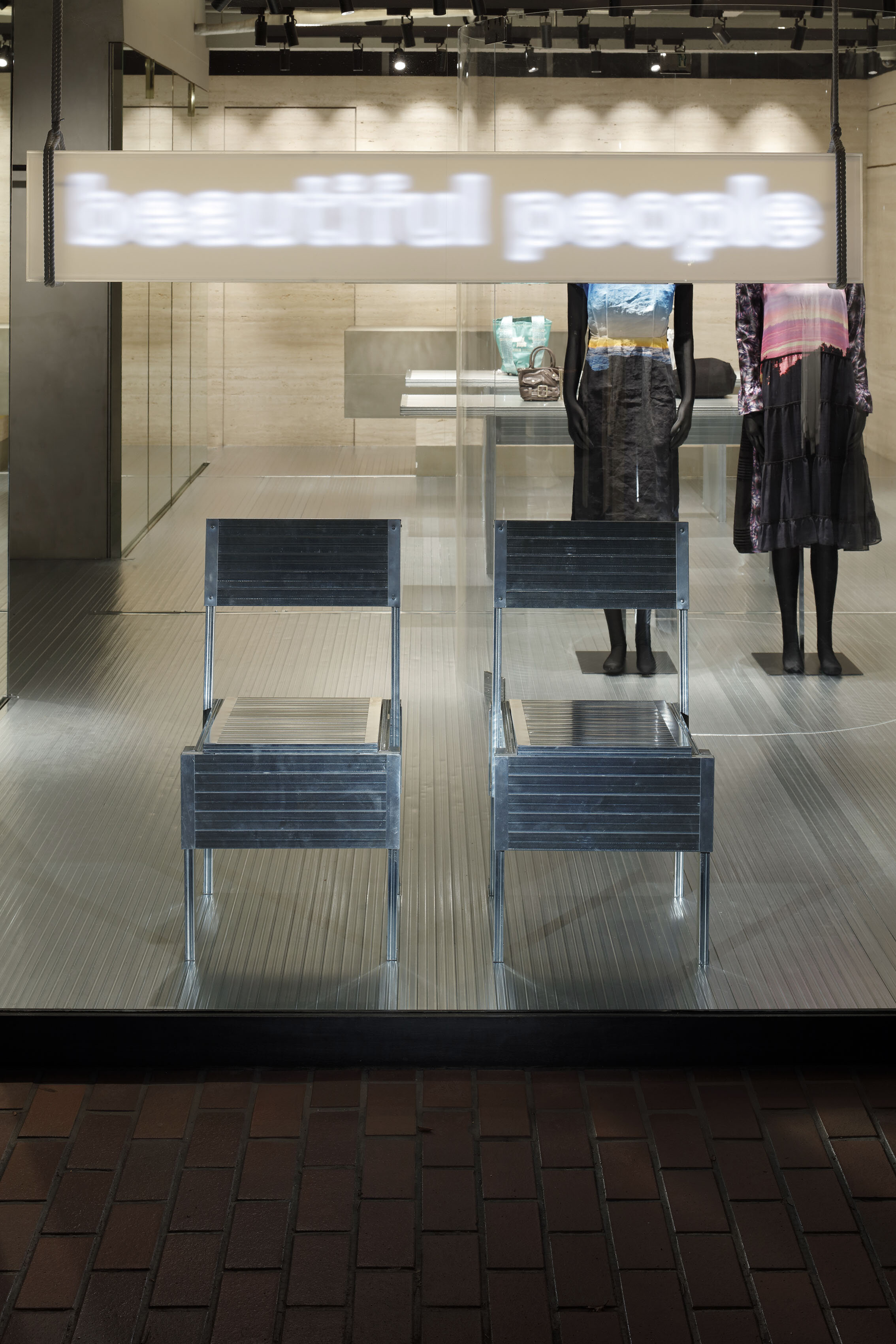
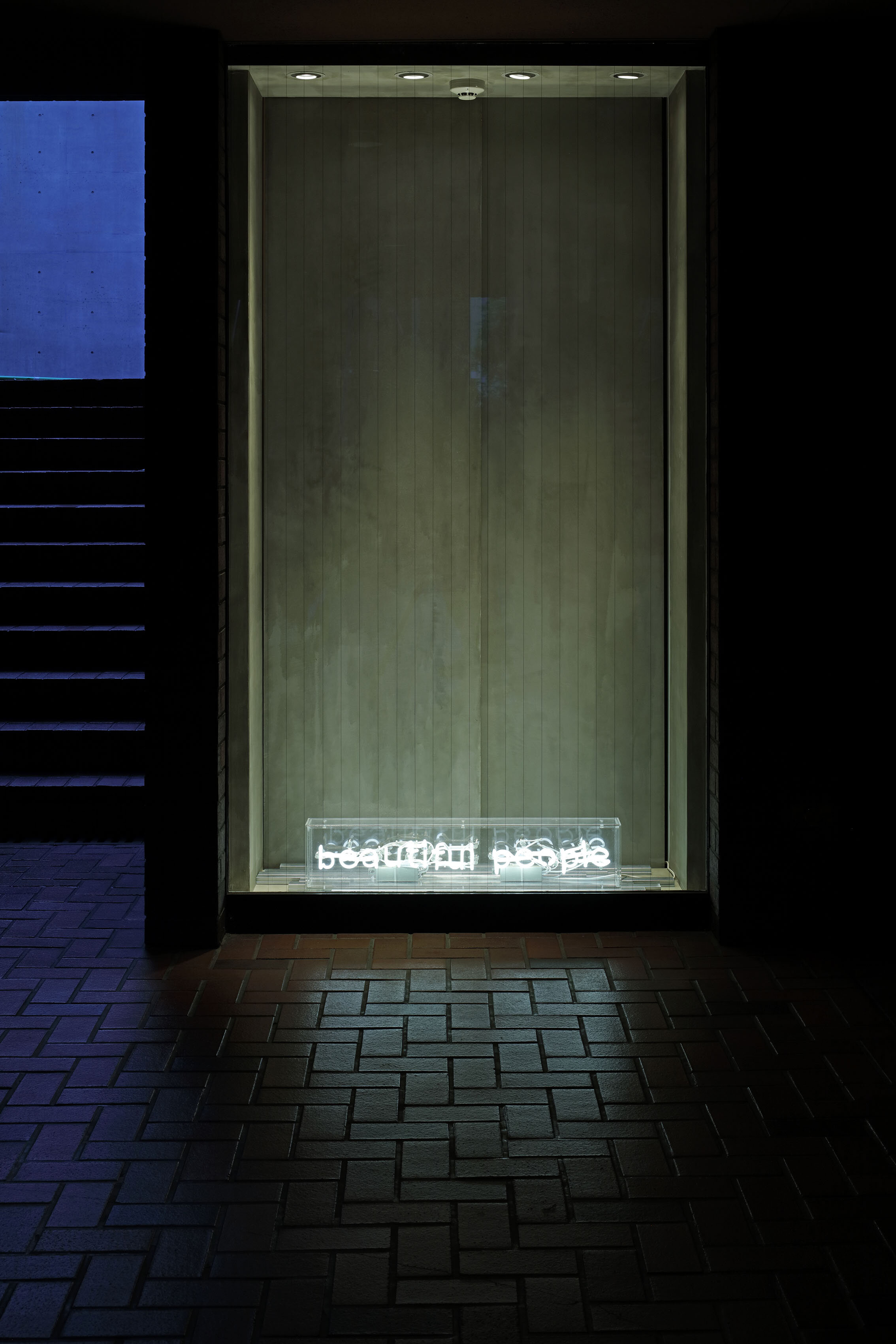
The neon sign, which is visible from the outside, is suspended from the ceiling by a rope to be moved to another shop later. “In a regular project, we would have used metal bolts, but we chose to use a simple, temporary rope to hang it. Everything in this shop is meant to be reused, so we designed it in the best way for that. It’s the first time we’ve designed based on the concept, but I believe it’s a new approach to create a store.
“Traditionally, Japanese shrines have had a system of reusing usable reclaimed timber. I think that Japanese aesthetics influences such a way of using resources with respect. The archive store will only be open for two months, but we thought it would be very Japanese if we could establish a cycle of reusing building materials after that,” he told us what he had in mind.
photography: DAISUKE YAMAMOTO/de:sign
Not only the pandemic but also the new law banning the disposal of clothes in France, the brand had been trying to reduce the amount of waste. In this situation, the designer was able to create such a drastic shop because he shares the same vision and has a trusting relationship with the brand. IDREIT will continue to follow Yamamoto’s design thinking as he develops feasible ideas that reflect the lifespan of materials and architecture.
DETAIL
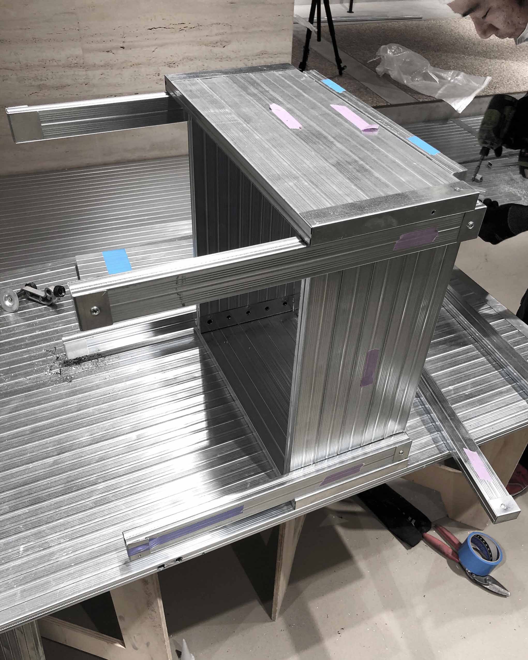
A chair made by LGS (Light Gauge Steel), based on the drawings of chair ‘sedia 1’ by Enzo Mari published in 1974. During the opening period, they received LGS-made chair enquiries from overseas galleries.
The shape of the table was inspired by a shrine desk. The corners of both tables and chairs have been sanded to ensure safety.
For the LED-neon signage, the surface of the acrylic box was partly covered with an vision control film. Also, the sign was fixed with just a rope in case it is used in other shops in the future.
CREDIT
Name: beautiful people pop-up store unseen archives during the pandemic
Design: DAISUKE YAMAMOTO / de:sign Daisuke Yamamoto
Construction: Kazuki Chikagawa Kento Ozawa / Decor
Capentry: Takayuki Kinouchi
・
Location: Minato-ku, Tokyo
Owner: entertainment co., ltd. ( beautiful people )
Main use: Shop
Opening period: May/June 2021
Floor area: 85.2sqm (backspace 10.7sqm)
・
Material
floor: LGS 20×40mm
sign: acrylic box + vision control film + LED neon
desplay table: LGS 40×40mm
LGS-made chair: LGS 20×40mm
sedia 1 chair: wood


