
Interview with YUSUKE SEKI —part 1
1/2

tried to implement as much material as possible with traces of the handiwork
— Yusuke Seki / Yusuke Seki Studio
photography : Kozo Takayama, Kenta Hasegawa
words : Reiji Yamakura/IDREIT
Yusuke Seki, from Yusuke Seki Studio that operates from the studio in Tokyo and Kyoto specialises in interior designing for shops and hotels, is the designer that is attracting attention from both in and outside Japan. We had the opportunity to interview him, and ask him about the background of designs for 4 projects he worked on in recent years, including OGAWA COFFEE LABORATORY and HOUSE IN NISHIYOSHINO.

OGAWA COFFEE LABORATORY opened in Sakurashinmachi, Tokyo in August 2020. photography: KOZO TAKAYAMA

Inside the counter, Seki set up a circular cellar to store the coffee beans.
— First of all, could you tell me about the design concept of the new cafe, OGAWA COFFEE LABORATORY?
Since Ogawa Coffee in Kyoto had the plan to deploy a new type of business in Tokyo, Takayuki Minami, who works on its creative direction, invited me to join the project. They had two requests for us; one was to create a shop where they can show customers their meticulous actions, like brewing coffee for them, and two was to show that this brand ‘originated from Kyoto’. What I mean by ‘actions’ here are the movements, like making tea in traditional way, or fitting kimono on a person, or something that reminds you of Japan or Kyoto.
Also, they have a storage inside the shop where they keep coffee beans, and the staff already had the set flow of actions, from receiving order from customer to getting coffee beans, grinding them in front of the customer before handing it over to them. To better suit the movement of staff, I considered about placing this symbolic storage right in the centre of the shop, and then surrounding it with coffee counters and seats for customers to sit down. Since there were a lot of functionalities required to be implemented in this design, I put extra effort in evaluating the kitchen area and the flows of all staff.

Inside the beans cellar. After receiving the customer's order, the cafe staff picks up the beans and brews the coffee in front of the customer.

The designer installed ‘Uzukuri’ textured lauan plywood for the counters to catch the light and look beautiful.
— The surface of the counter looks unique, but what material did you use there?
The space this tenant had had lots of natural light coming in from the outside, so I was thinking of the design that would look beautiful under these lights. I used the processed lauan plywood to emphasise the bumpiness of its wood grains, so that you can feel these wood grains when the light hits the counter. I used solid lauan wood on the edges of the countertop, and finished it up so that the edges would be 1.3mm higher than the countertop.
— You did finish it up neatly indeed. What about the lower part of the counter?
We applied white washi paper under the counter, and painted clear coating over it to prevent stain. We followed the Japanese architectural rule to make sure each seam of washi papers where they overlap would be 9mm width. Also, I found paver stones at a stonemason in Kyoto which were used by Kyoto tram lines in the past, and used them for the floor under the counter. I think Kyoto that non-Kyoto people imagine is quite different from the actual, current Kyoto in many ways. Instead of choosing typical designs that use, for example, Kyoto-like vertical lattice that everyone knows, I chose materials for this shop that are authentically related to Kyoto.

The lower half of the counter was covered with white Japanese paper and the floor was embedded with paving stones from Kyoto.

For the cafe, Yusuke Seki Studio has designed the lauan-made table fixed with a paving stone between its legs.
— Furniture have this calm impression overall too, and they look nice.
For the chairs I chose products designed by a designer from Bangkok. The table is the original item that I designed myself. This table has the concept of changing the material part that can be inserted between its legs depending on how you want to use the table, and it’s something that I myself developed a few years ago.
For this project though, I attached a piece of Kyoto paver stone in between the table legs, and I made the tabletop with lauan wood, the same material I used for the countertop.
— Which designs played the important role in this project when you look back at the whole process?
The deeply impressive point for me would be the sign of the shop name that was attached to the floor grating at the shop entrance. When I visited the location for the first time, I thought it would be bothersome to have this floor grating installed since staff would need to clean it frequently once they have it.

Seki has designed a steel letter sign and attached it to the grating in front of the entrance. This unique design was inspired by the corporate culture of Ogawa Coffee, which pays close attention to the cleanliness of its stores.
But at the same time, I had the idea that someone from this shop would probably clean it every single day if it had their shop name attached on it. I also considered it could catch customers’ attention well since they will need to go past this spot every time they enter the shop. I am very happy with how this sign turned out with high quality finish.
Also, with having the key concept of this shop in mind, which is “to show their actions to customers”, we tried to implement as much material as possible with traces of the handiwork of artisans. I believe we were able to create a space where you can feel the craftsmanship through the materials I’ve chosen for the shop name sign, the countertop, washi papers, and rattan furniture.

Yusuke Seki Studio has renovated a house in Nishiyoshino, Nara. In front of the main building there is an annex with a parasitic design. photography: Kenta Hasegawa
— OK, could you tell me about the residential renovation project called ‘HOUSE IN NISHIYOSHINO’ next? What was the request you’ve received from your client for this case?
It was the request I’ve received from the home owner who operates orchard farms, and the request was to renovate home since it was not so comfortable to live in, and that they wanted to have spacious living room and kids’ space inside. They had this old shed-like structure at the back of the house where farming tools were stored, and I thought this old structure could be used for some other purpose. As I proceeded with its design, I’ve finalised the project plan to add an additional floor to the wooden structure since I could not fit in the rooms the owner requested inside the main building.
But then the structural materials of the shed were badly worn out, so the whole structure was torn down completely, and the materials were taken to carpenters’ studio to be reinforced, and then taken back to the site to be re-assembled altogether. Since we placed the new structure on top of the reinforced structure that already existed there, it looked like a “parasitic” organism being stuck there.

The main building and old wooden shed before renovation. (photography: Yusuke Seki Studio)

The wooden structure, once dismantled, was repurposed after reinforcement. (photography: Yusuke Seki Studio)
— It does look like something is “parasitising” the place if you look at that part from the outside! How did you manage inside the home?
A room that used to be a storage space on the ground floor was made into multiple rooms, with the couple’s master bedroom in the centre of the building, surrounded by corridors to move freely between rooms. Since they did not require individual rooms for their kids, I designed an L-shaped space on the ground floor to be kids’ space, and I made the first floor into a spacious living room.
The owner loves shoes, and requested space for the collection, so I created thin, long earthen floor of 10m length within the entrance of the house. As a result, we were able to create 3 flows that the residents conveniently use today; from the earthen floor area to the path to either the single room, kids’ space, or to the staircases to go upstairs to the living room on the first floor.

They created a 10-meter-long earthen floor at the entrance.

In the opening where the shutters were placed, a new glass window was installed.

The first floor turned into a spacious living room with kitchen at the corner.
— What did you place on top of the wooden structure?
We placed a bathroom and toilet there. By preserving the existing sash windows on the added floor of the old structure, we were able to design the floor with existing exterior walls and windows being visible even from the inside. I thought it would be unnatural to integrate the wooden ‘yagura’ structure into the interior design, so as a result I ended up re-using it simply as structural materials, but I think that ended up really well for this project.

They utilised the existing wooden beams as the underlying structure for the Annex.
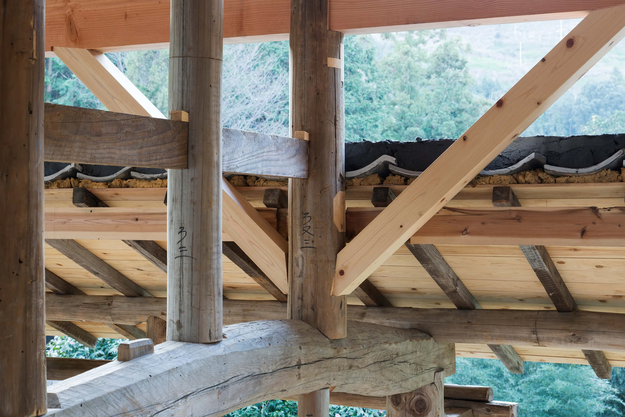
The heavily damaged timbers were reinforced and reused by skilled carpenters.

The former exterior wall became an interior partition, leaving the window.

They designed the exposed floor material at the stairs.
Together with this extended floor that looks like it’s “hacking” the existing structure, there were some other details that act like “bugs” of this house, such as the exposed steel frame on the ground floor ceiling, or the stairs that reveal their cross section, all mixed together as part of the renovation project for this home that had not much characteristics to it, and I think I was able to suggest the best solutions for the client to make him satisfied with the end result.
continue to part 2


