KOFFEE MAMEYA -Kakeru- by 14sd / Fourteen stones design
Coffee shop & cafe | Tokyo, Japan
KOFFEE MAMEYA -Kakeru- | 14sd / Fourteen stones design | photography : Ooki Jingu
DESIGN NOTE
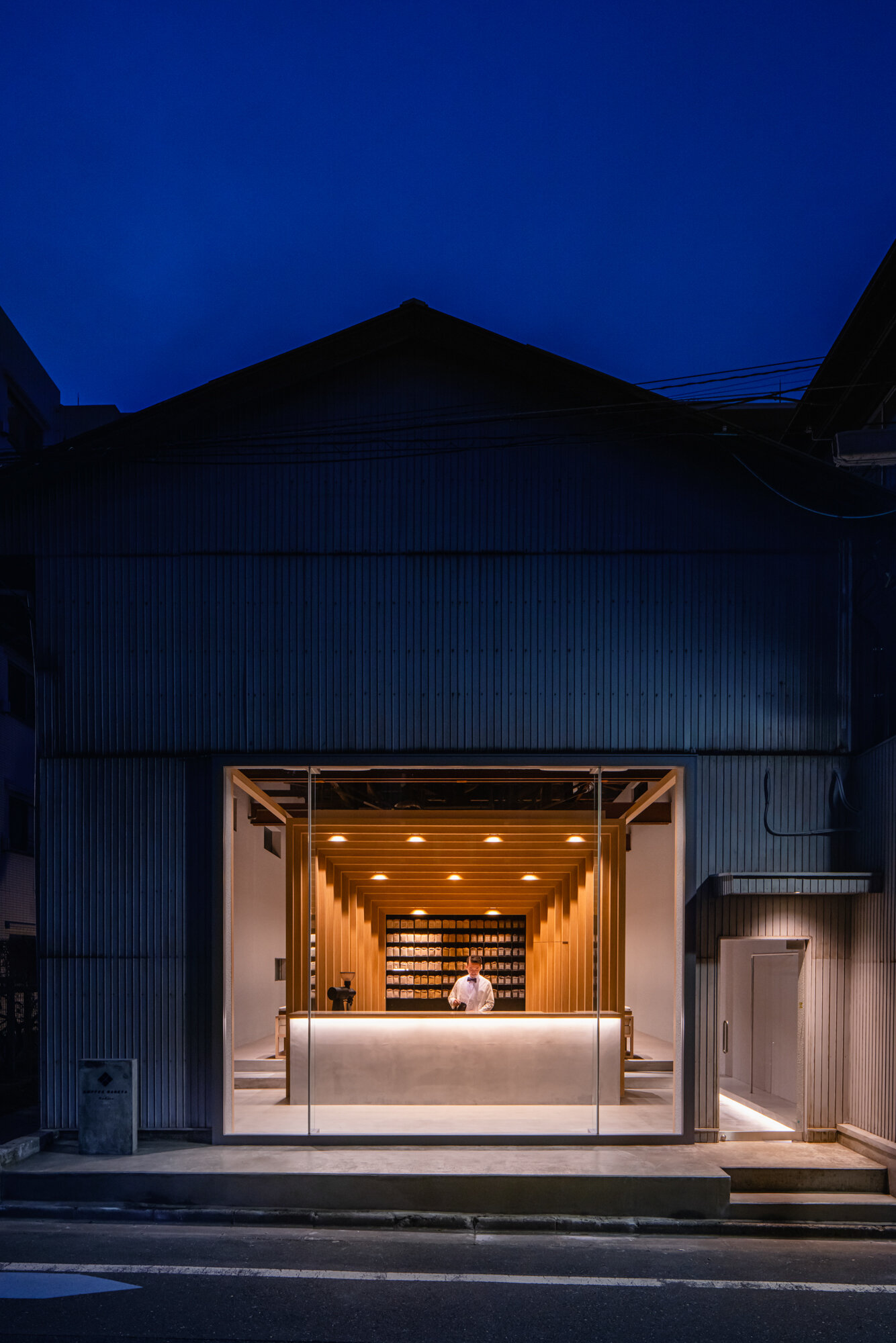
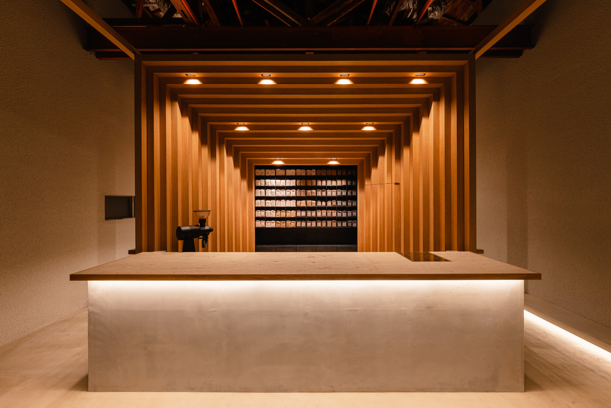
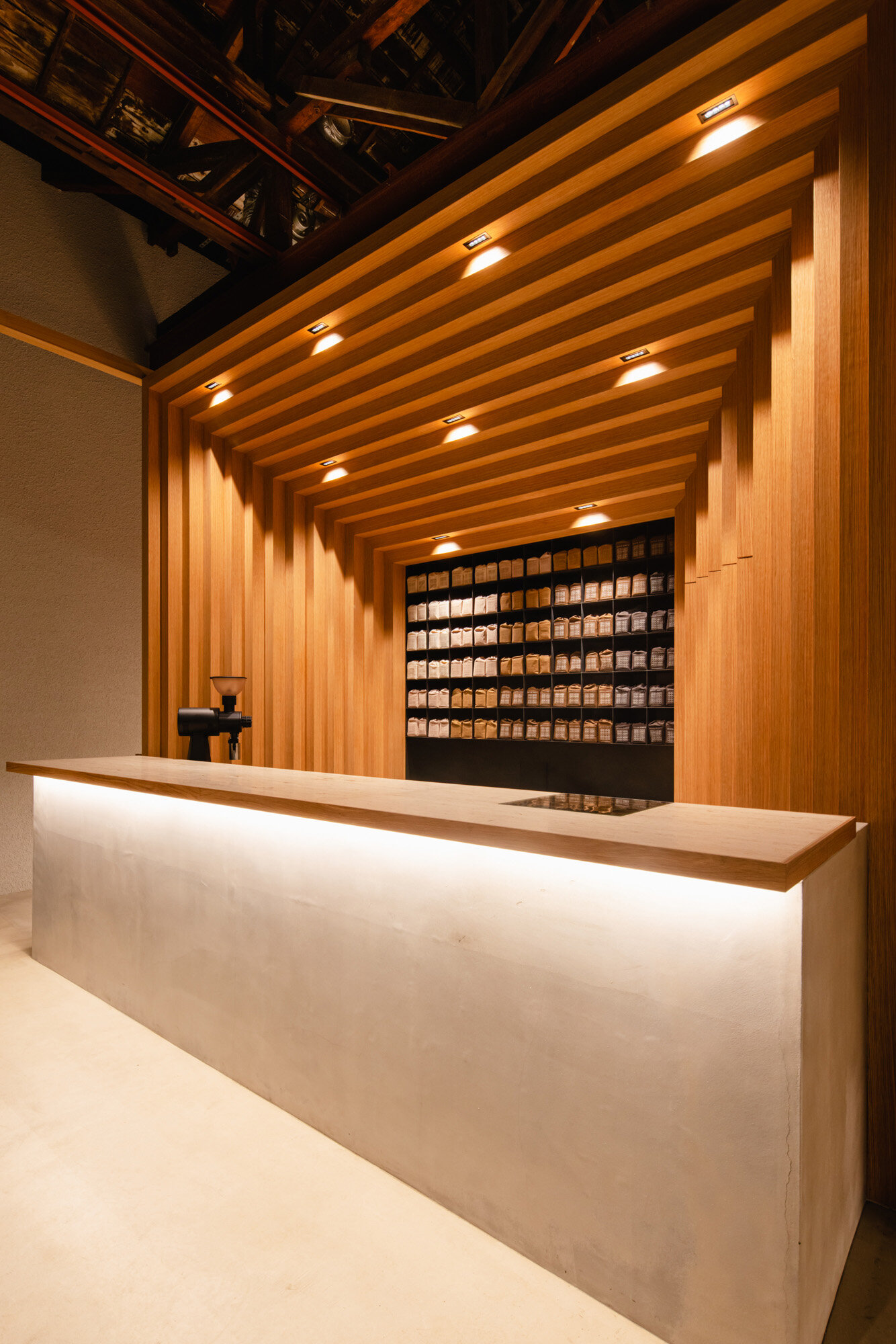
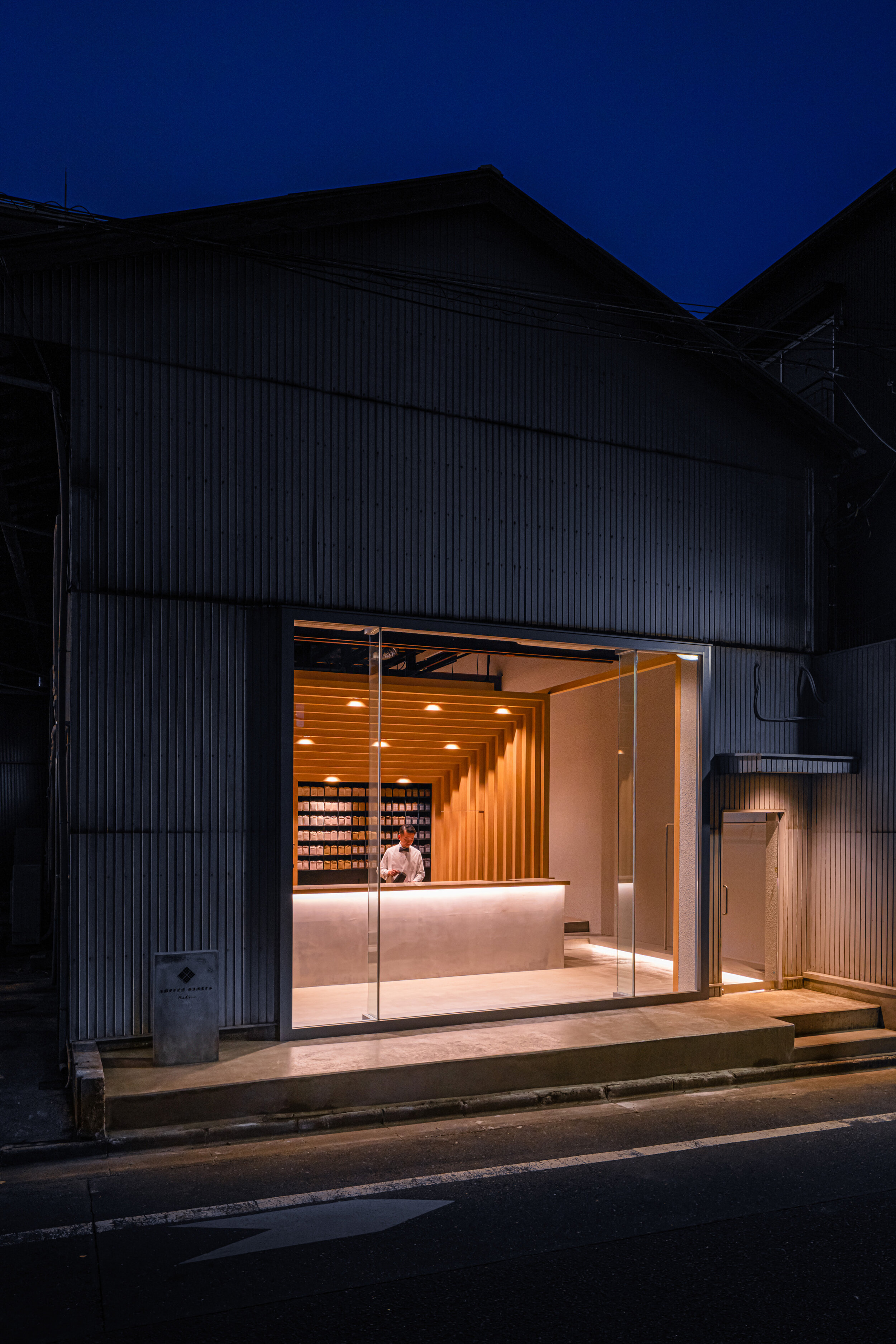
KOFFEE MAMEYA EXPERIENCE inserted in the warehouse
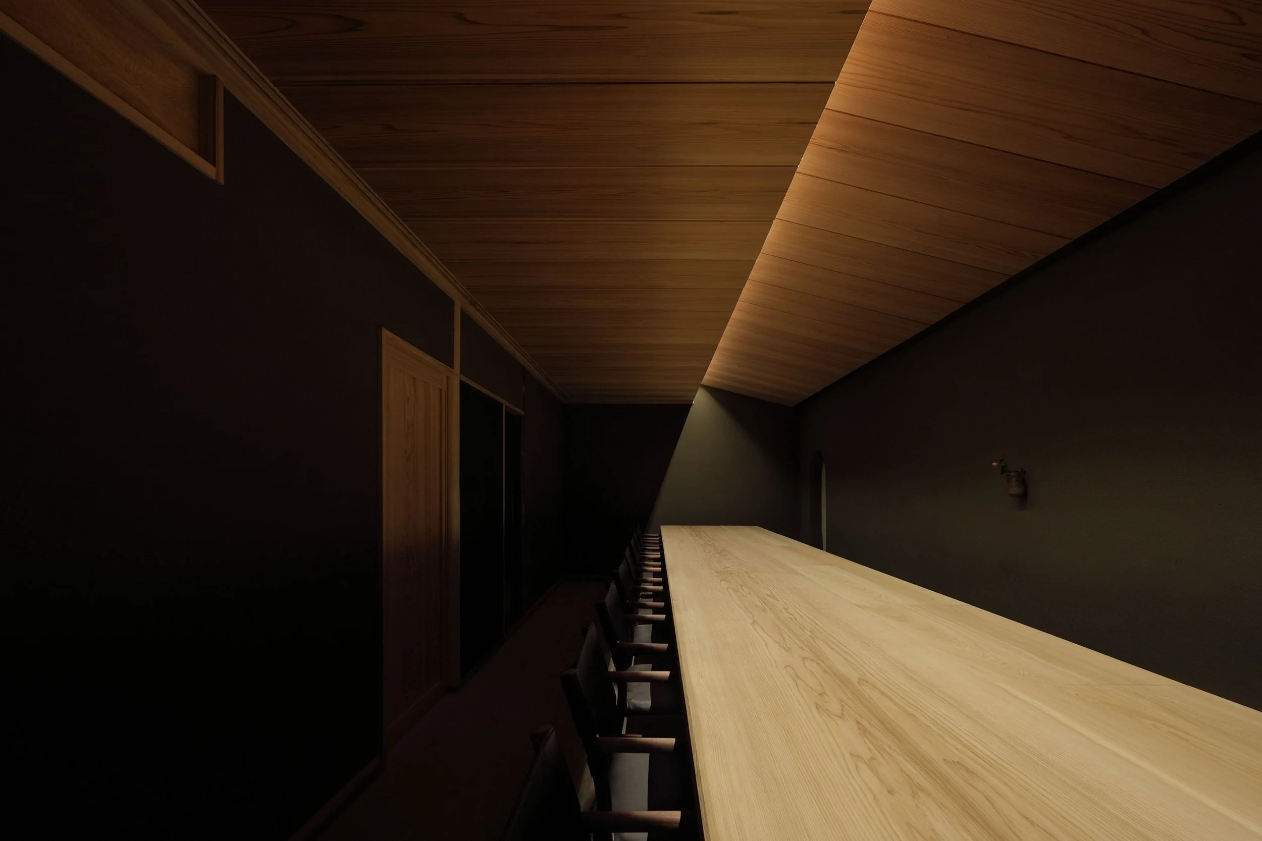
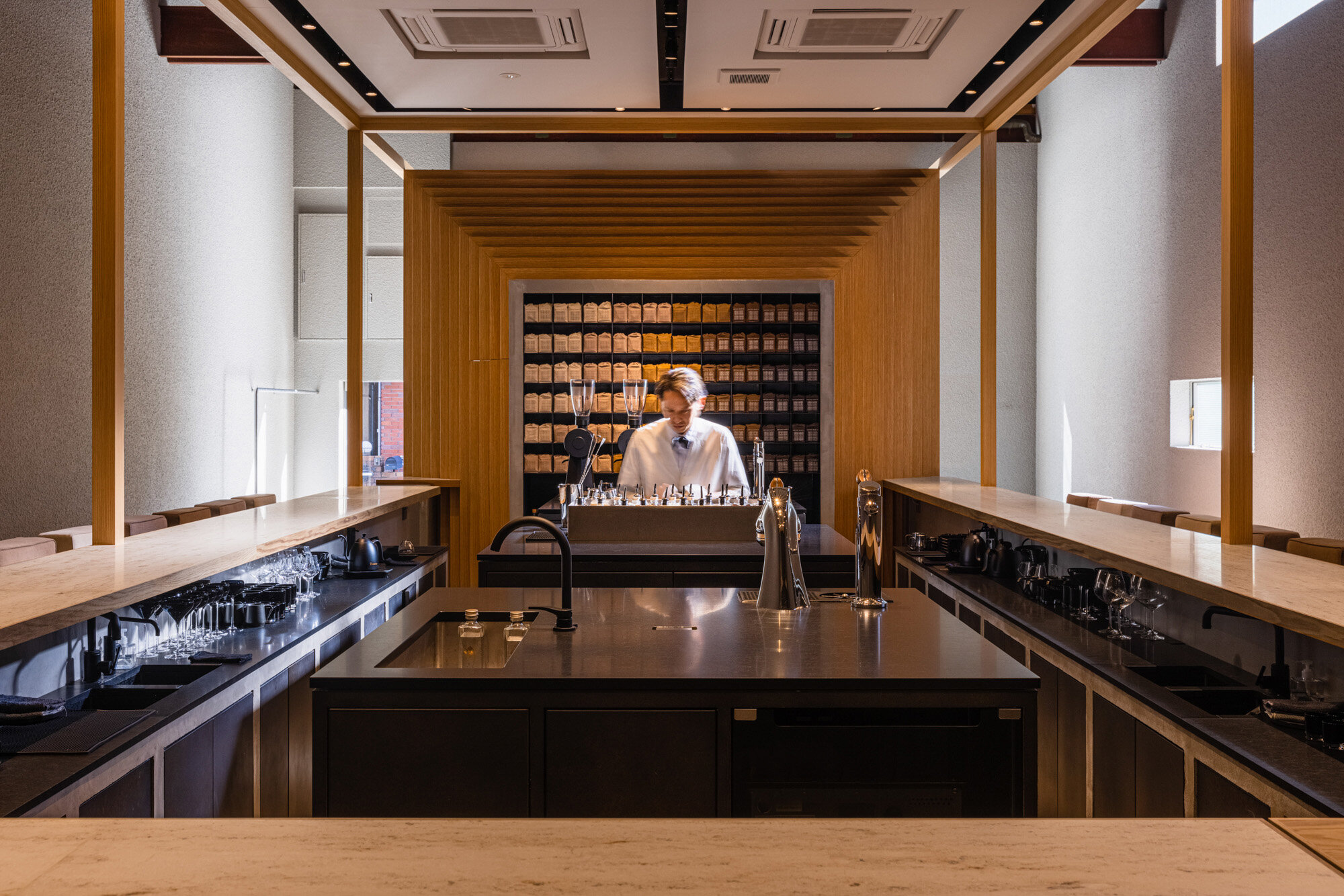
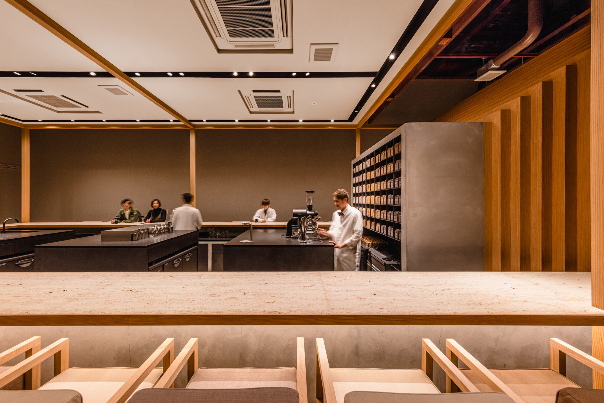
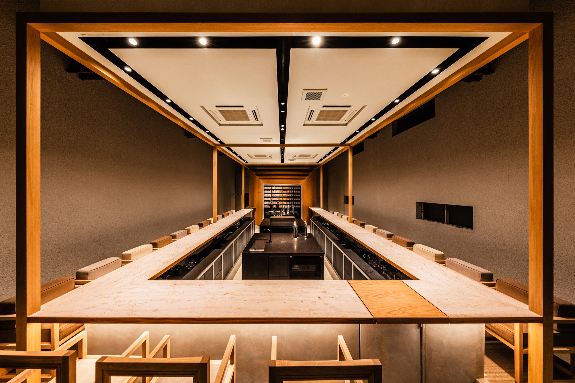
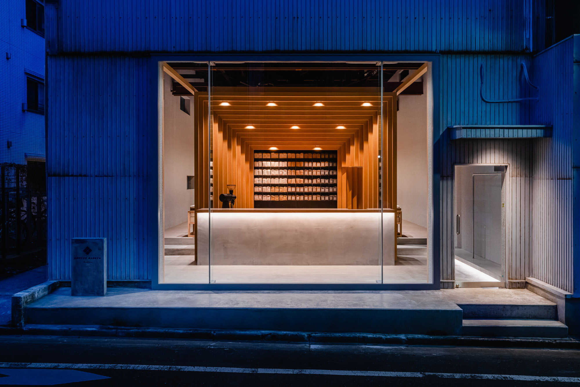
U-shaped cafe counter showing the barista's skill
Iconic walls finished with white oak

photography : Ooki Jingu
words : Reiji Yamakura/IDREIT
Yosuke Hayashi, director of Tokyo-based design studio 14sd / Fourteen stones design, has designed a coffee shop ‘KOFFEE MAMEYA -Kakeru-’ in Kiyosumi-shirakawa, Tokyo. They renovated a warehouse into a shop with a retail counter and 27 seating areas. The development was carried out in collaboration with the owner Eiichi Kunitomo, the creative director Tomohiro Kato, and Yosuke Hayashi. These three members once created the legendary coffee shop OMOTESANDO KOFFEE in Harajuku in 2011. The K in Koffee is derived from the Kiosk. Also, in terms of operation, it is planned to collaborate with patissiers and chefs, which is why the name Kakeru (means multiply) was given.

Their first OMOTESANDO KOFFEE is located in a 60 year old traditional Japanese house. photography: Hiroko Tsukada
When we asked the designer Hayashi about the shop's concept, he said, “The project aimed to create an evolved KOFFEE MAMEYA, a full-service cafe and beans shop offering advanced barista skills. The owner, Kunitomo, had the passion for creating a place that enhances the barista's profession and connects it with society, just like sommeliers in the wine industry. This belief was the backdrop for the development.”
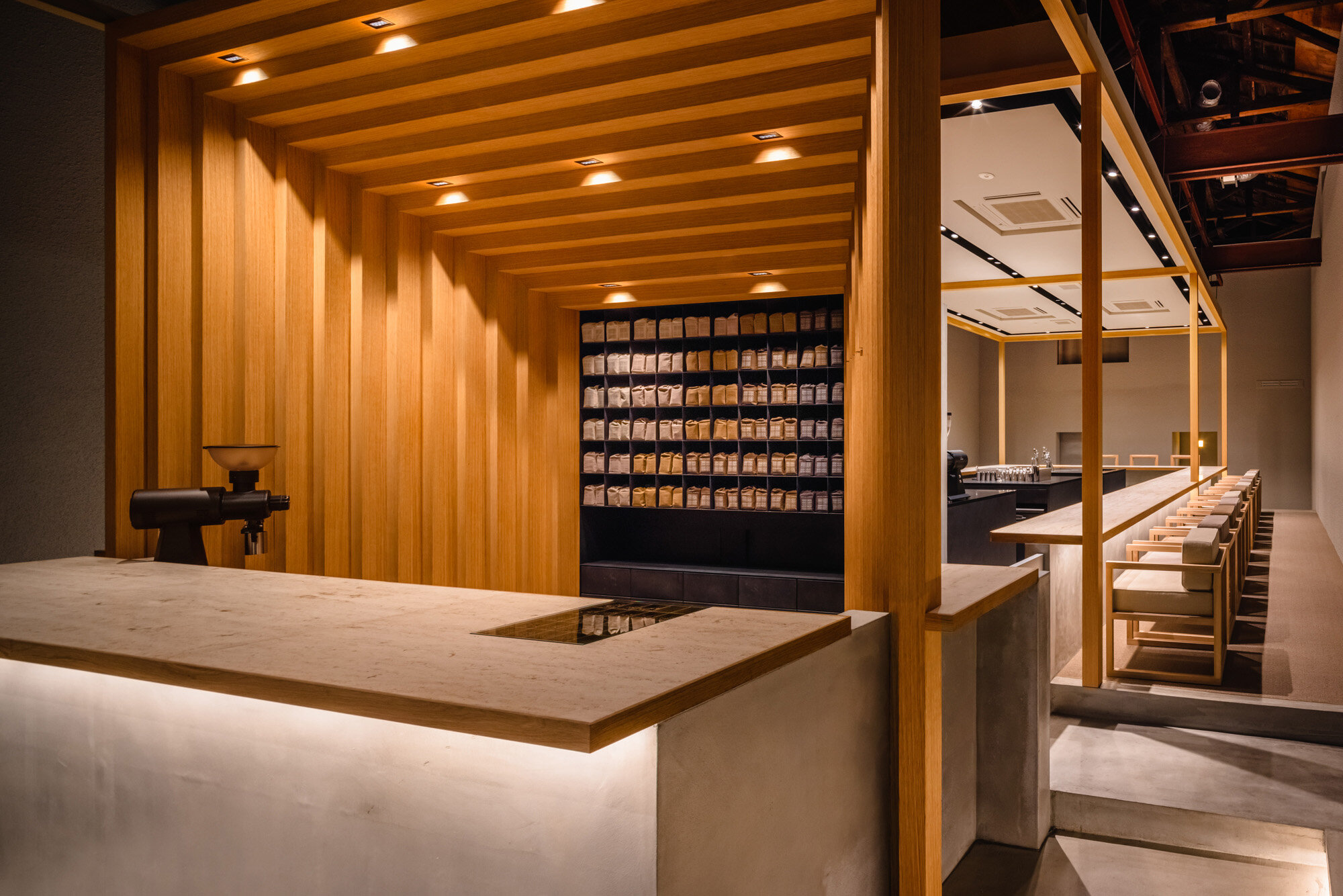
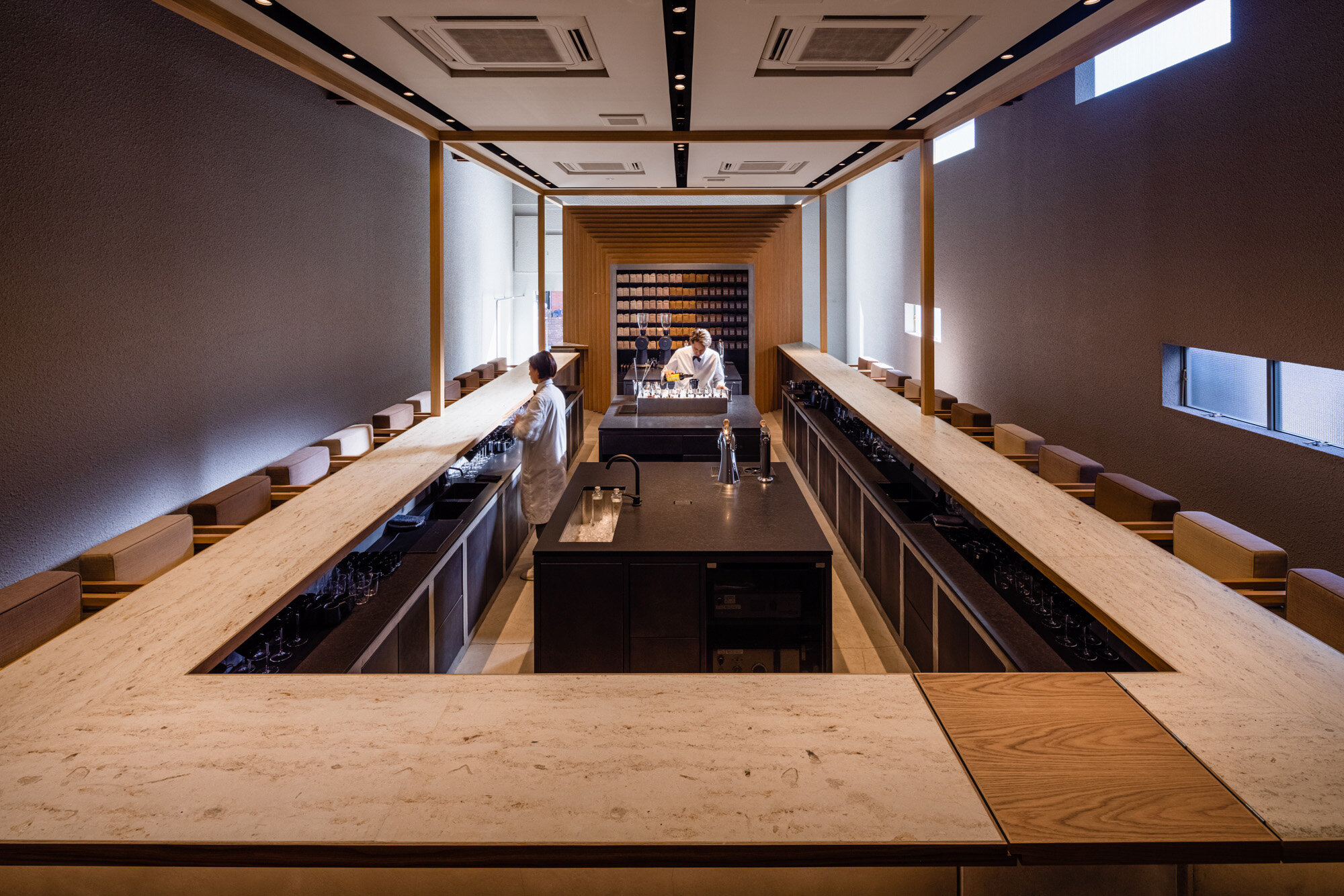
The shop was divided into two zones: the front retail counter, where customers were counselled and helped to choose their coffee beans, and the back seating area, where customers could relax and have coffee with table service.

Based on the idea of preserving as much of the existing as possible, the cafe and counter area were designed. The designers left the exterior walls untouched and did not add a wall sign on purpose. The glass door on the right is the entrance.
About the design of the space, Hayashi said, “I thought that the previous spacious warehouse would not suit their concept, where customers could concentrate on their coffee. So we carefully designed a shop and a long cafe counter, as if the new part was inserted into the old warehouse. In this way, we believed that the brand identity of MAMEYA and the character of the warehouse could coexist. We placed the coffee counter as the centre of the shop, without any signage, creating a facade that makes passers-by wonder what this building is.”
Hayashi also said that he wanted to preserve the context of Kiyosumi-Shirakawa, a town that was once a water transport hub, and the vibe of the warehouses.
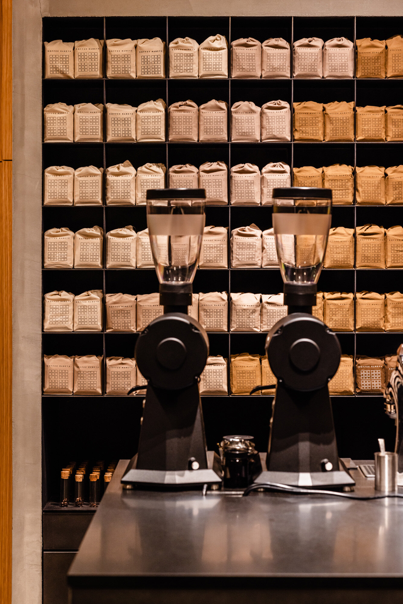
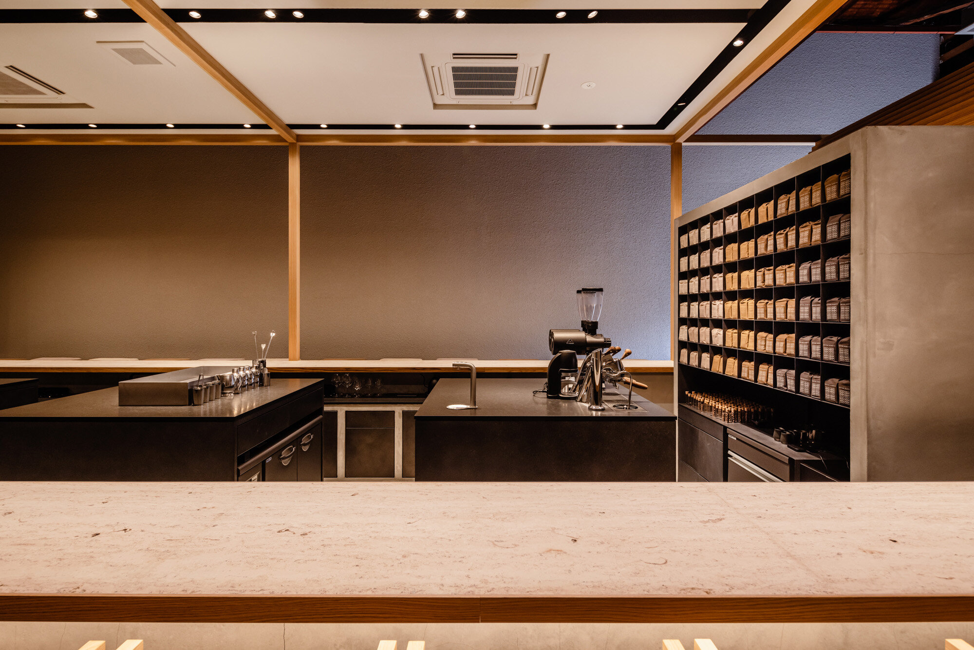
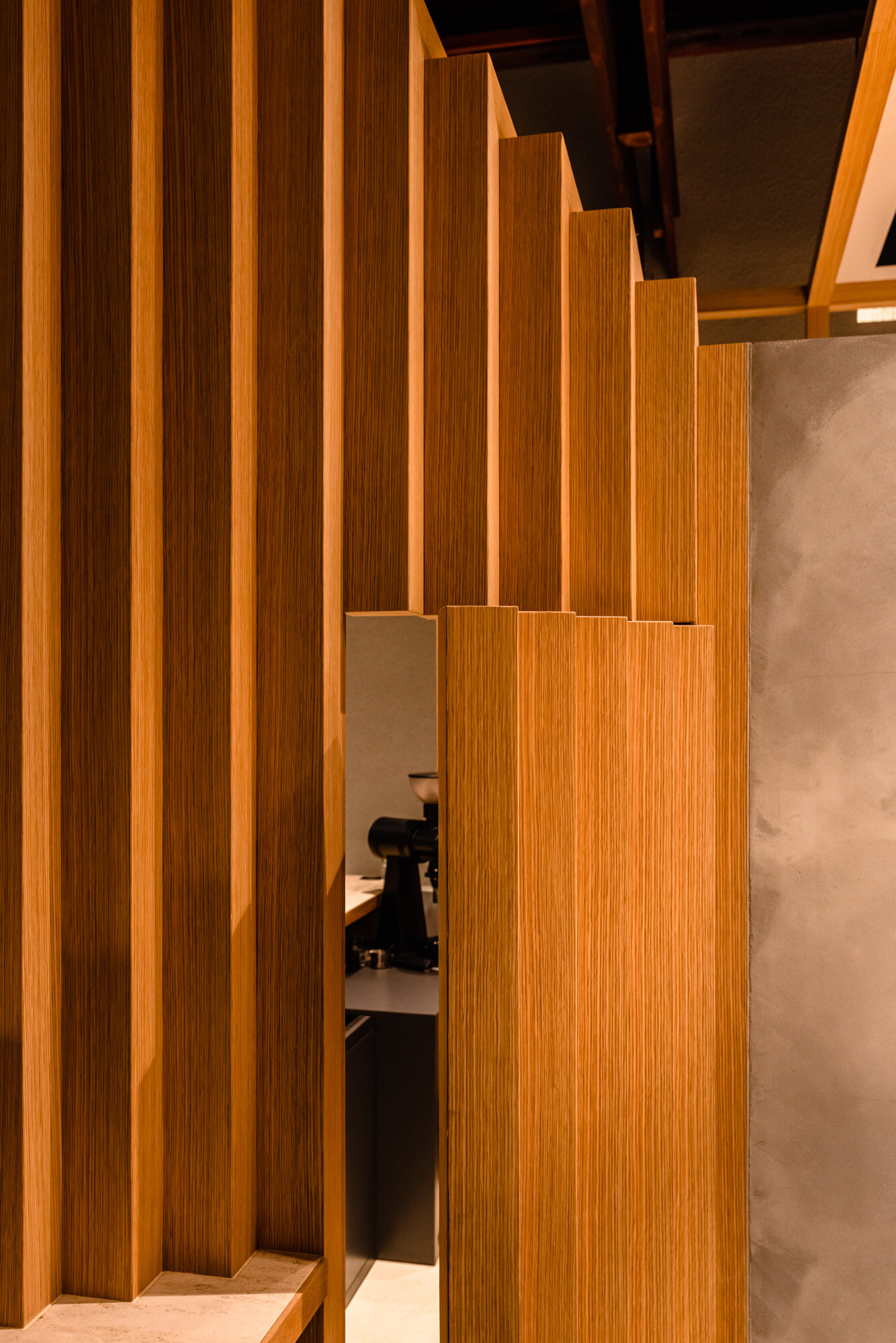
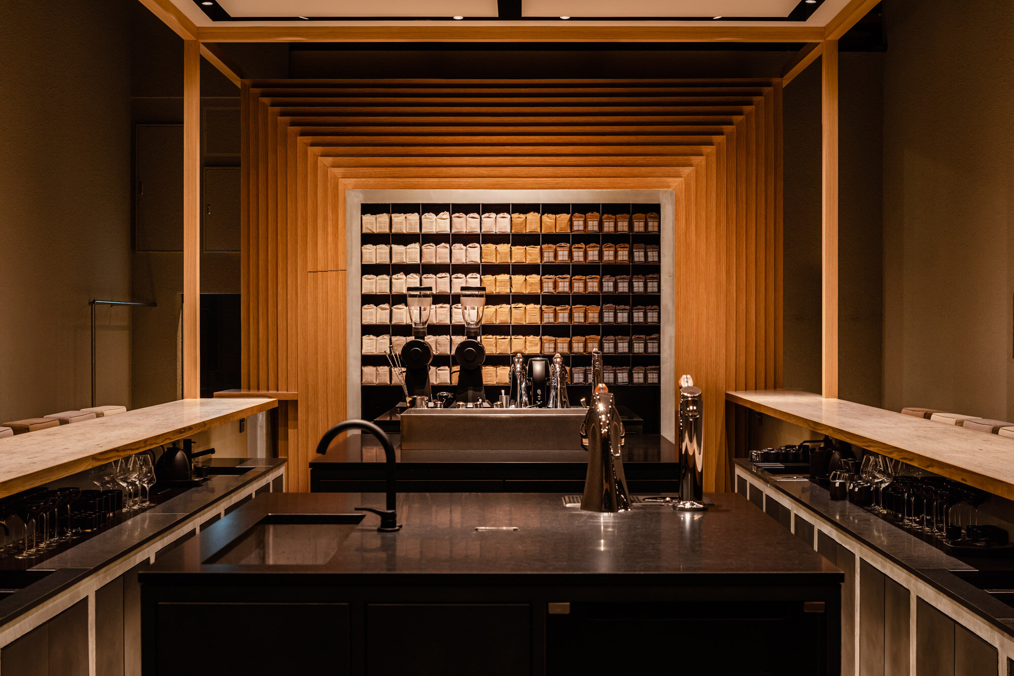
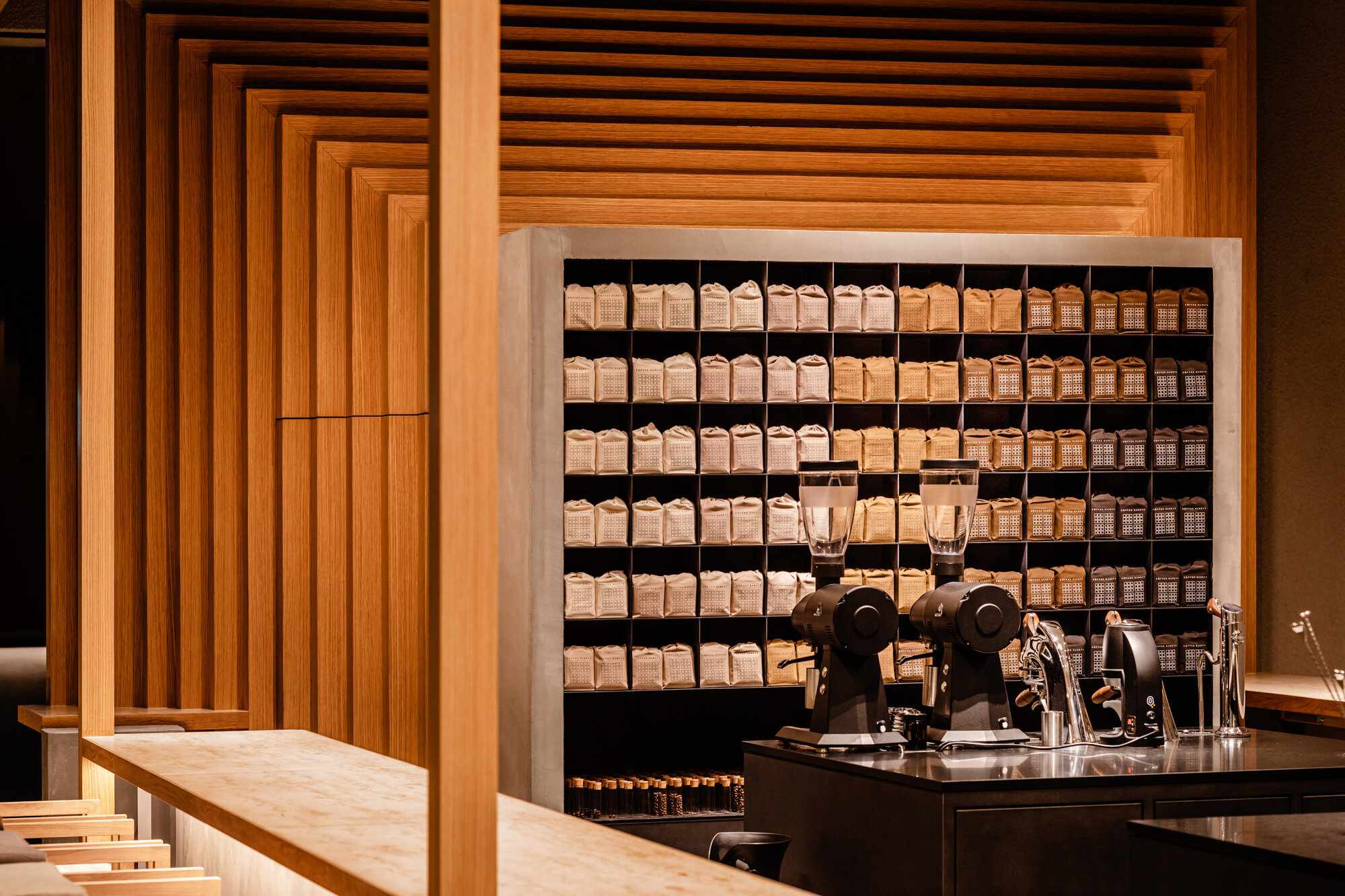
When asked about the similarities between the previous cafe designs for the same client, he replied, “We did not change the design language and format of the coffee bean shelves, and the gate shaped wall. The gate-shaped walls at the counter back, which evolved into a zigzag surface, have become an iconic feature of the coffee shop.”
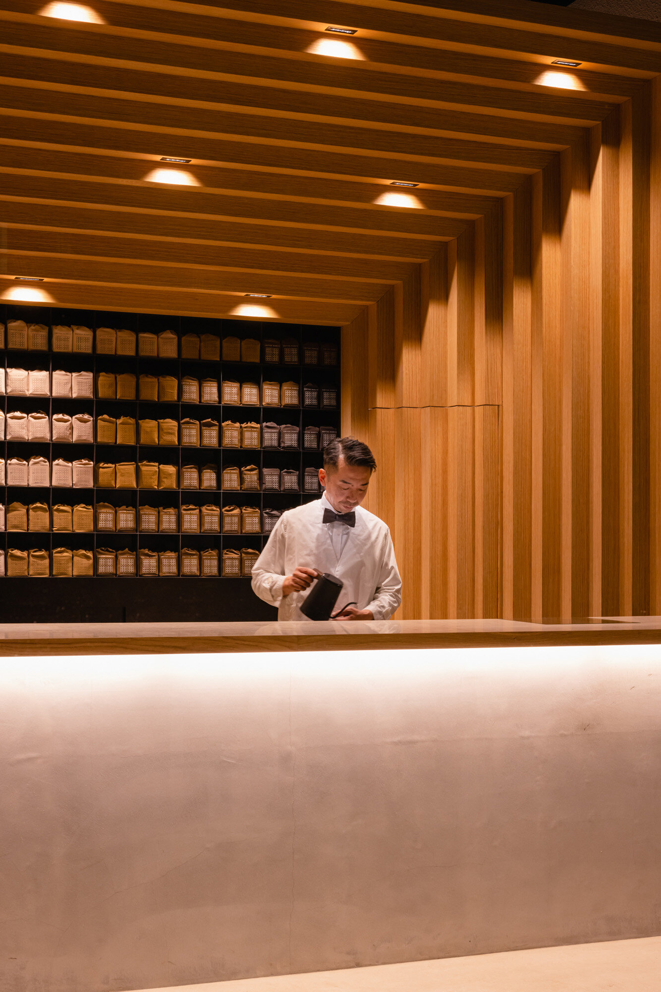
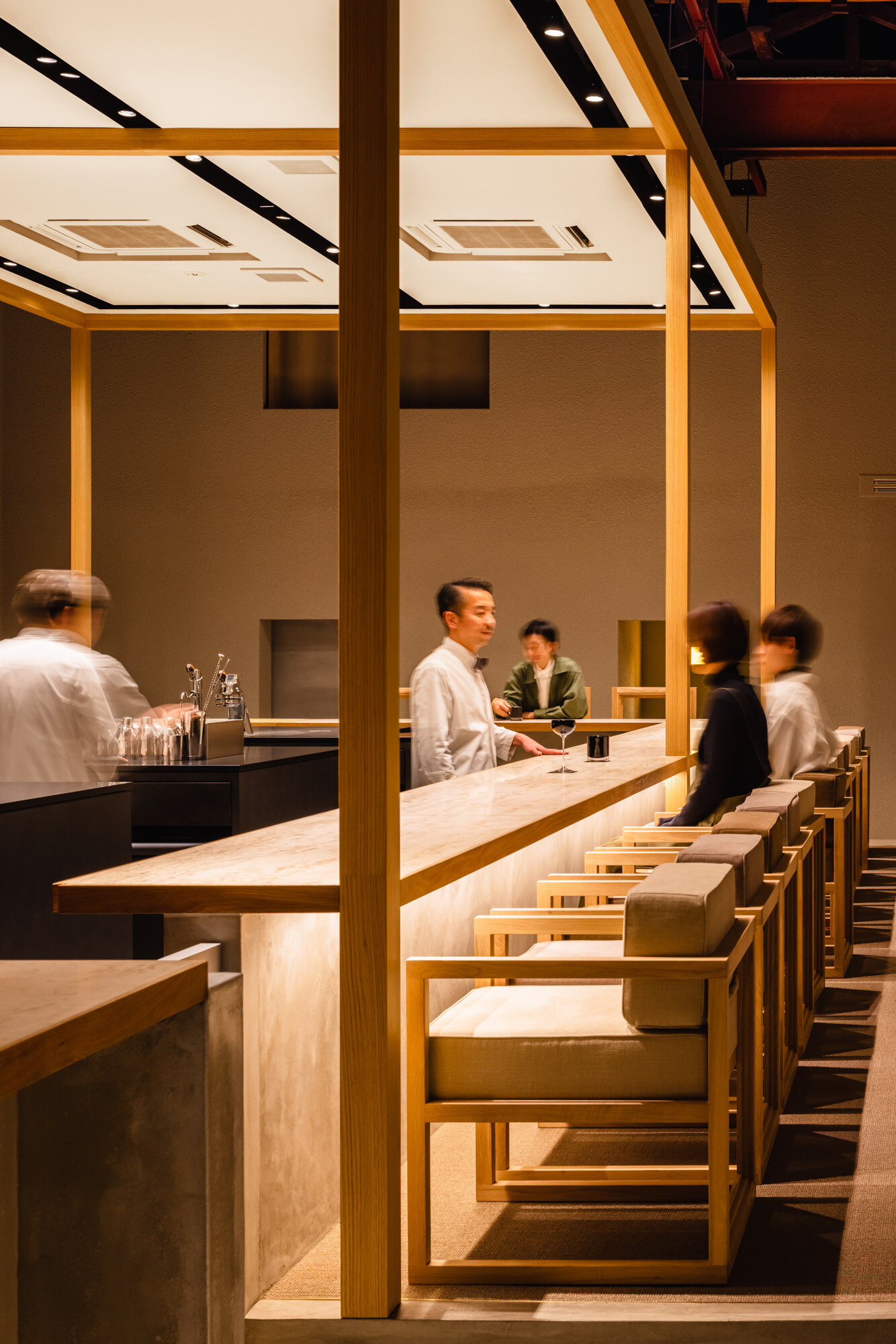
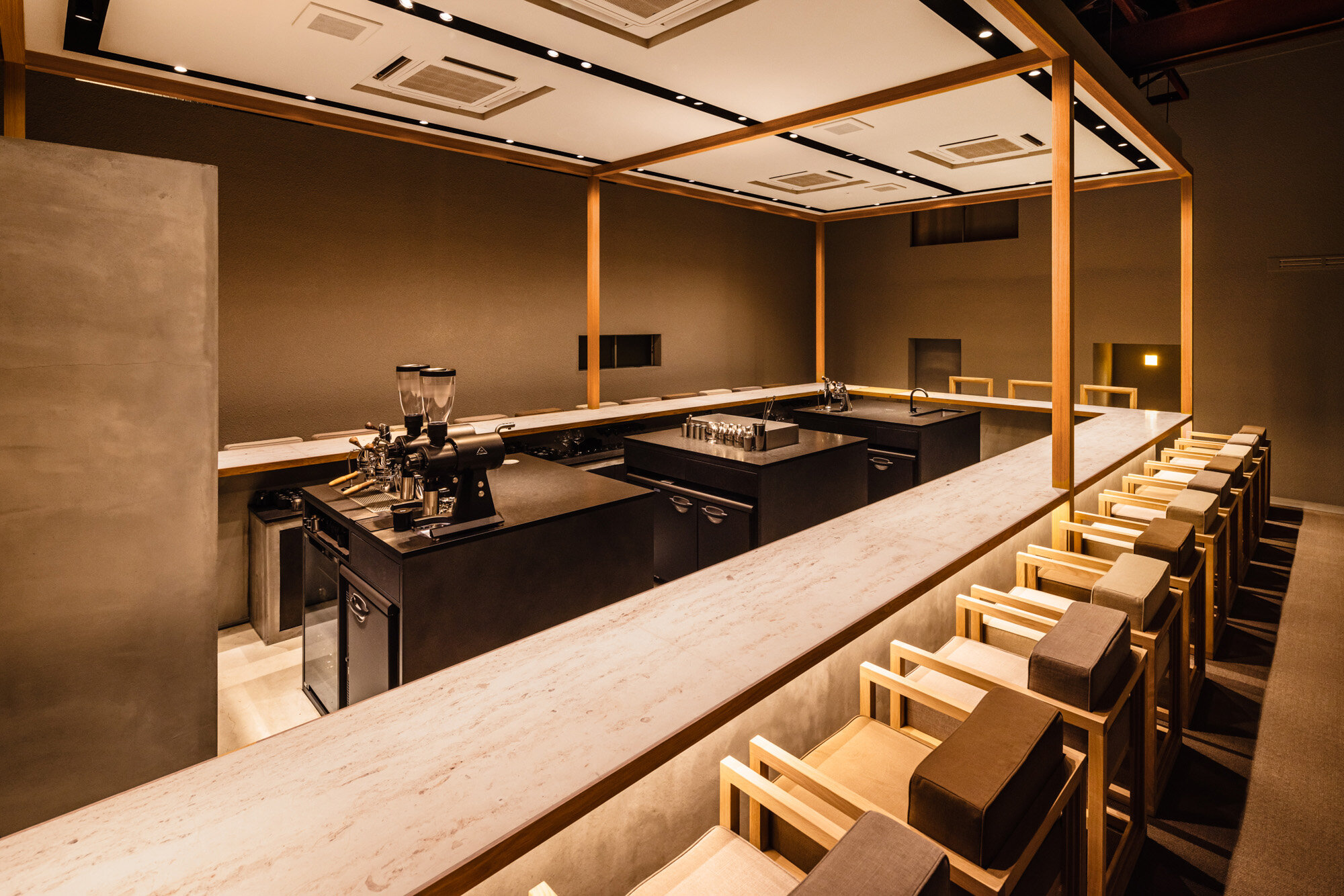
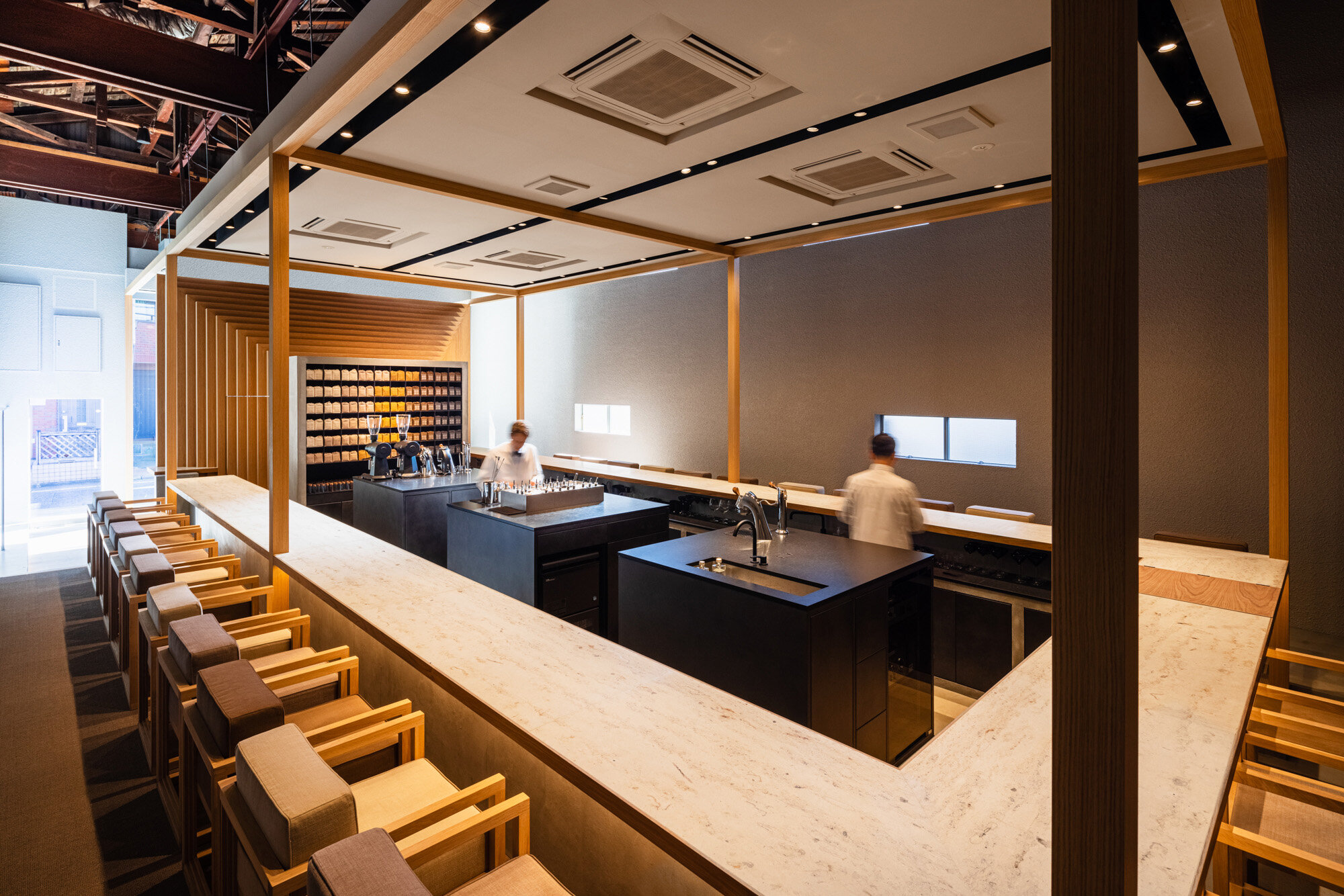
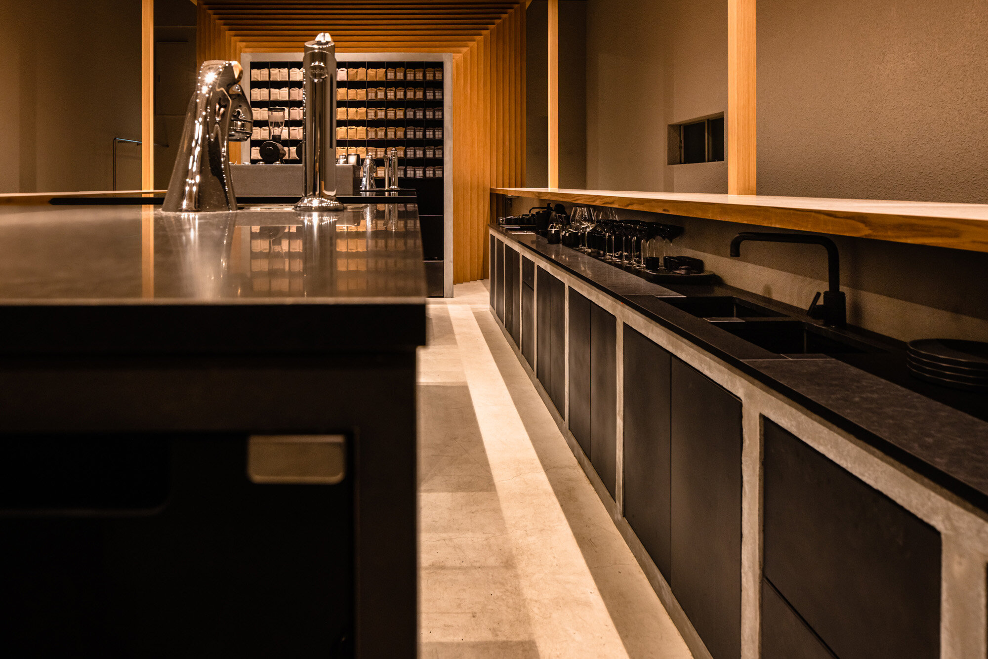
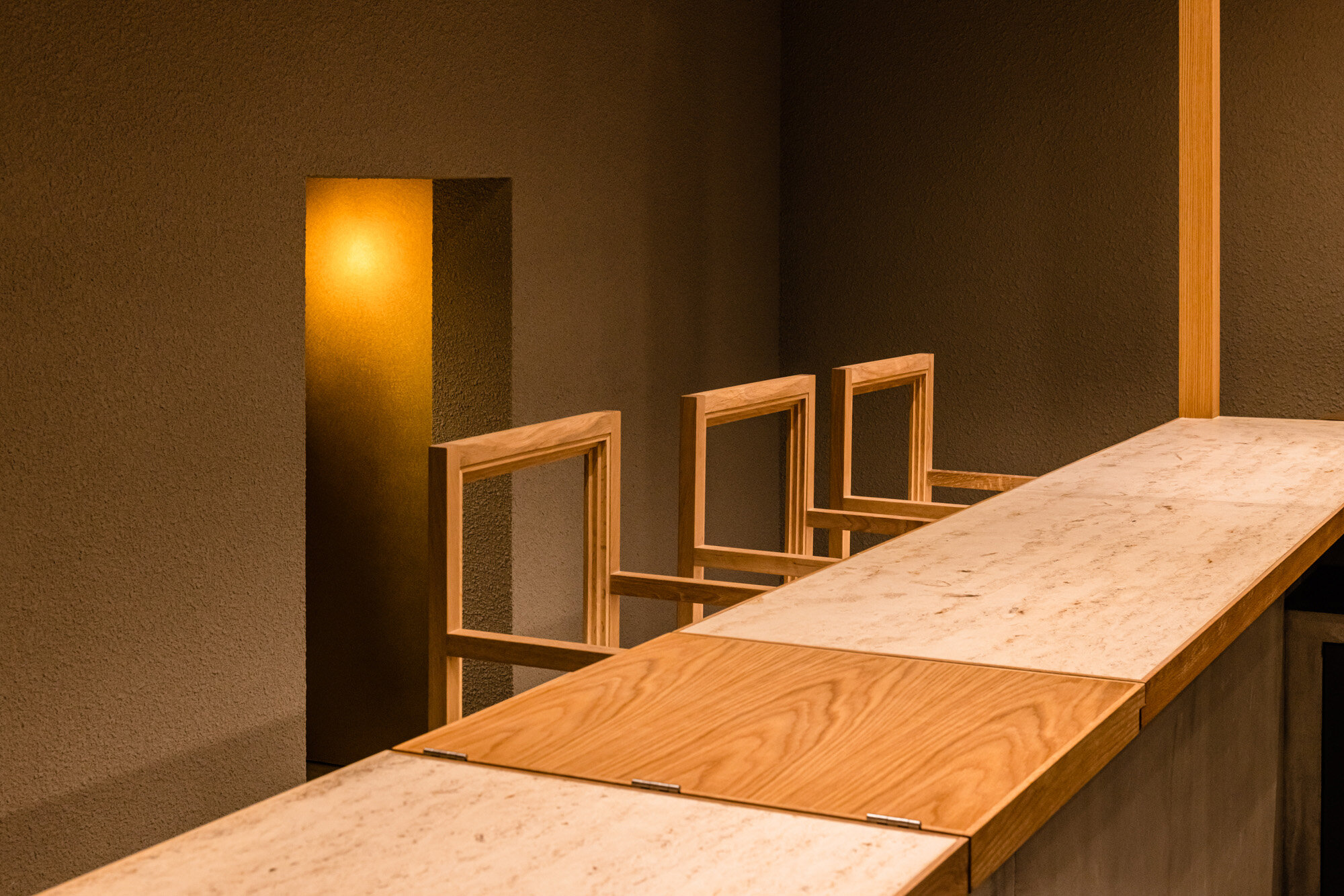
The layout of the long counter was a key in the development, and they had a lot of discussions about it. “The U-shaped counter was chosen so that customers enjoy talking to the barista and, at the same time, they could see their skills. The owners also requested that the guest countertop and the workbench top be aligned to allow the customer to see the barista's hands. This counter represents MAMEYA's expertise and their pride,” said Hayashi.
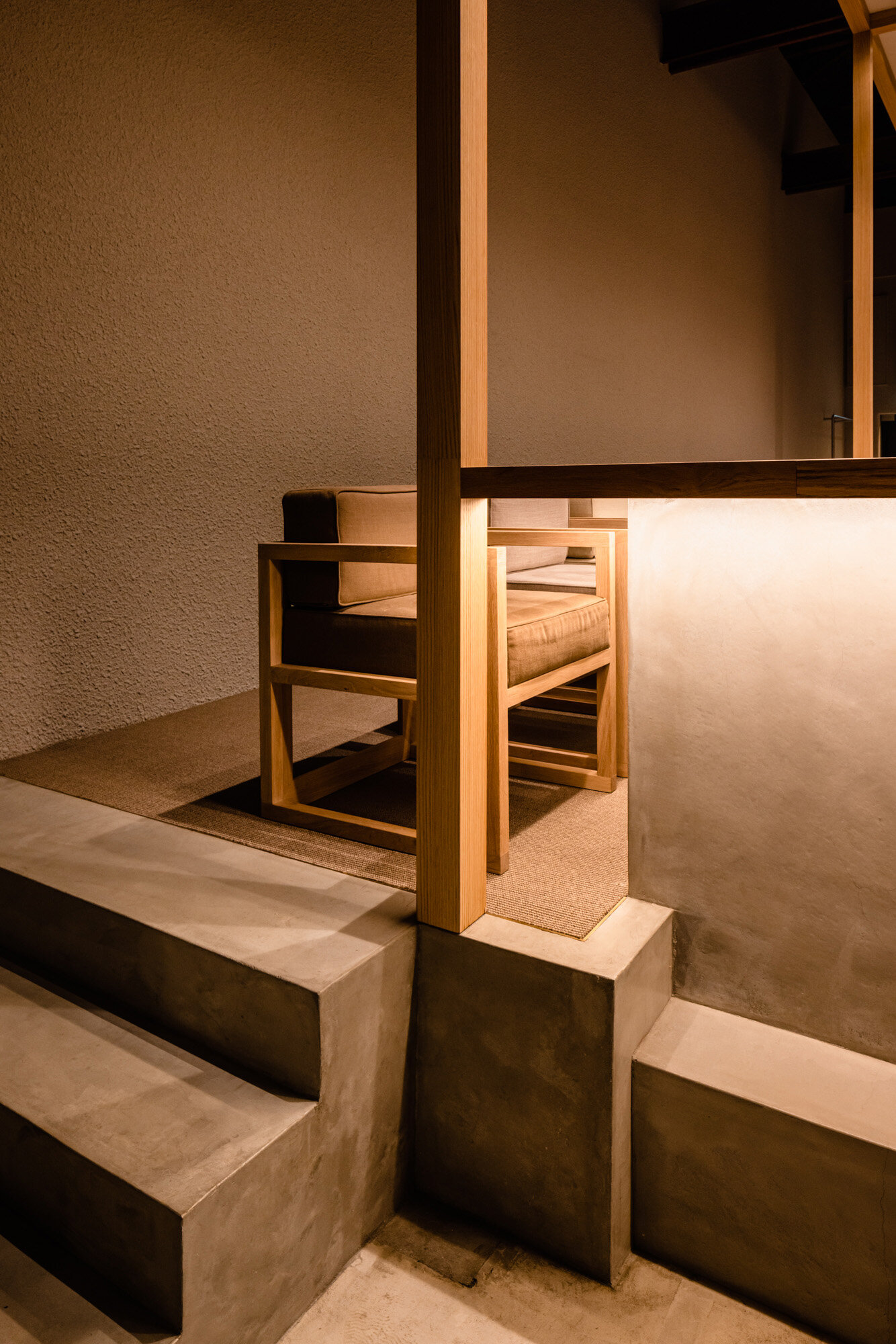
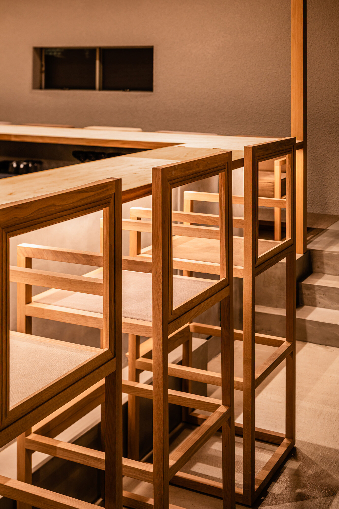
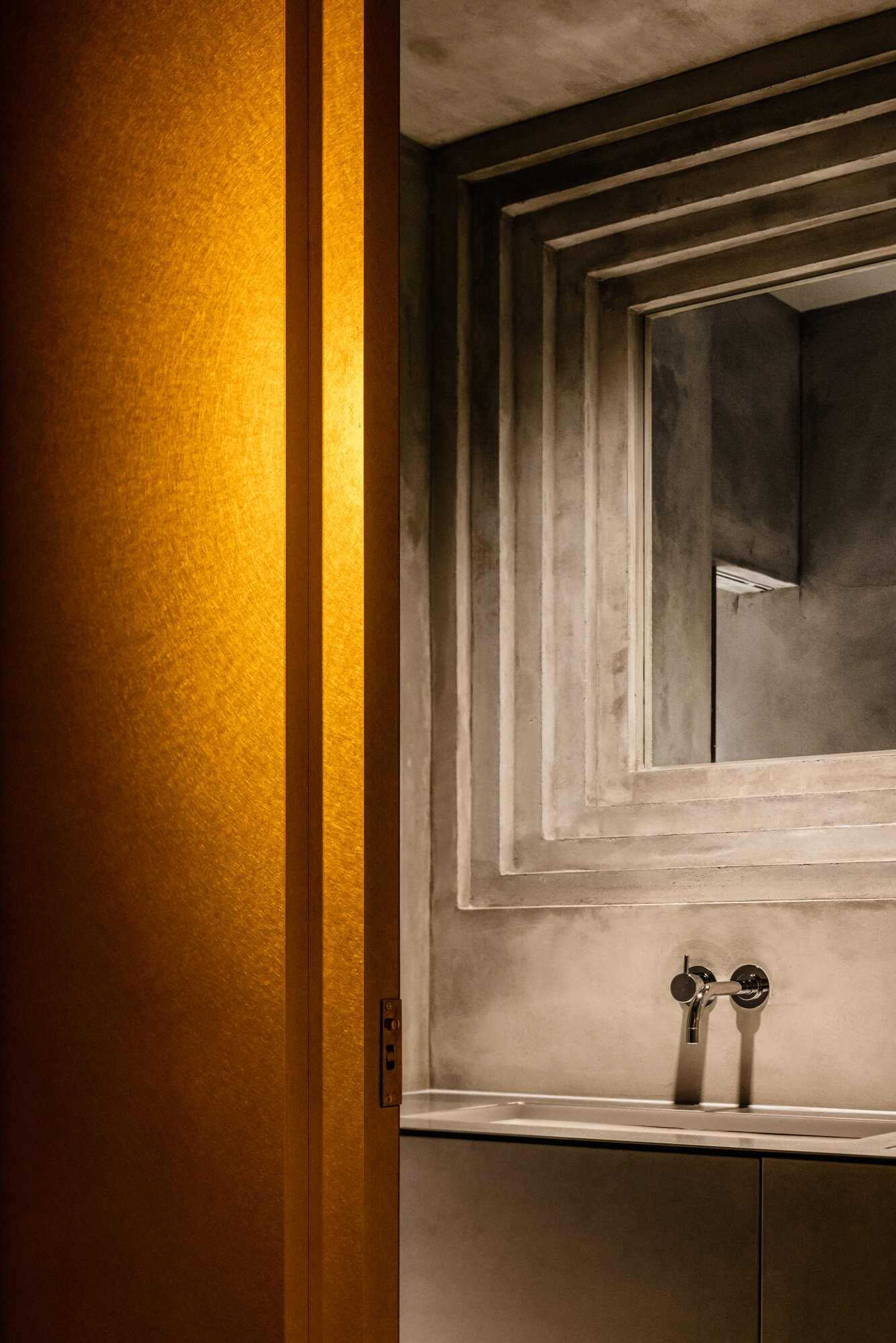
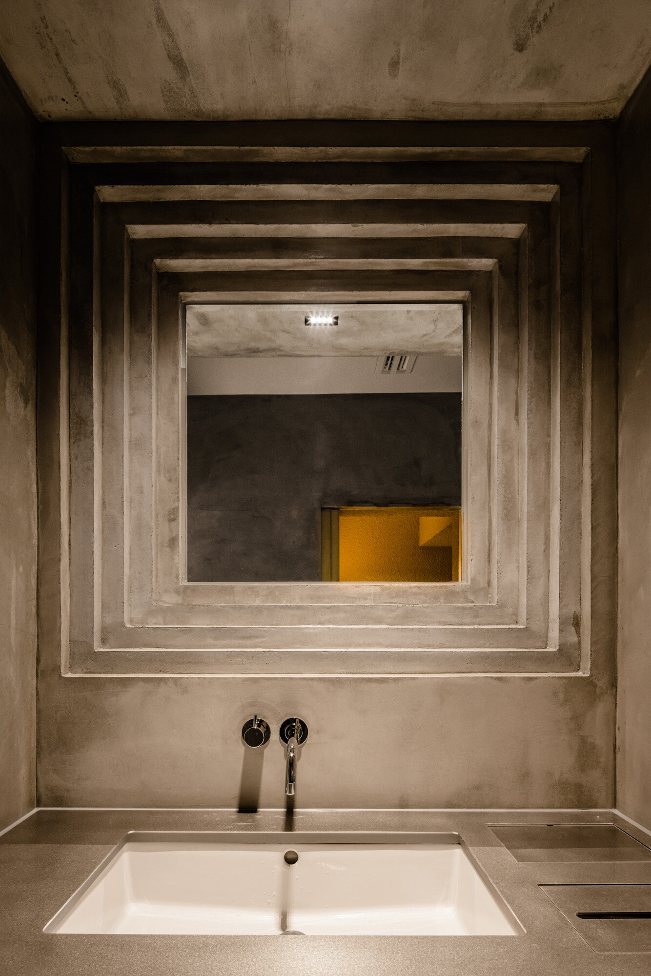
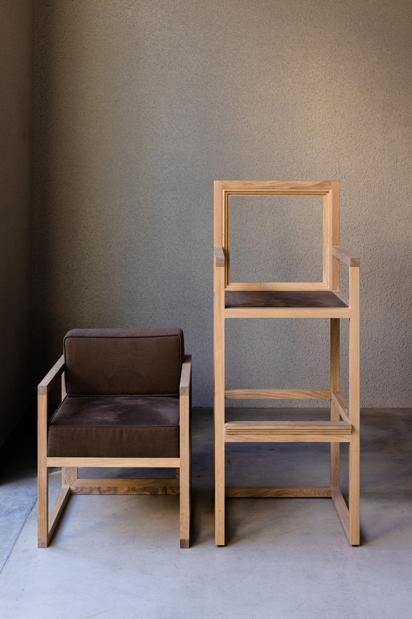
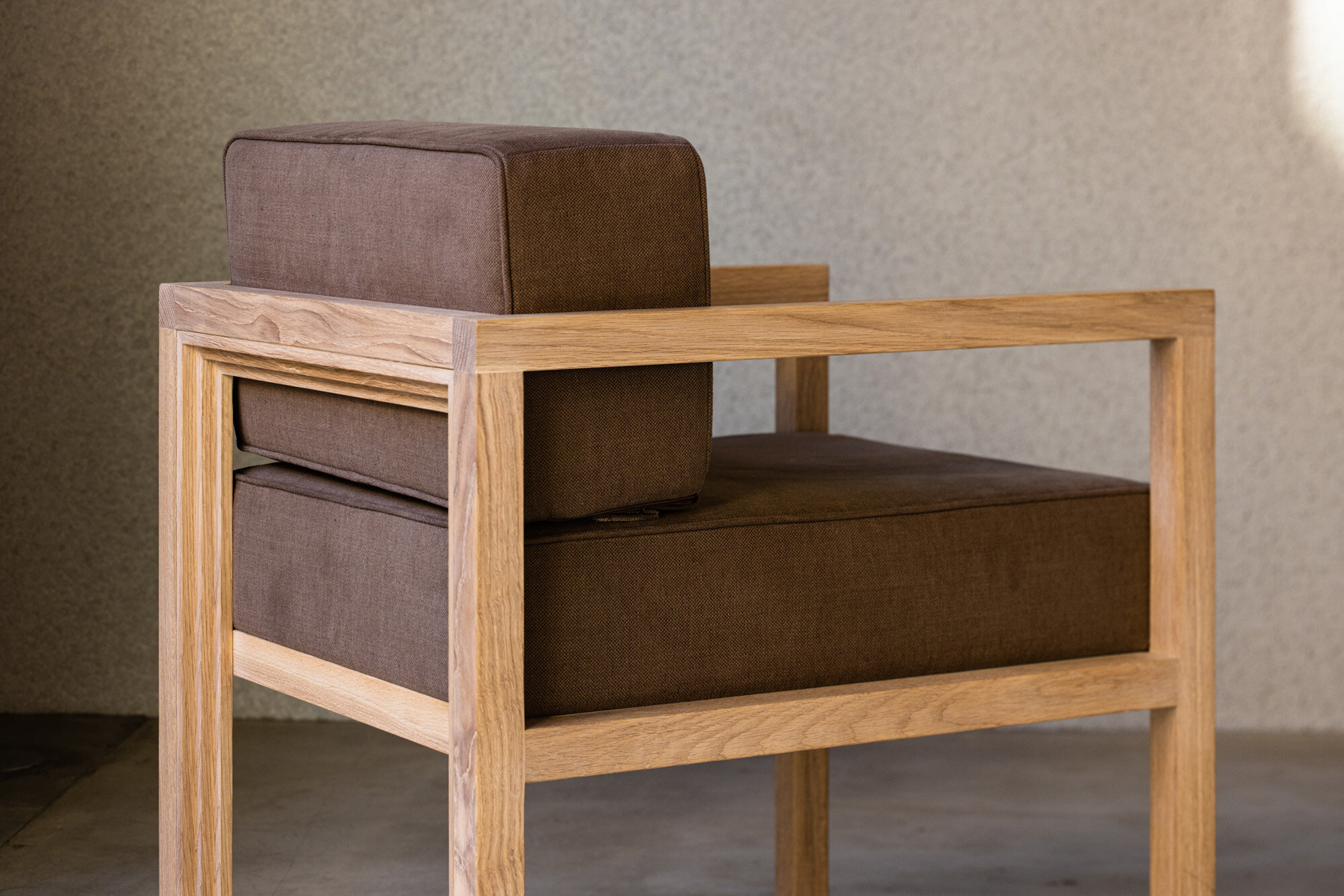
Besides, the designers have created this shop with meticulous attention to detail. Zigzag shapes can be found on custom-made furniture and in bathroom mirrors, just like on counter-back walls.

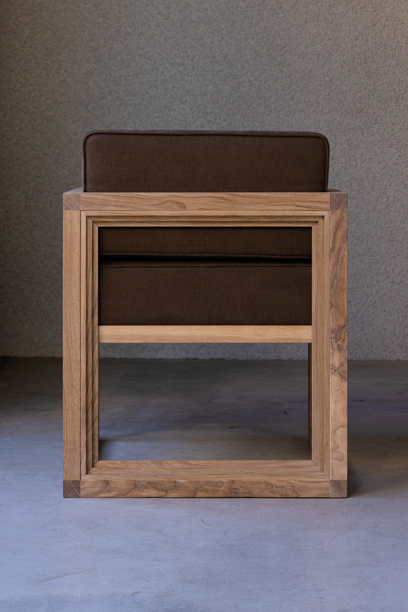
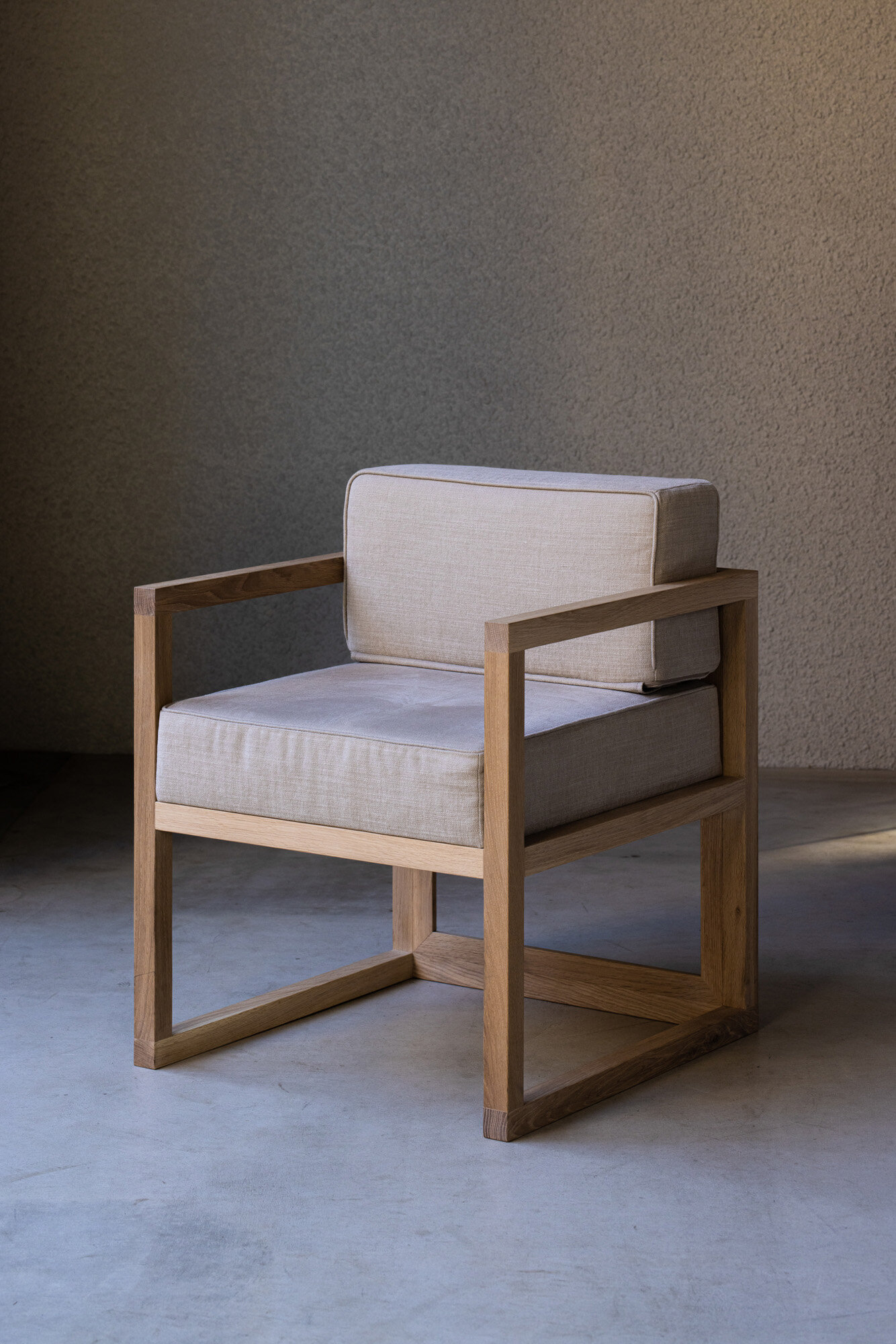
Details of the original chair with zigzag edges to match the spatial design. The legs are made of solid white oak. The cushions were made in three colours, from dark brown to beige, inspired by the colours of the coffee packaging.
Reflecting on the whole process, he said, “This unique counter-centred style was achieved because the management has a clear vision of showing their skills to customers. The sophisticated service is well managed because they have five or six experienced baristas with coffee and service skills. A significant advantage of this new challenge was the relationship between the owner, the creative director and myself, working together for ten years. The fact that the three of us could share an essential idea before designing each part of the space has enabled us to create a solid and inimitable space where management, graphic design and space design are integrated as a trinity.”
So far, the cafe's unique way of drinking coffee, such as the coffee cocktail and the coffee course menu with different brewing methods, and its hospitality, are well received by both its core fans and local customers.
DETAIL
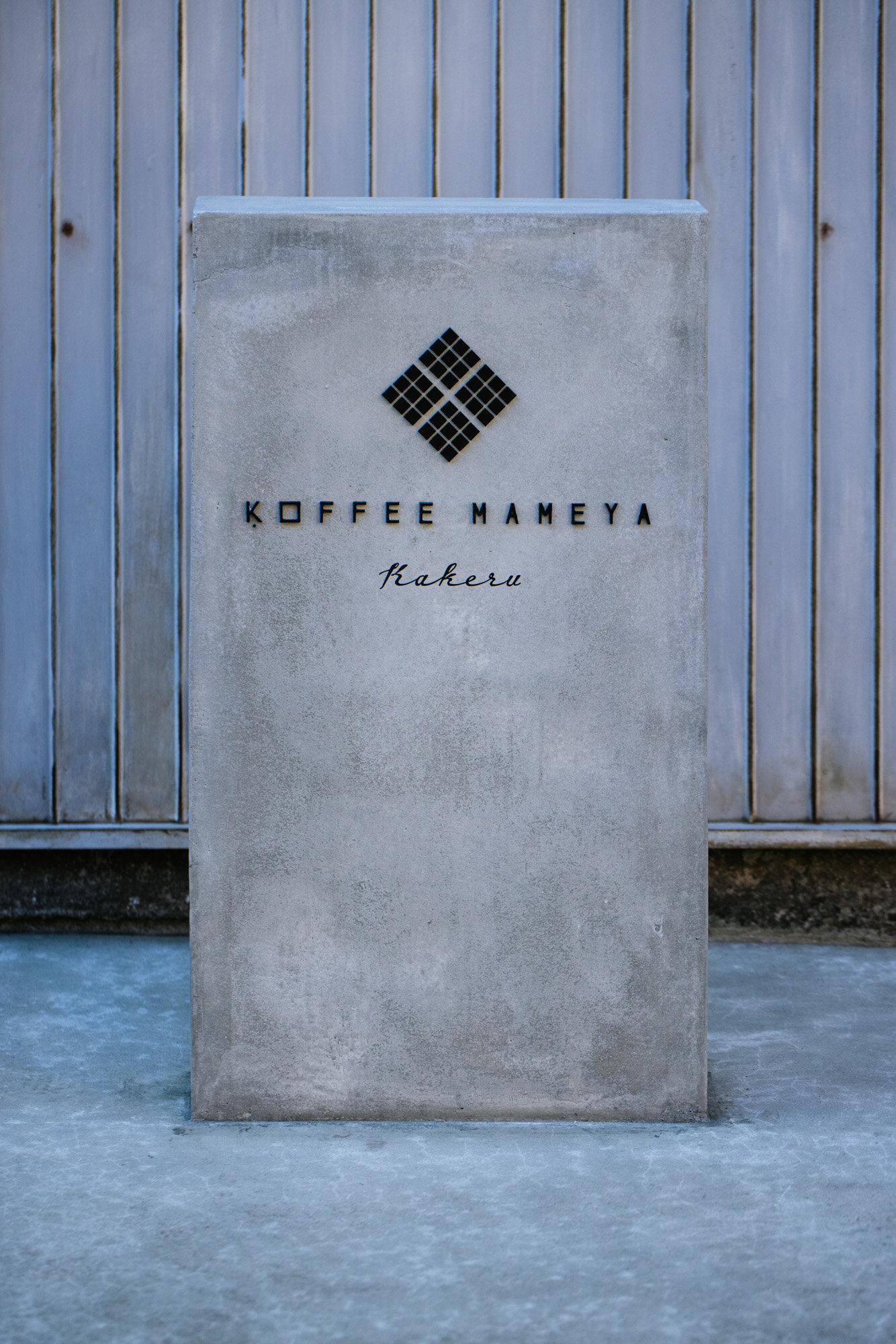
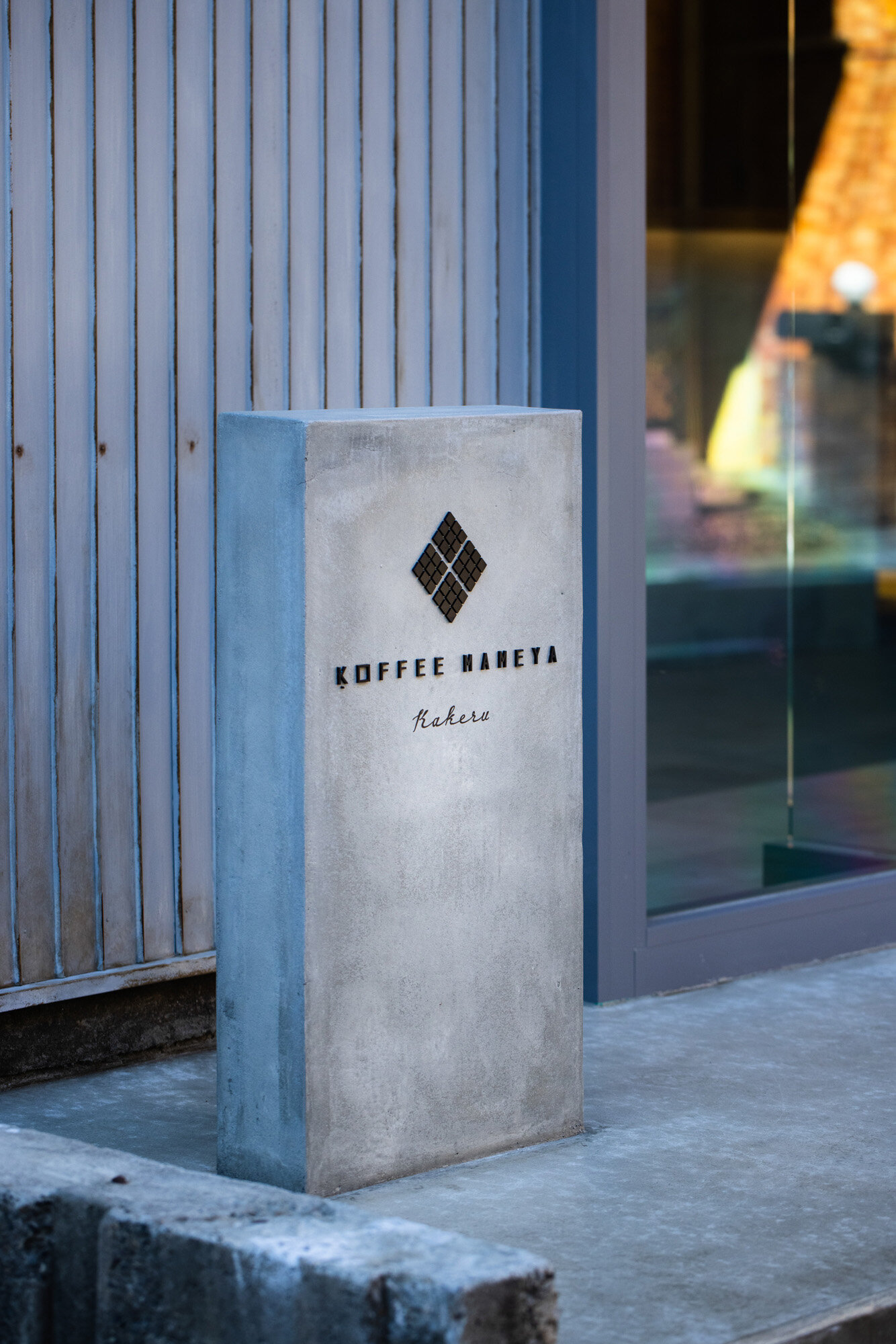
The new logo was designed as a 45° swinging version of the previous square based symbol. All the graphics were created by EDING:POST.

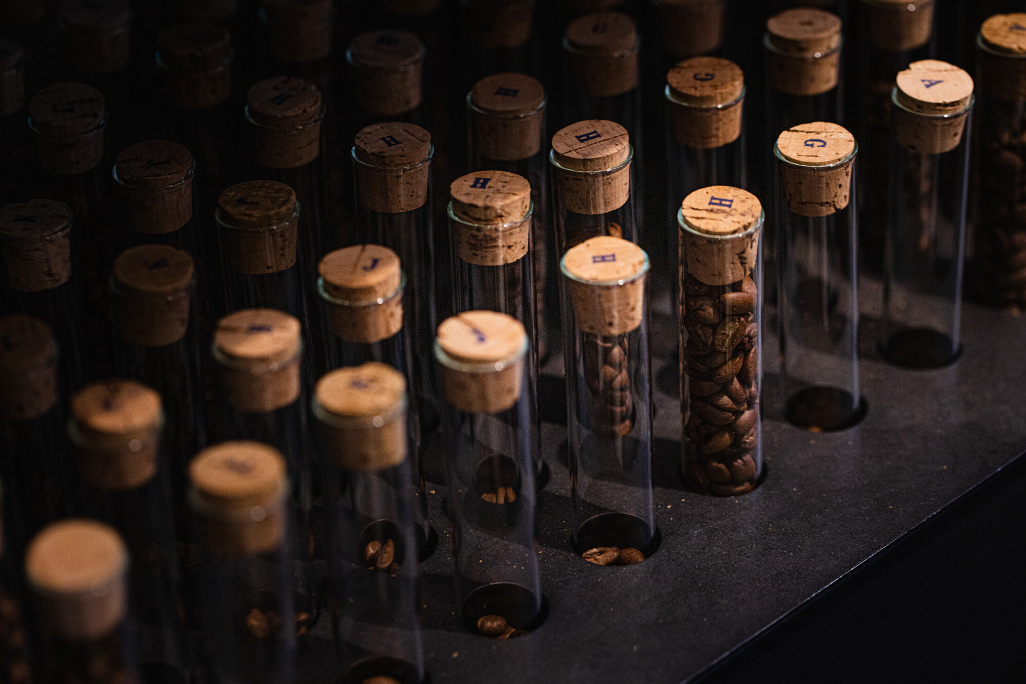
The custom-made brass case for the coffee beans is built into the counter top and is divided into 25 glids. In Omotesando, it was made of stainless steel, but the designer changed the material for this shop.
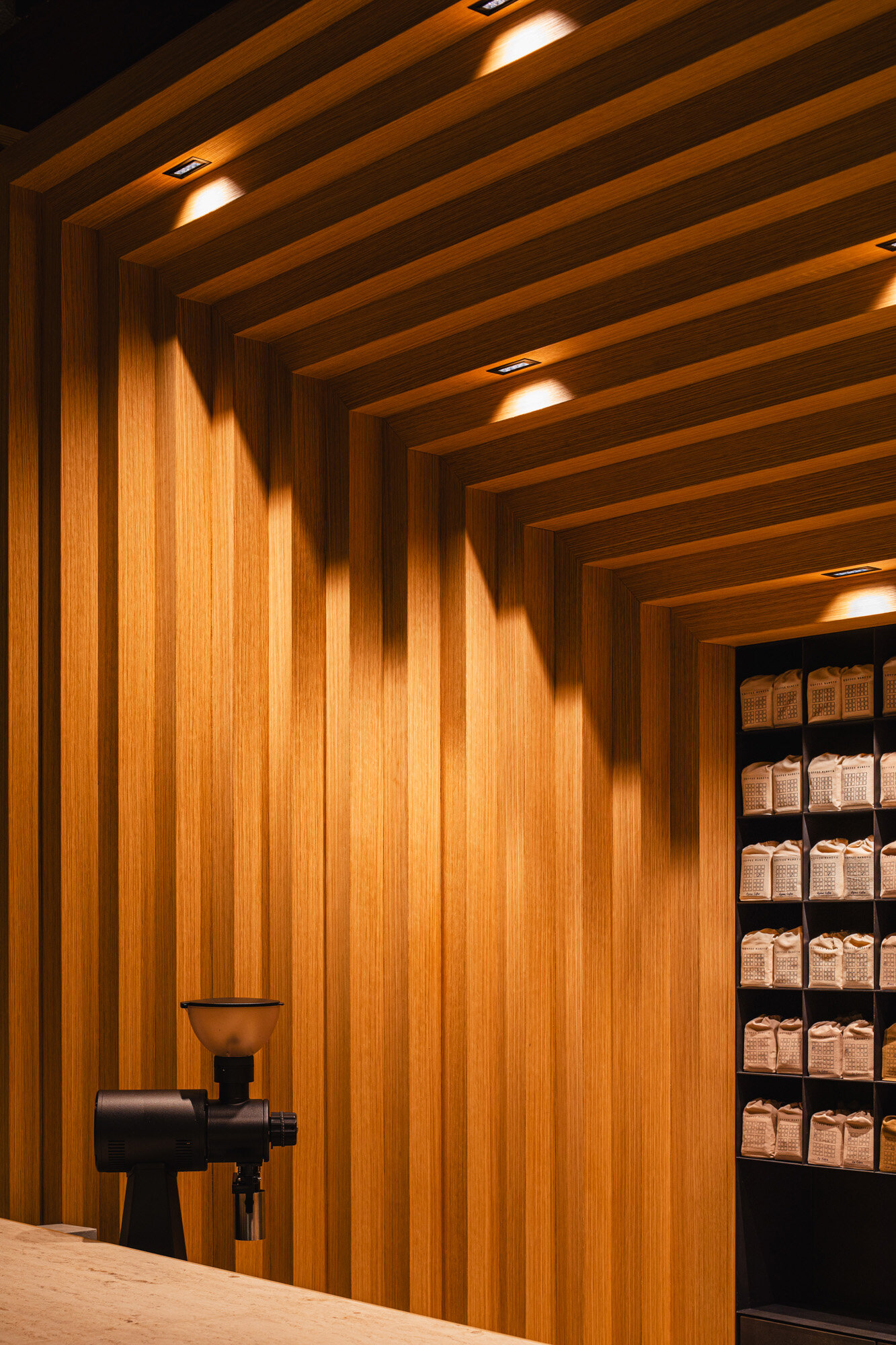
The counter back has a characteristic zigzag design.

Seen from the seats, the zigzag wall appears to protrude in the middle. The wooden pillars above the counter are 85 mm wide.

The door in the zigzag wall was designed in the same detailed zigzag shape.

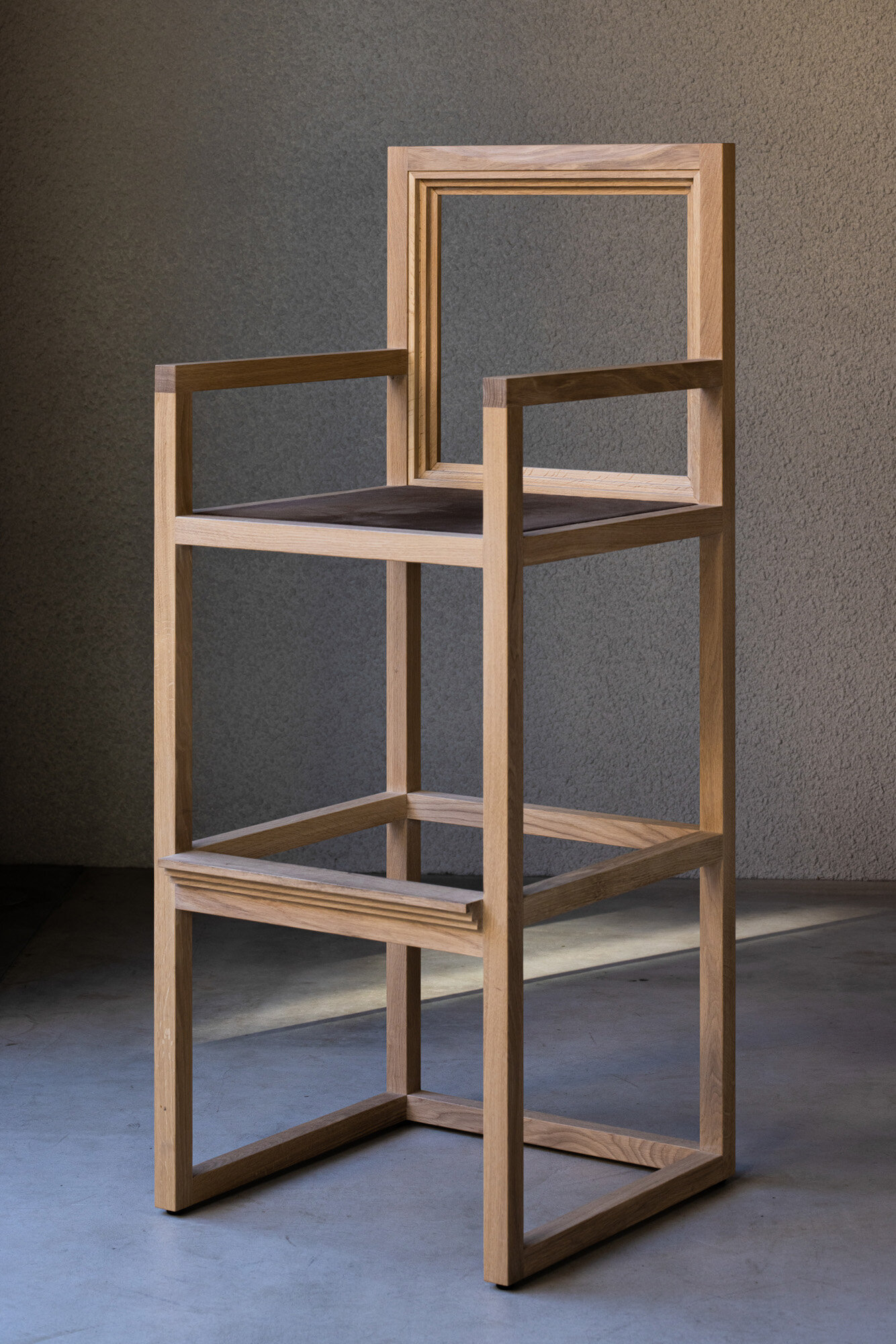
An original high stool with an open backrest. The high chair is only used for the three seats at the back of the cafe.

The zigzag motif was repeated on the mirrors in the toilets, echoing the interior
CREDIT + INFO
Name: KOFFEE MAMEYA -Kakeru-
Creative direction: Tomohiro Kato / EDING:POST
Design: Yosuke Hayashi / Fourteen stones design
Furniture: E&Y
Construction: Kurihara Naiso
Location: 2-16-14 Hirano, Koto-ku, Tokyo
Owner: Eiichi Kunitomo / SHIKOUHIN-KENKYUSYO CO.,LTD.
Main use: Retail store + cafe
Completion date: 2021 January
Floor area: GF 126.71sqm (kitchen 6.6sqm) , 1F 23sqm
Material
floor: mortar + dust proofing
floor (seating area): sisal carpet
wall: Jolypate spray finish
counter back wall: white oak veneer +matte clear finish
ceiling: AEP matt finish
countertop: limestone + solid white oak t8 matte clear finish
counter: mortar
coffee beans shelf: steel + mortar
coffee beans sample case: custom-made brass case + clear glass
workbench: black marble + steel
chair: solid white oak + matt oil clear finish