LICHT GALLERY by CASE-REAL
Gallery and furniture shop | Tokyo, Japan
LICHT GALLERY | Case-Real | photography : Hiroshi Mizusaki
DESIGN NOTE
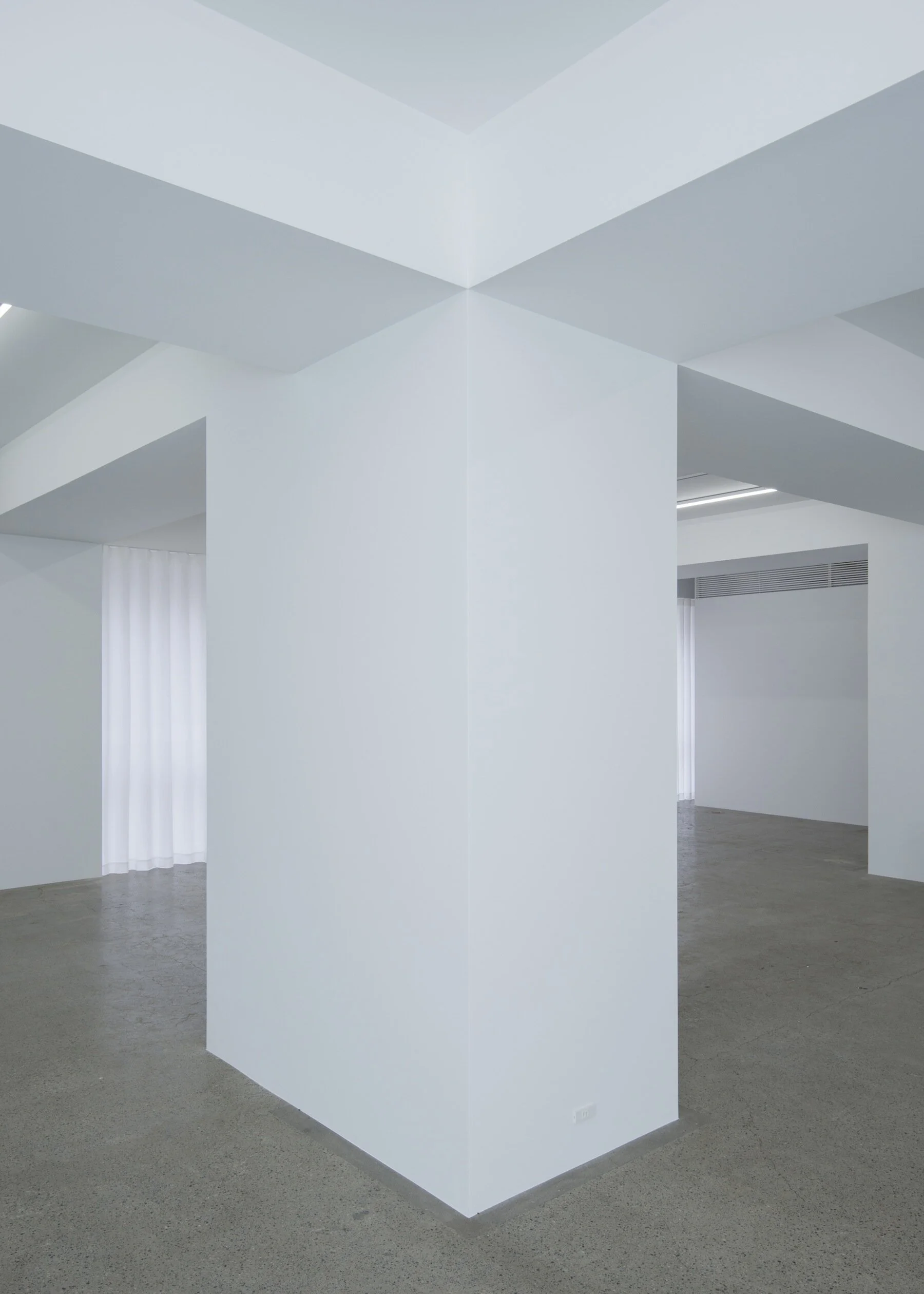
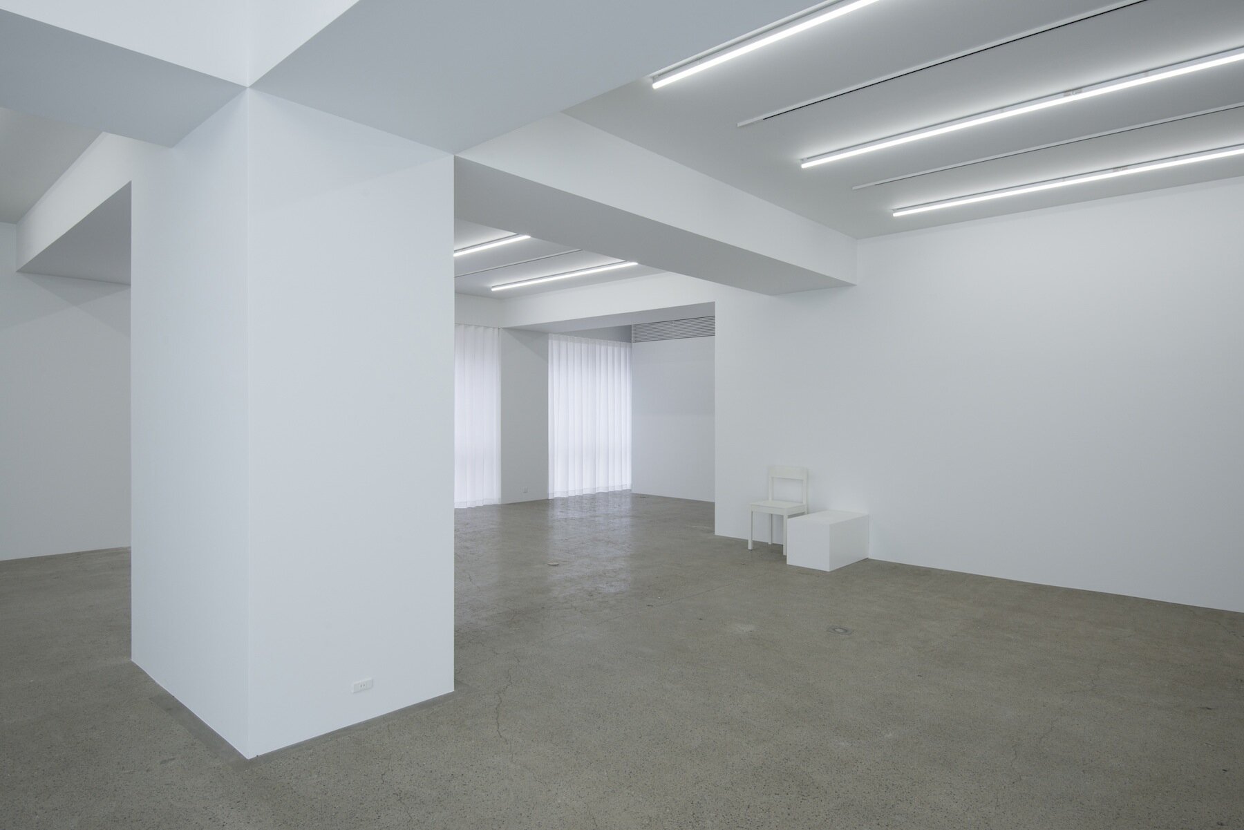
Simple combination of pillars and beams
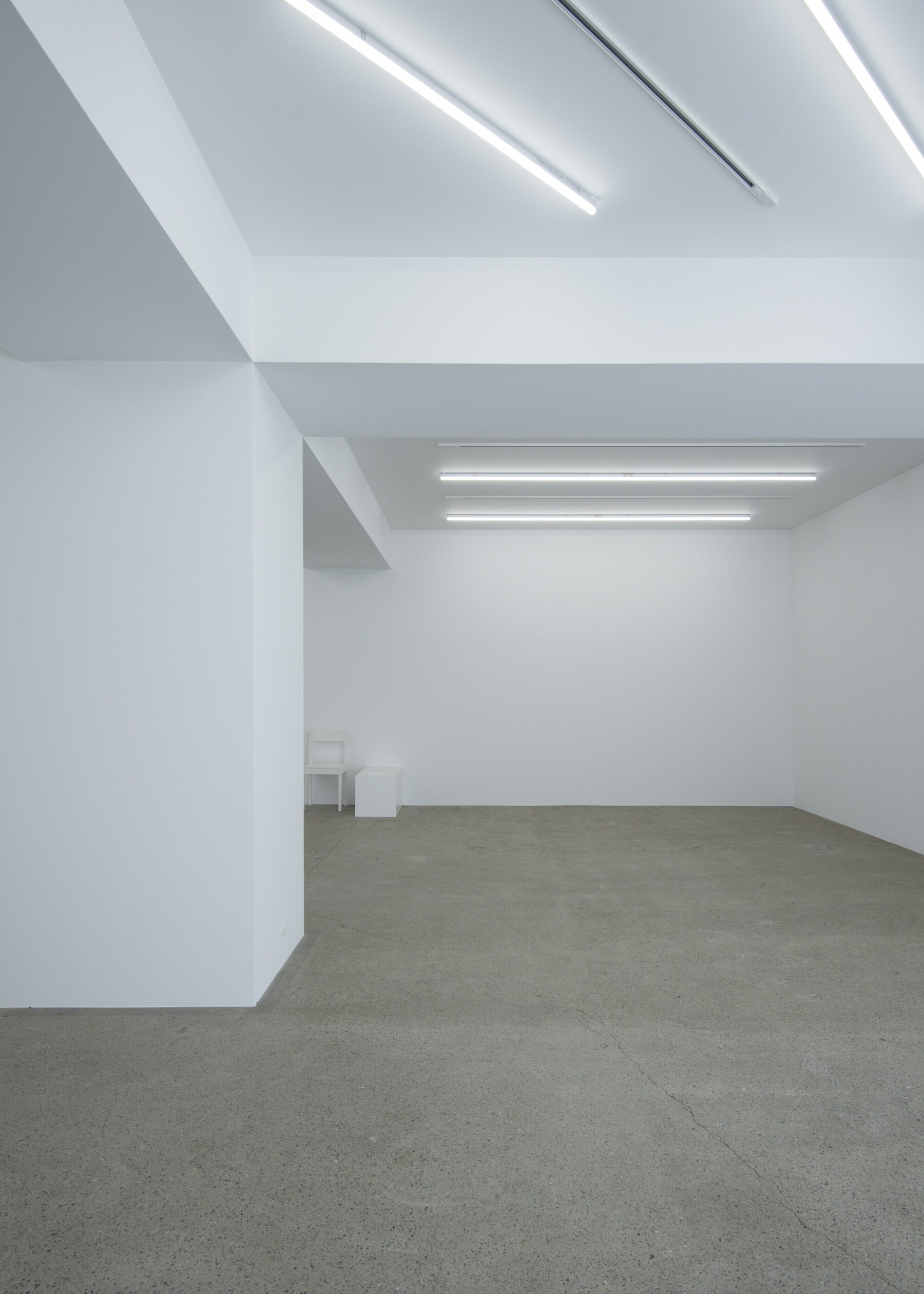
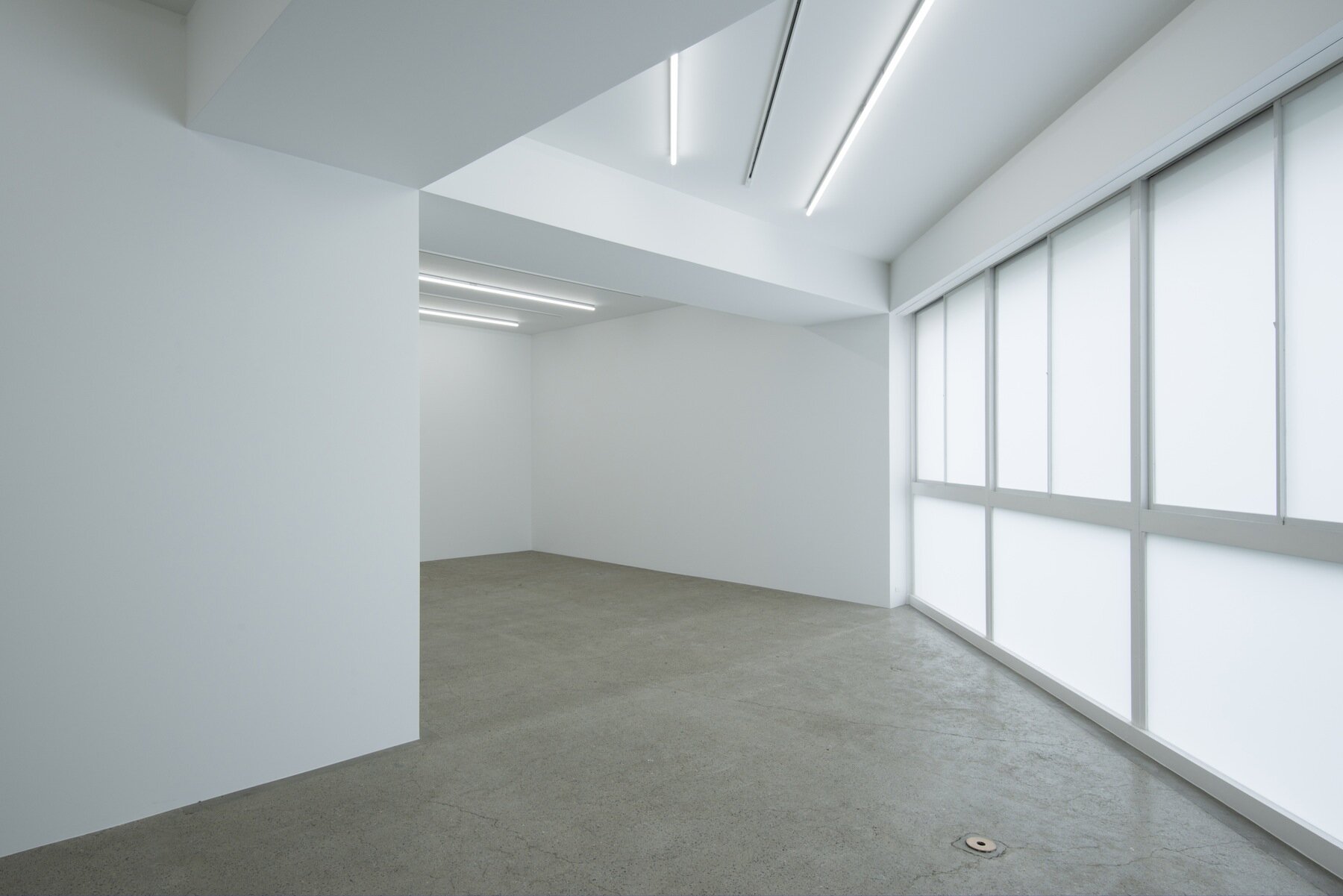
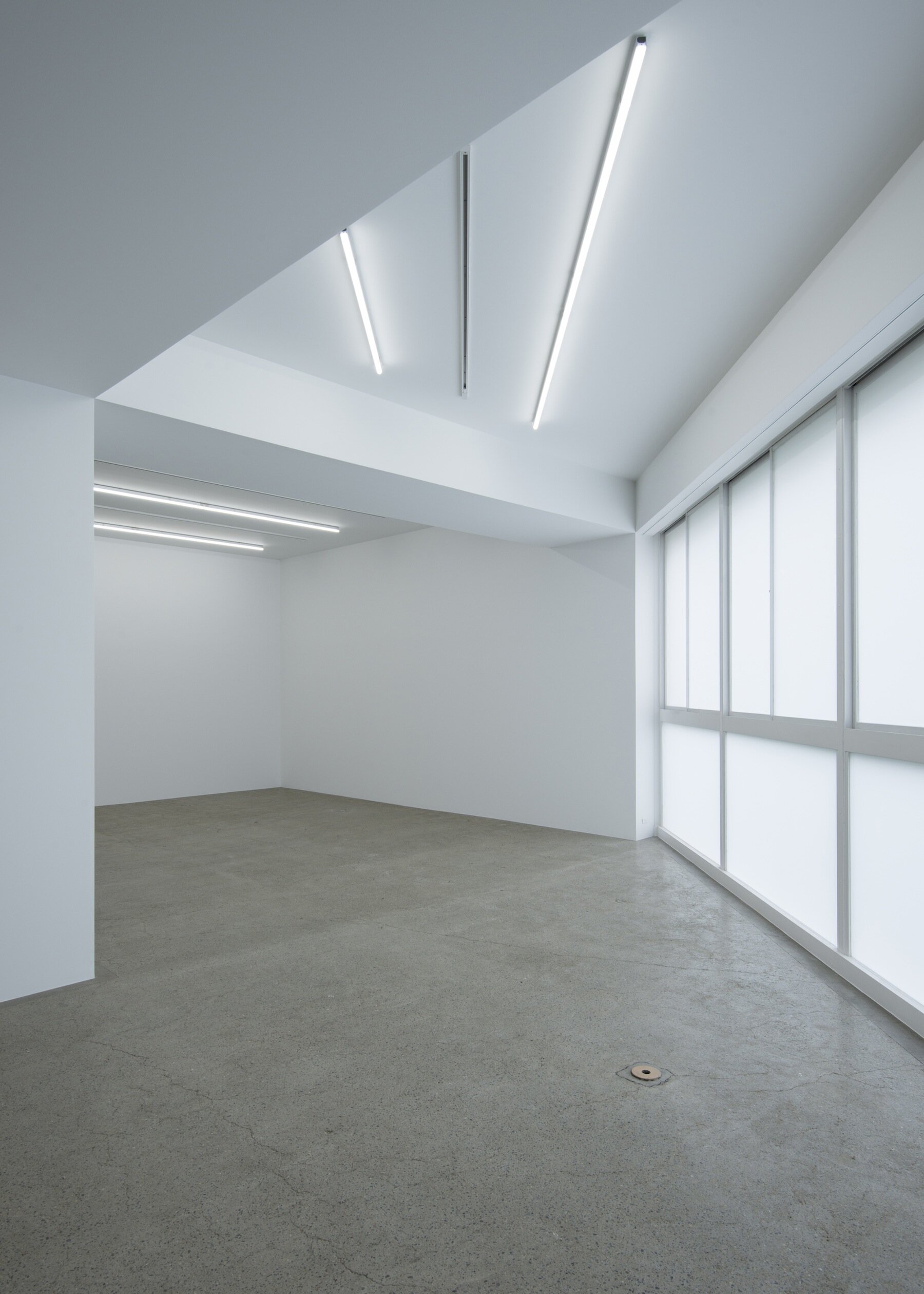
Contrast between white wall and polished concrete floor
Minimum designed white cube
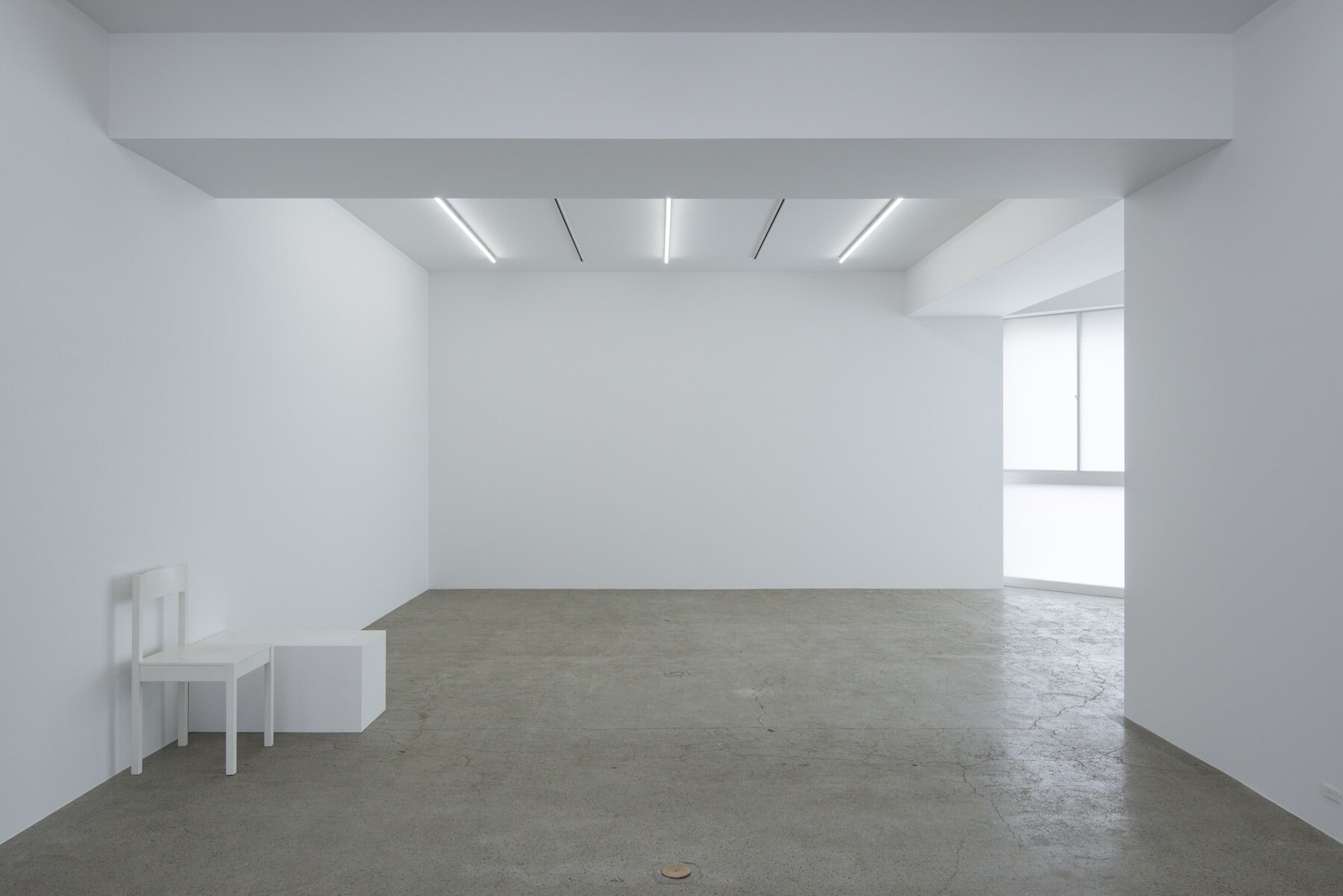
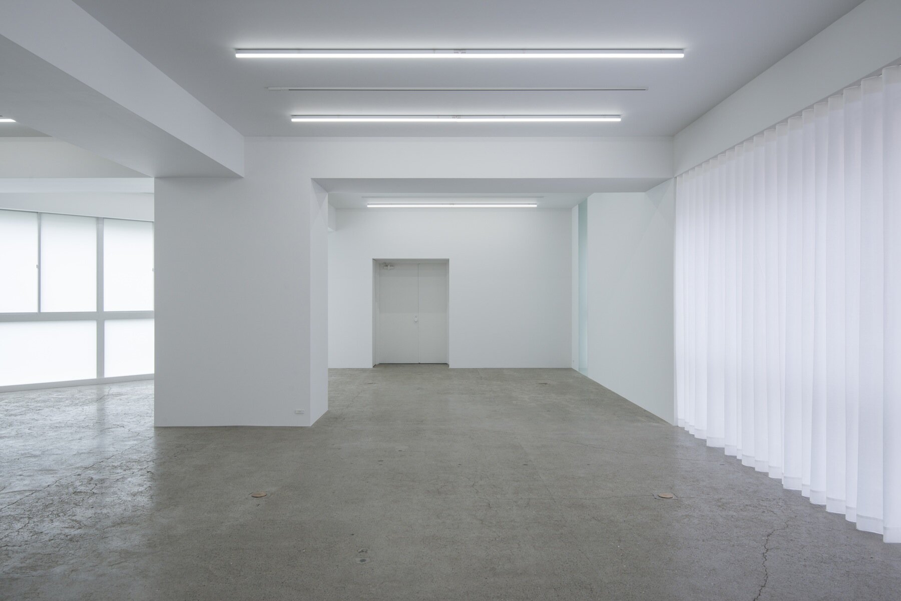
photography : Hiroshi Mizusaki
words : Reiji Yamakura/IDREIT
The detailed structure of the pillars, beams and walls caught our eye in here.
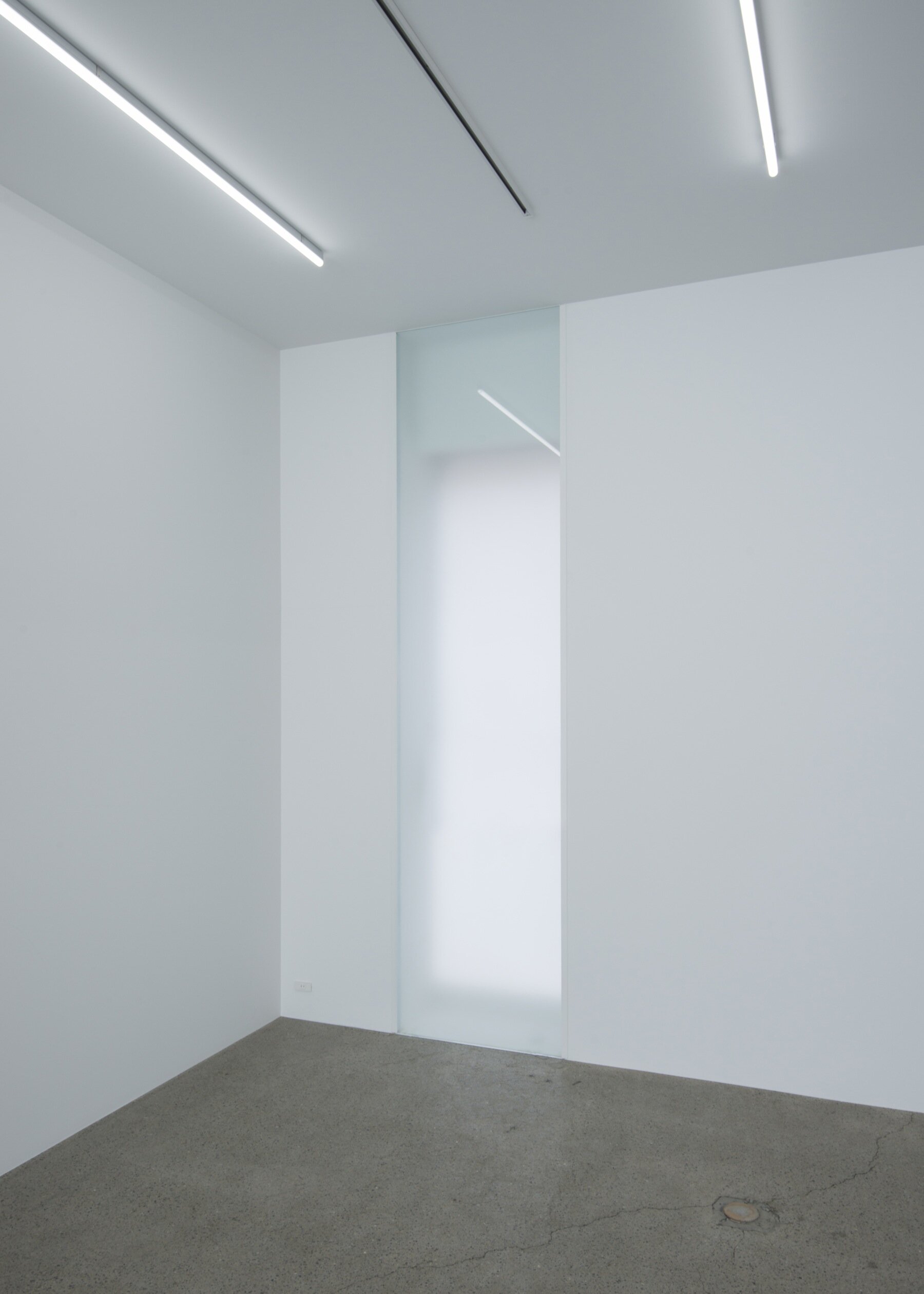
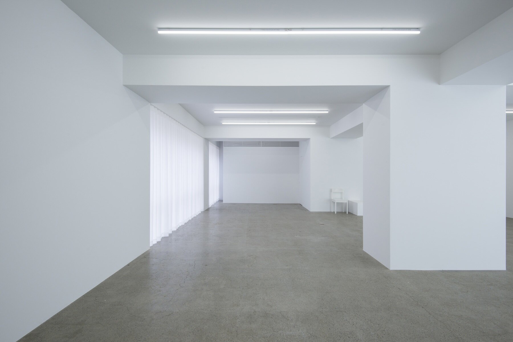
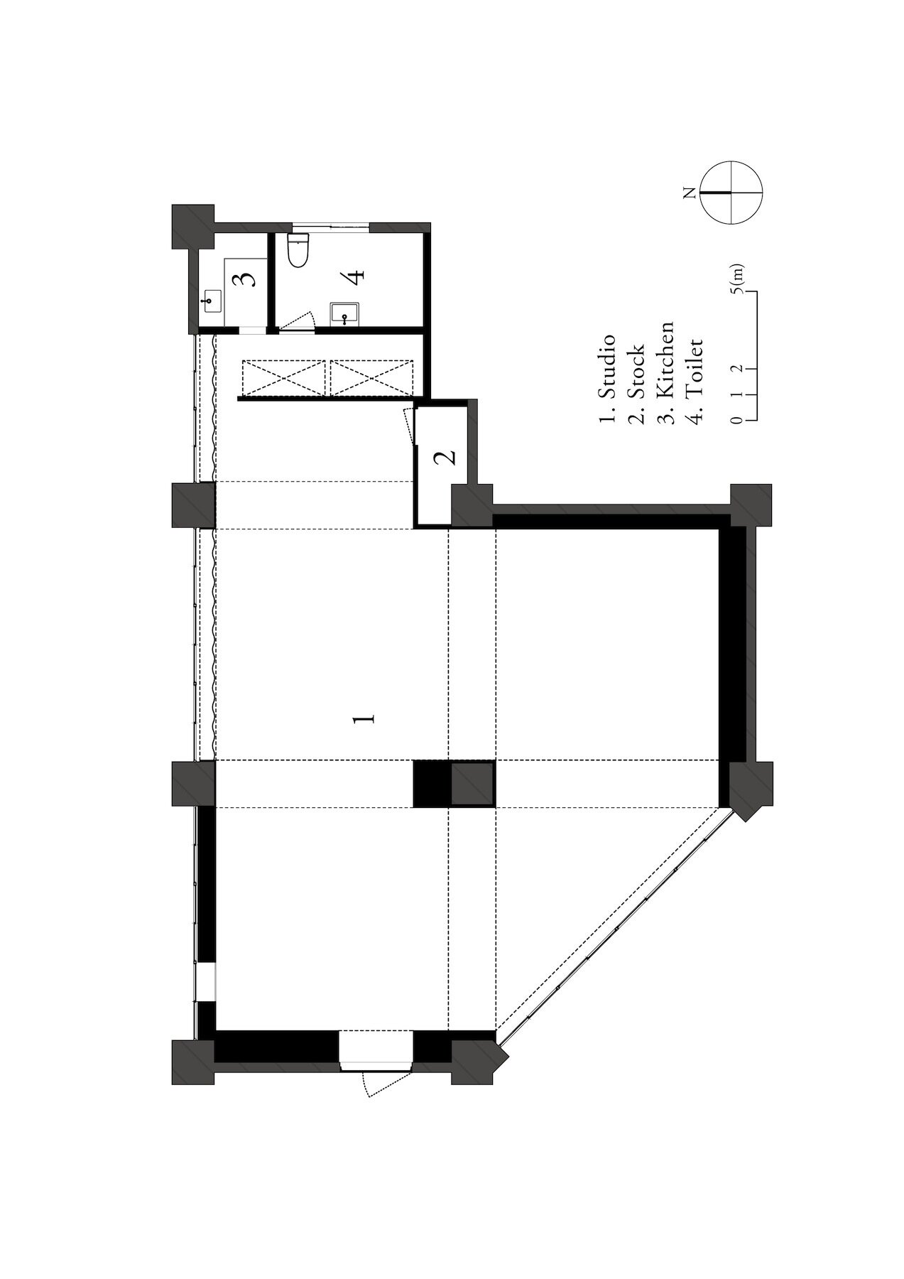
The space is for gallery and selling goods from the furniture shop. Originally, the owner only requested that the room in the old building be painted all white, but the designer, Case-Real also proposed the idea for lines to be added based on existing poles and beams and their intersections to give a sense of symmetry.
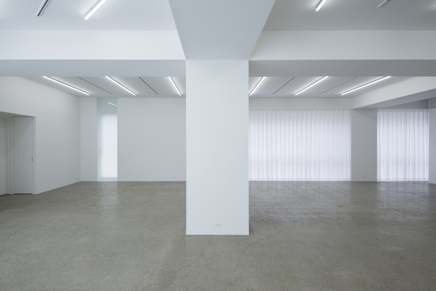
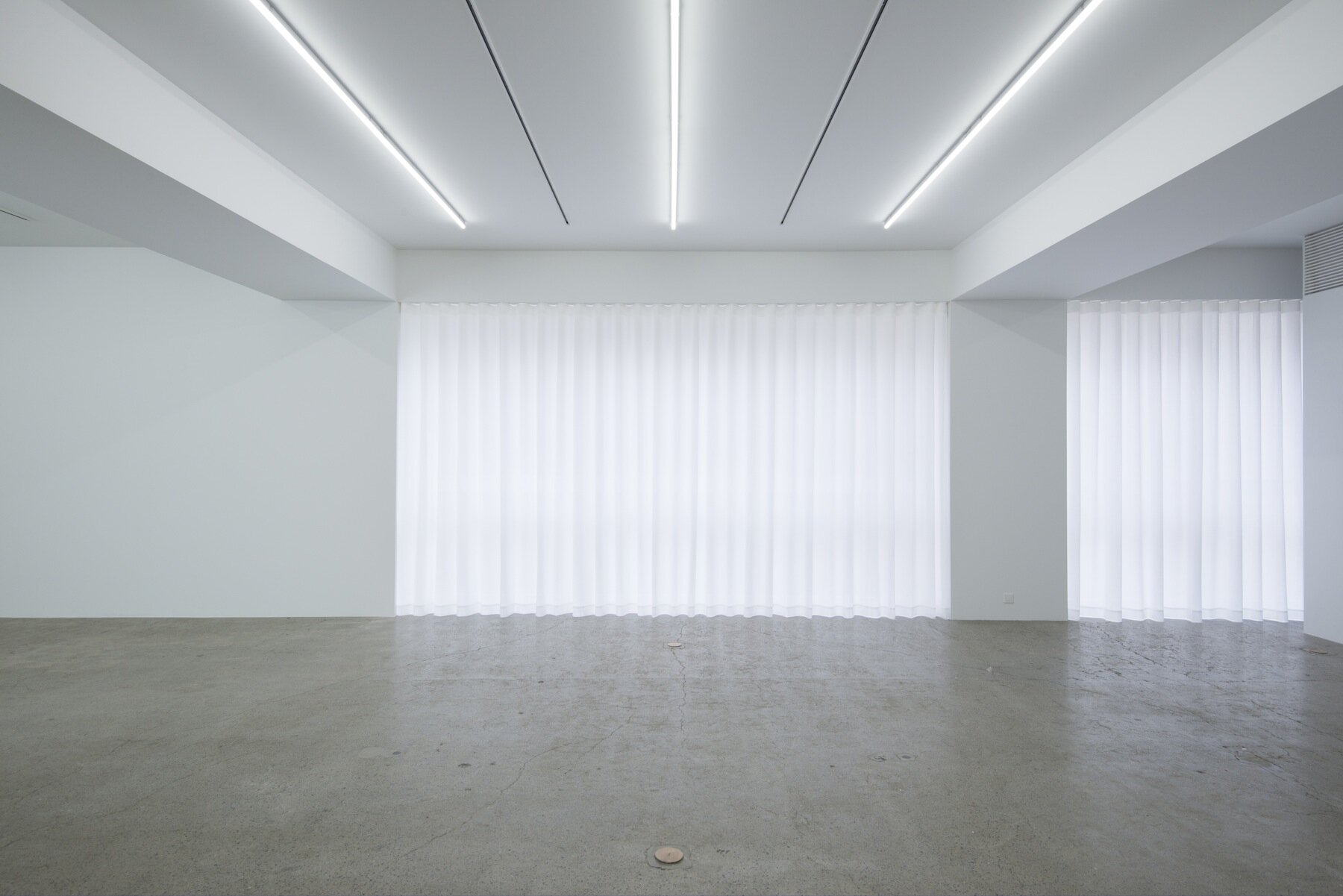
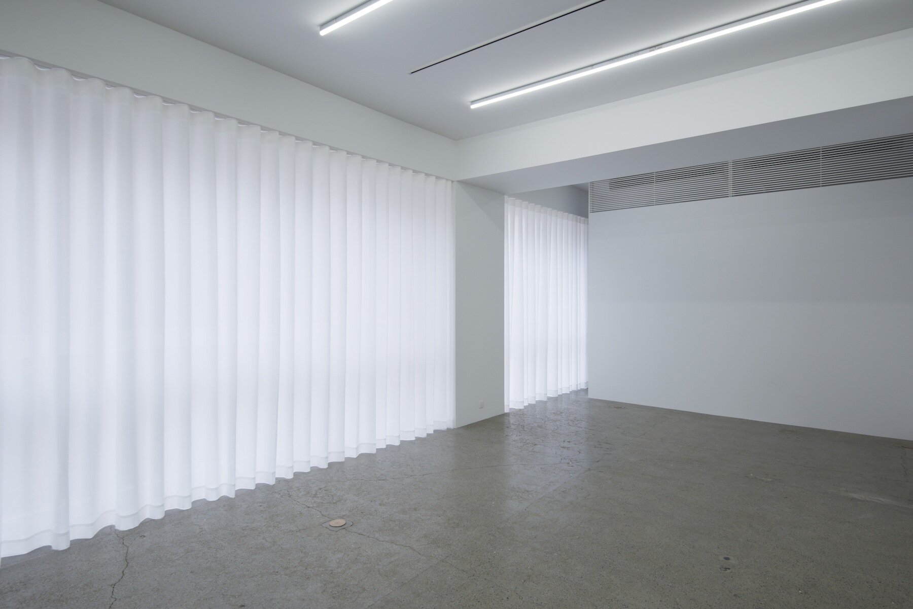
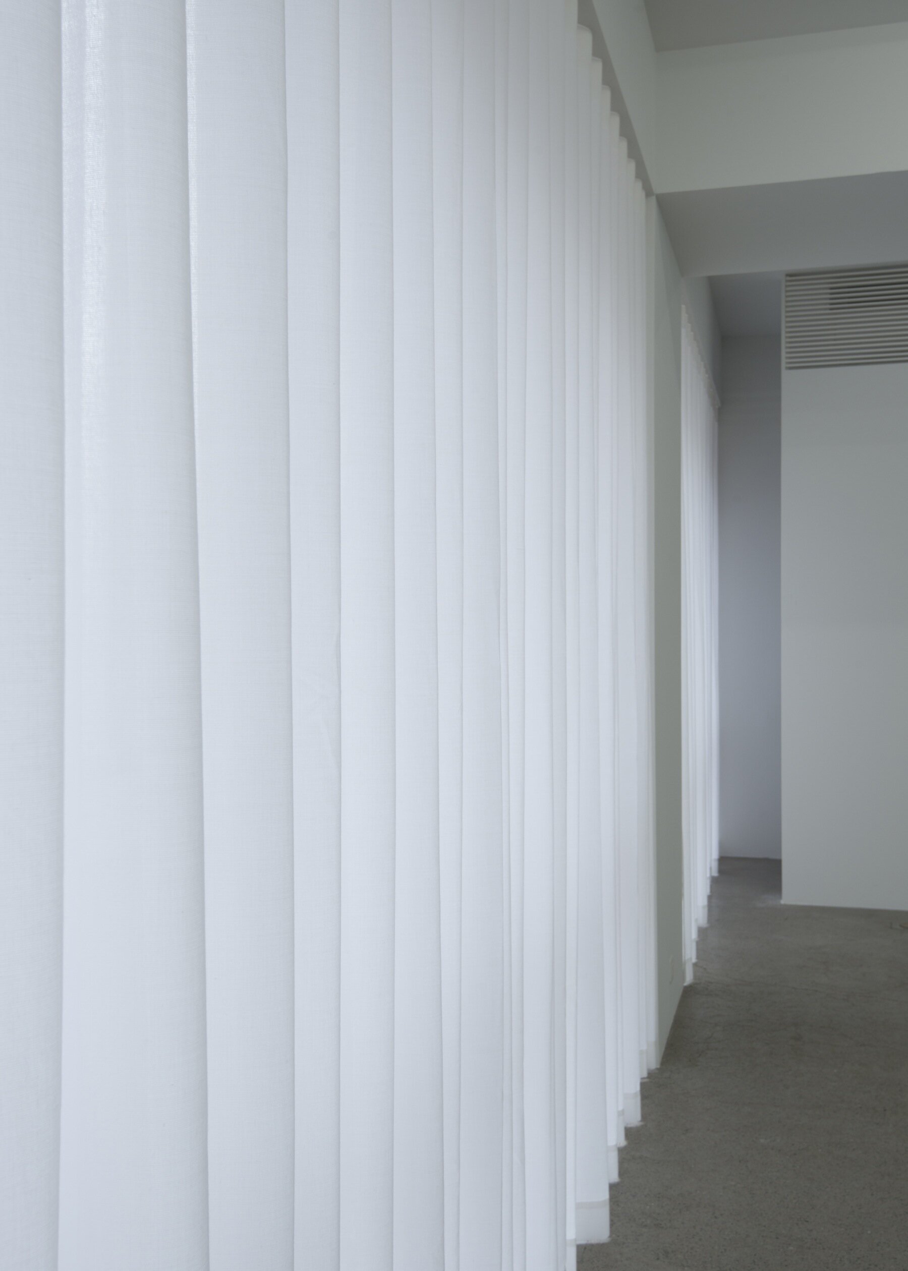
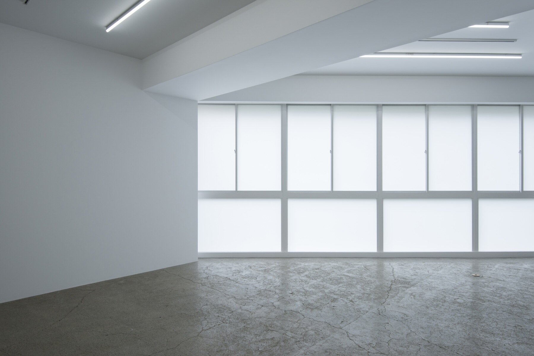
Through simple, sensible design and high precision construction, there is a commanding atmosphere promoted from the intersection of the pillars and beams and the added lines. The room gets light from the window, so by installing walls and utilising curtains, the light level can be adjusted to avoid overly strong light.
DETAIL
The line of pillars and beams were organised to create simplified shape.
Originally, this space had a large number of windows, so the white translucent films were added for each glasses to control incoming light.
Existed small window was covered with a glass wall to create minimalistic fit-out.
CREDIT + INFO
Name : LICHT GALLERY
Designer: Koichi Futatsumata, Yuki Onita / Case-Real
Construction: Zero
Location: Aobadai, Meguro-ku, Tokyo, Japan
Main use: Furniture shop, Gallery
Completion date: August, 2018
Floor area: 131.2 sqm
Main material : wall/AEP white matte finish window/translucent film
RELATED POST
>>> interview with Case-Real
>>> designed by Case-Real


