HOUSE IN KITASANDO by Permanent
Tokyo, Japan

HOUSE IN KITASANDO | Permanent | photography : Kenta Hasegawa
DESIGN NOTE
A dwelling with a margin space for imagination
Beautiful contrast between old and new
Minimalist approach with concealed wiring
photography : Kenta Hasegawa
words : Reiji Yamakura/IDREIT
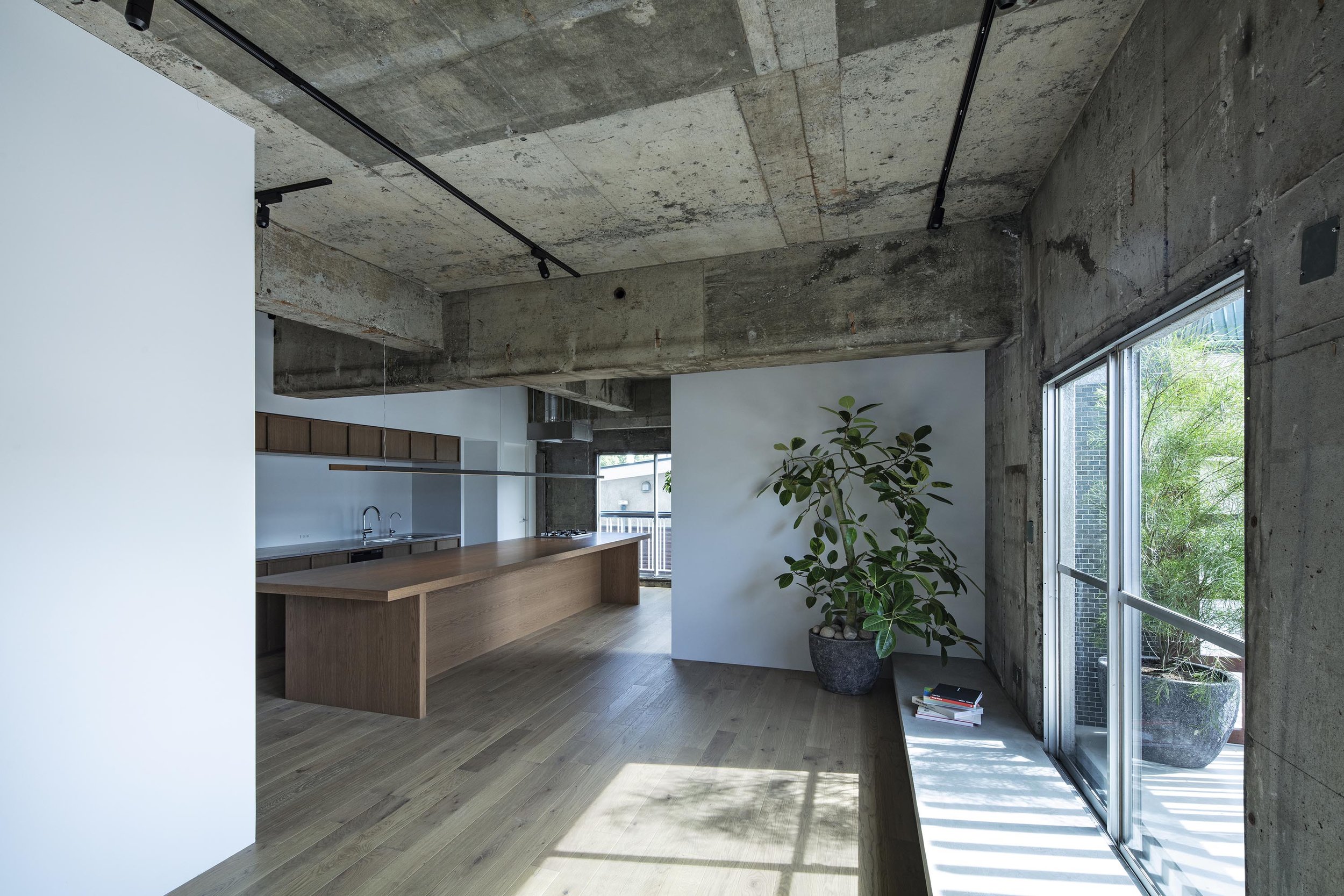
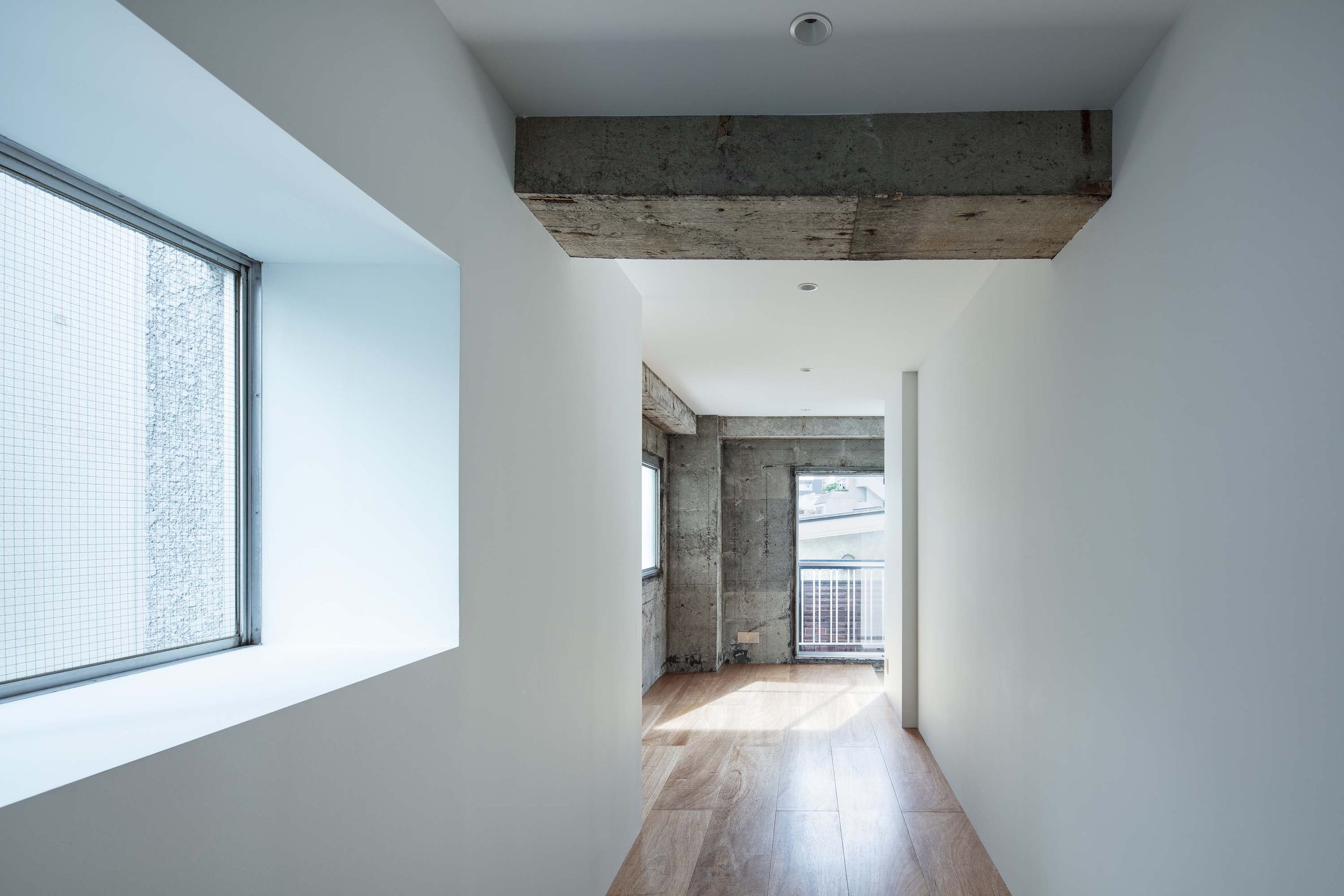
Tokyo-based design studio Permanent, led by Masaki Takeuchi, has renovated a dwelling in a three-story building. The rooms are located in an apartment building built in 1969 by co-op housing. The interior design was developed as if it were a detached house because of the ideal conditions with windows on three sides.
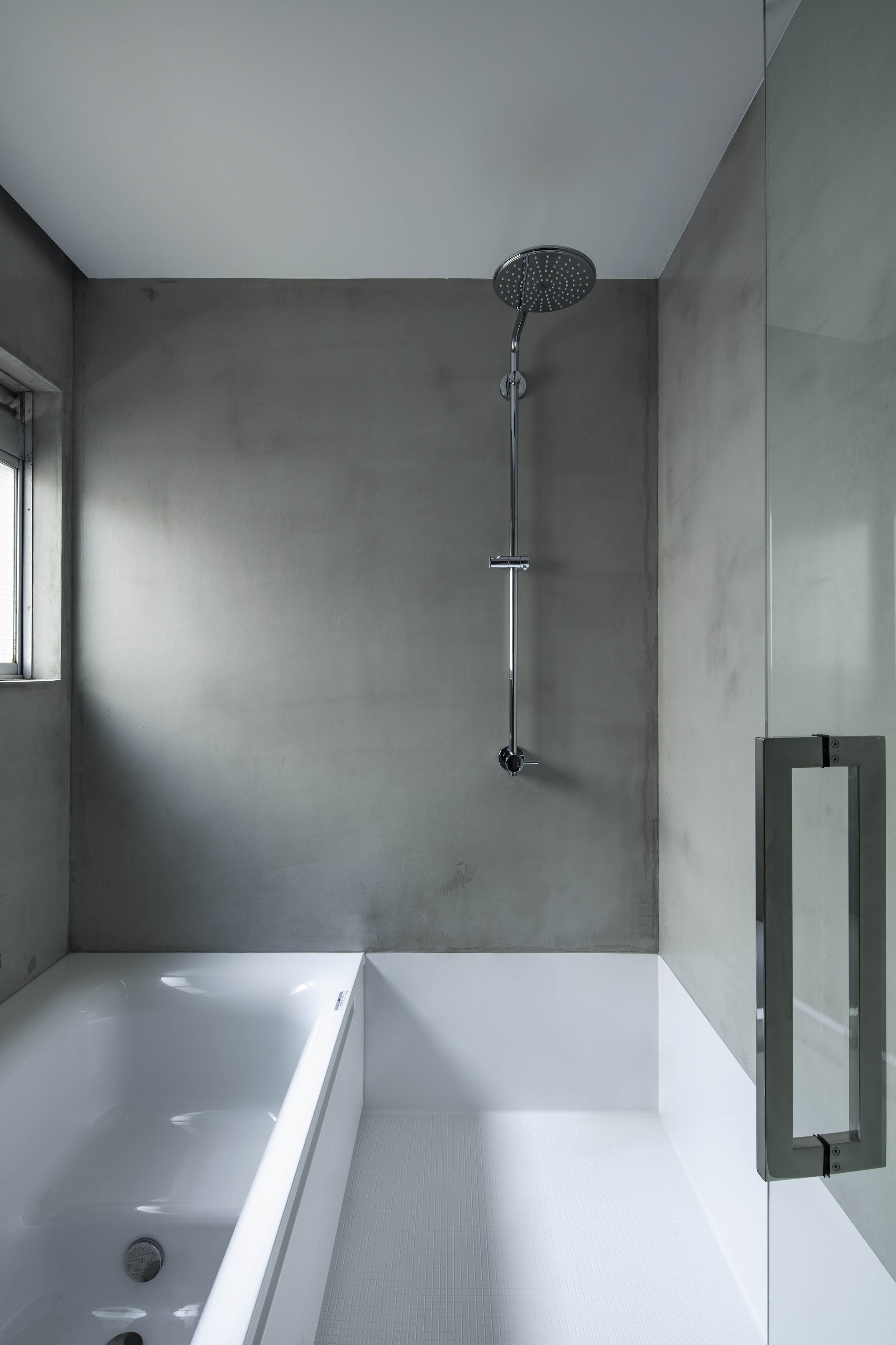
When we asked about the client's requests, Takeuchi replied, 'There were no specific requirements about the style and design. In terms of functionality, they wanted the bathroom and walk-in wardrobe to be located close to the front door, so they could take a bath right after they got home. They also needed a children's room that can be divided in the future for their children."
As for the design concept, "The client worked as an art director and had many collections of records, art and books. At the time, they lived in a house with children's handmade chandeliers and graffiti. Having learned about their lifestyle, I first decided to create a home with margin spaces, like a white canvas. Because in a perfectly styled room, they would be unable to display their personal favourites. Interior fit-out aimed to be as simple as possible. Our idea was to keep it simple and deliberately create blind corners to give a sense of spaciousness.
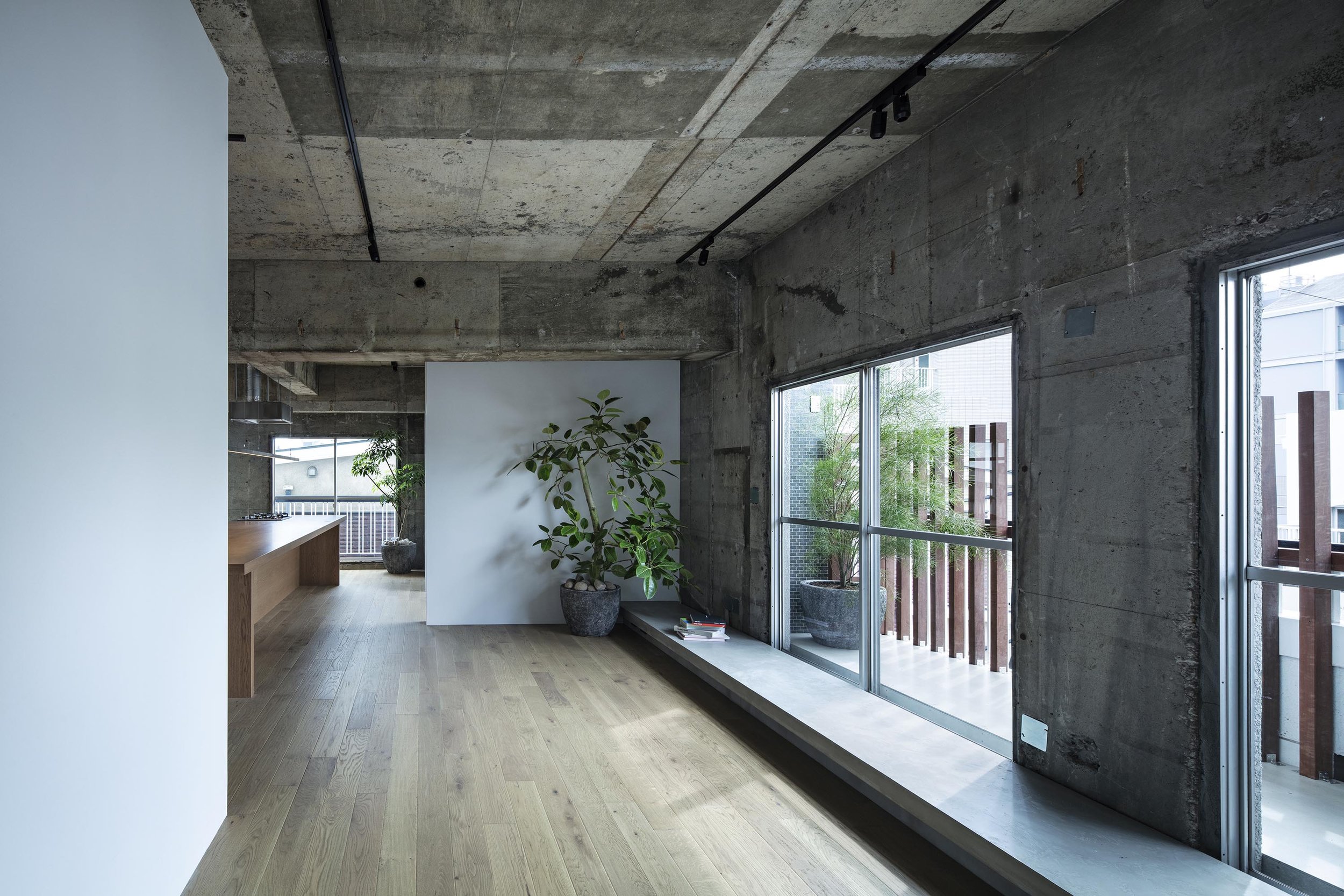
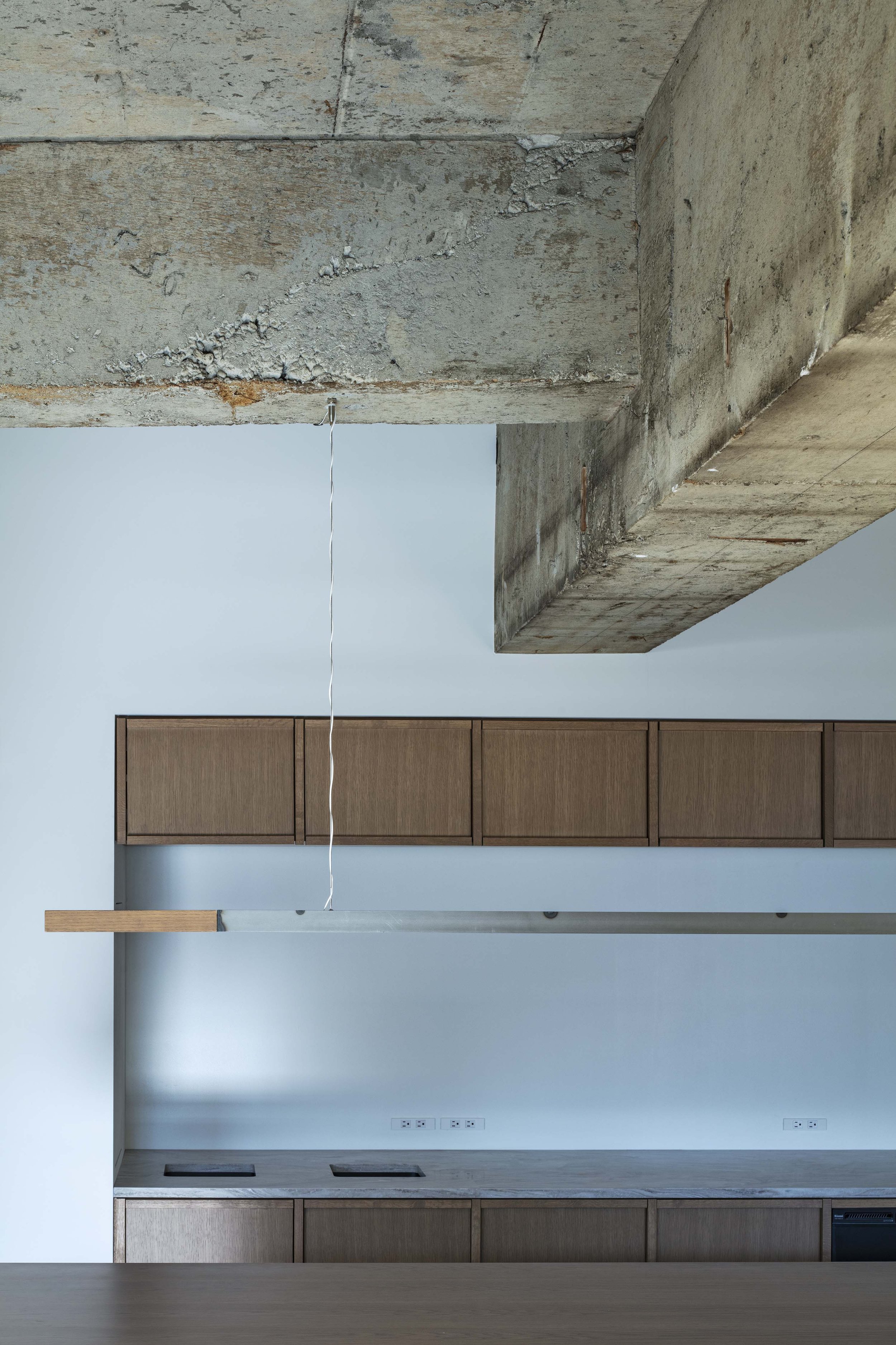
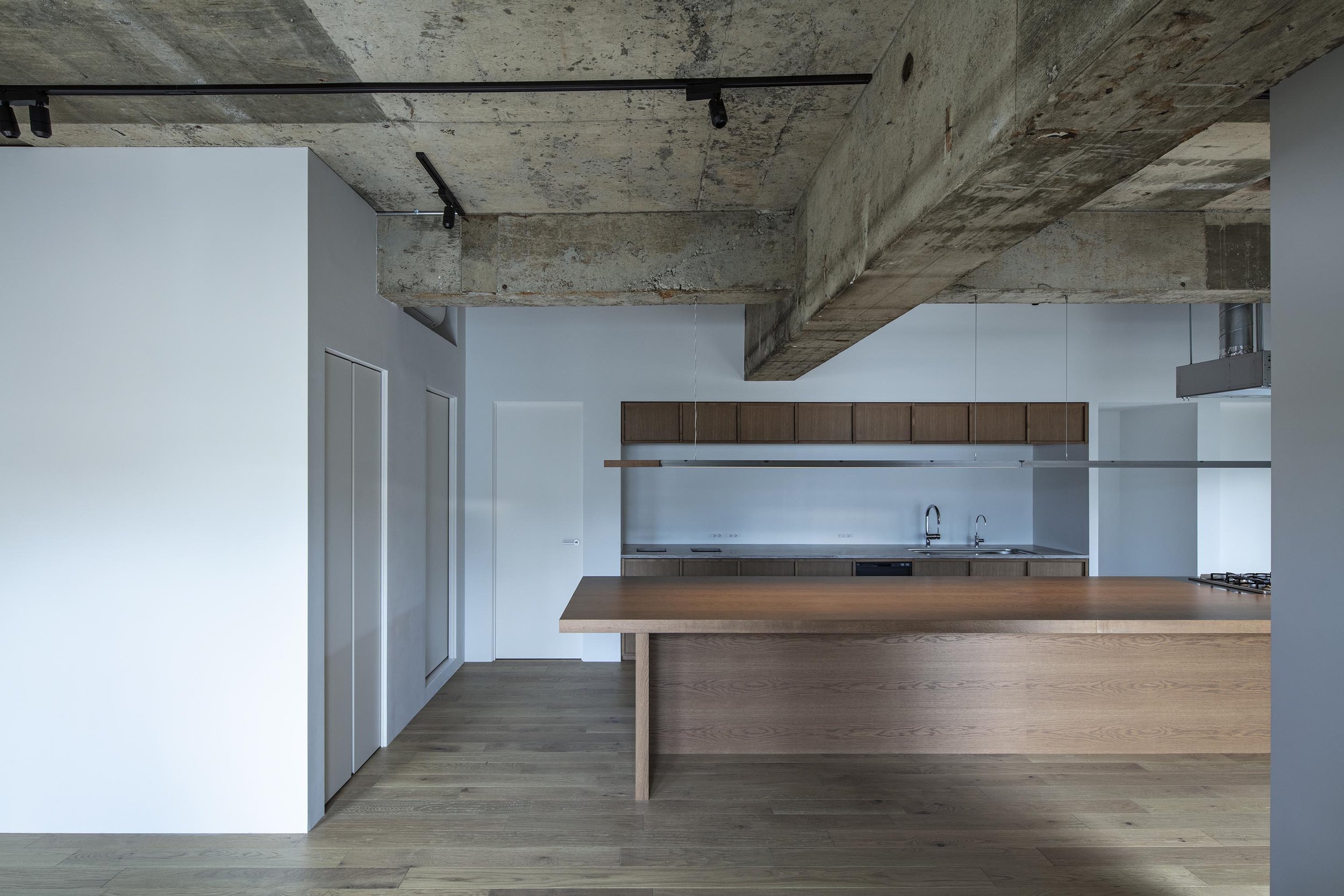
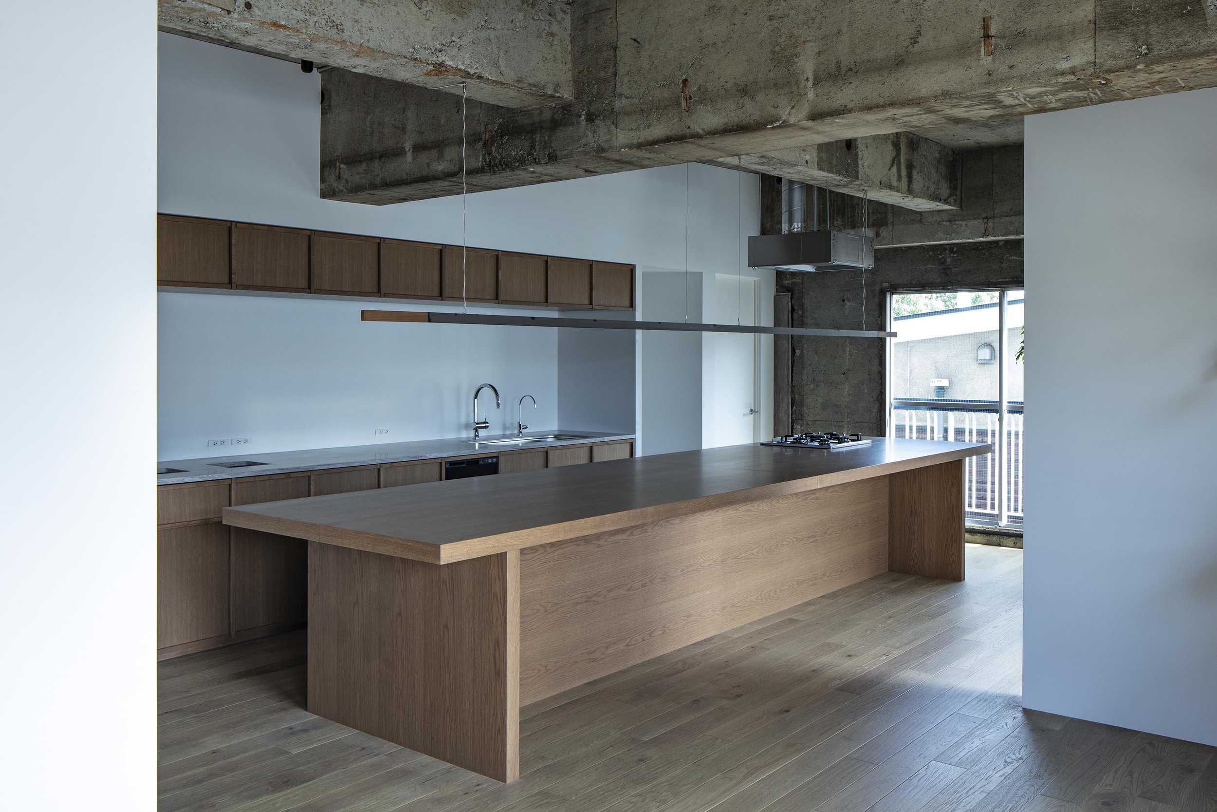
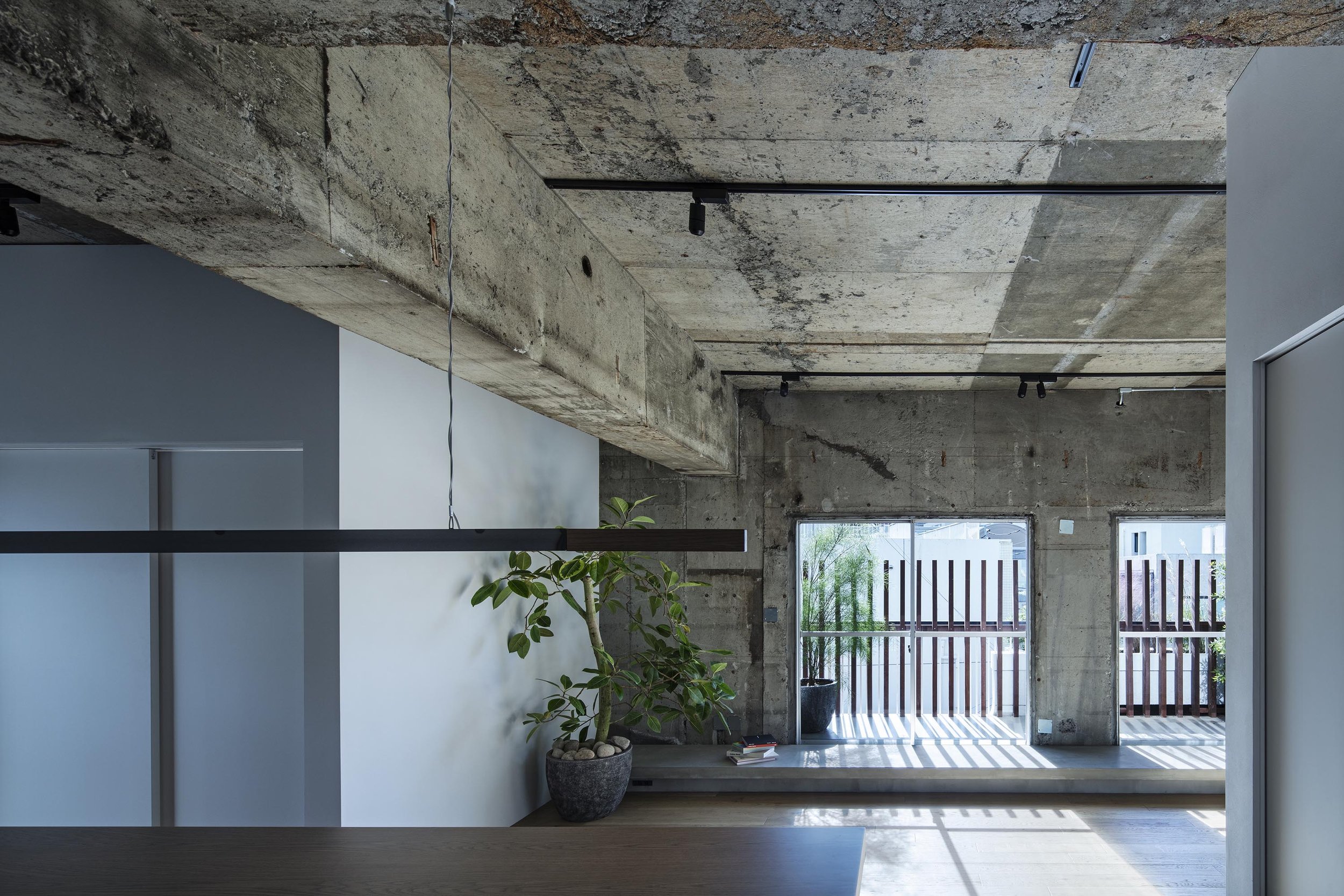
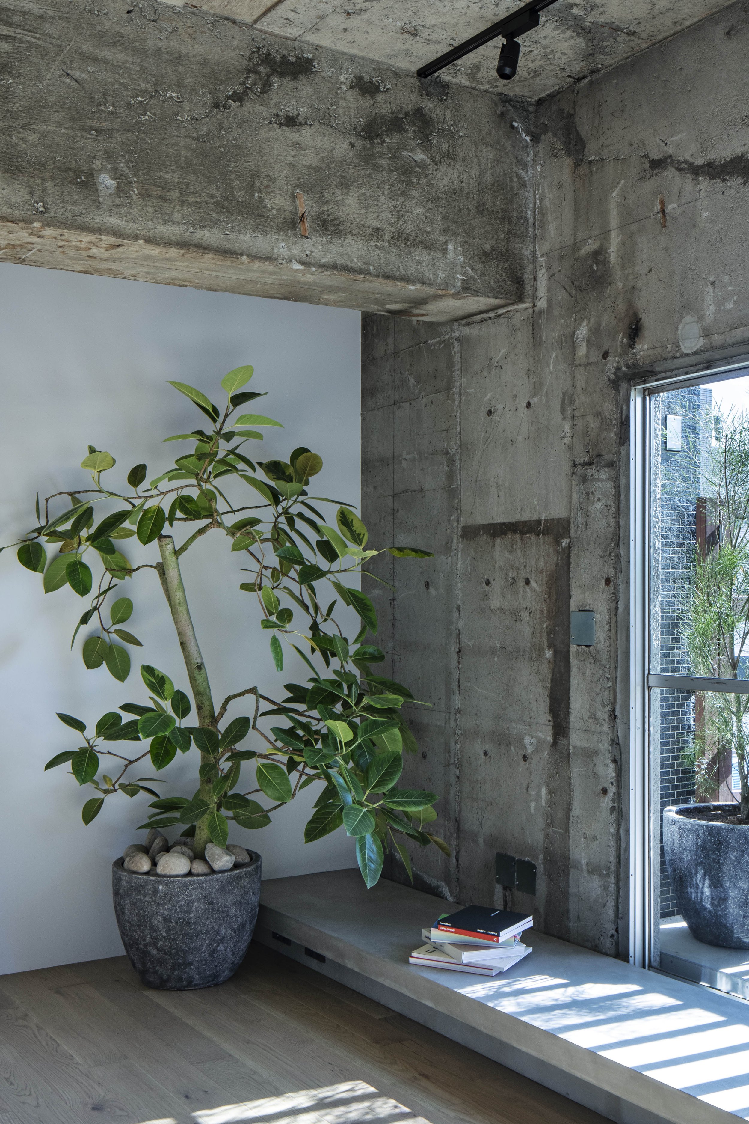
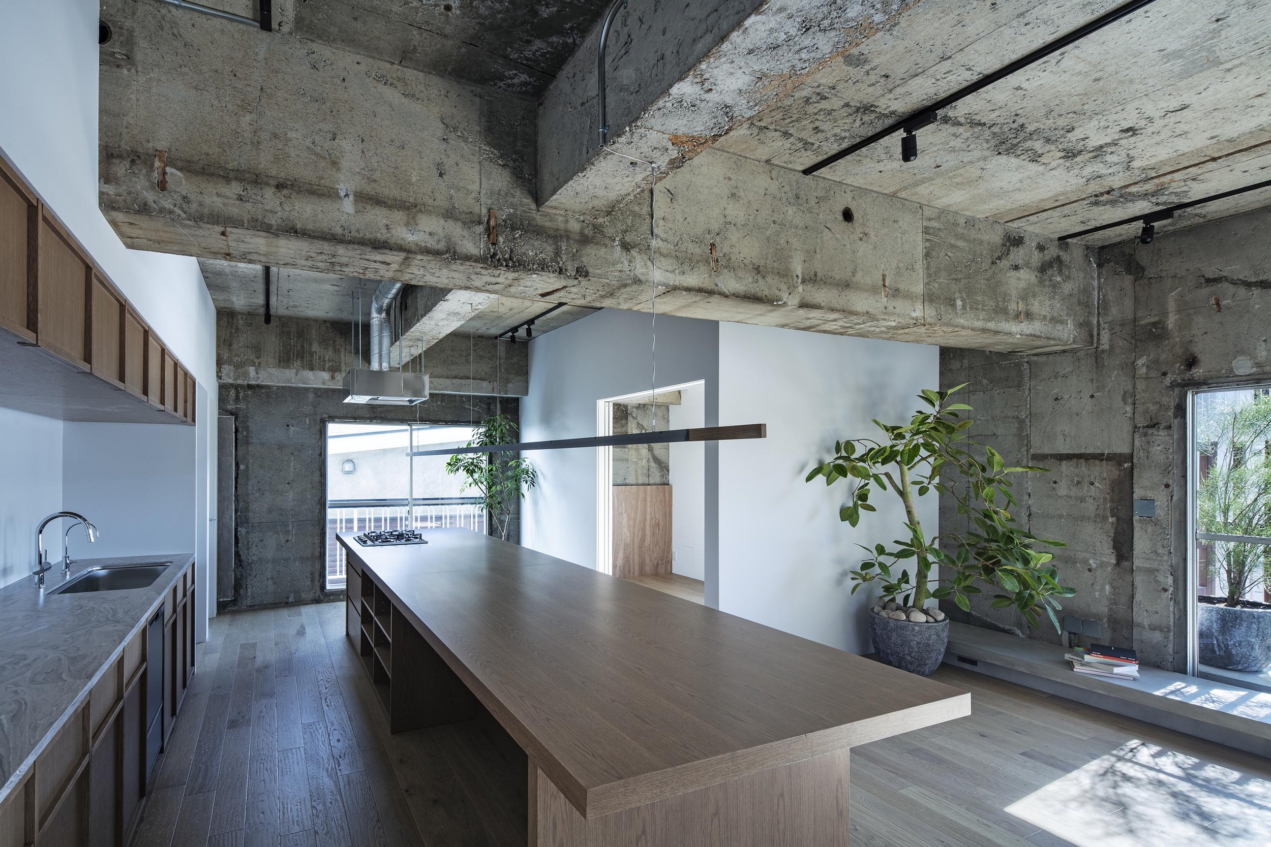
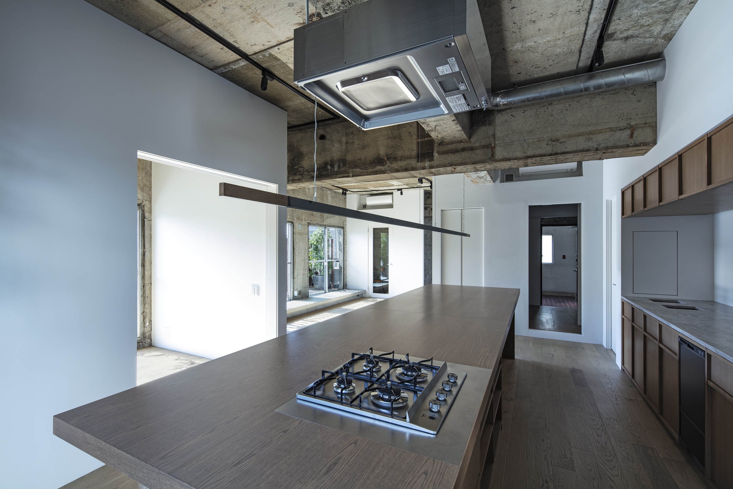
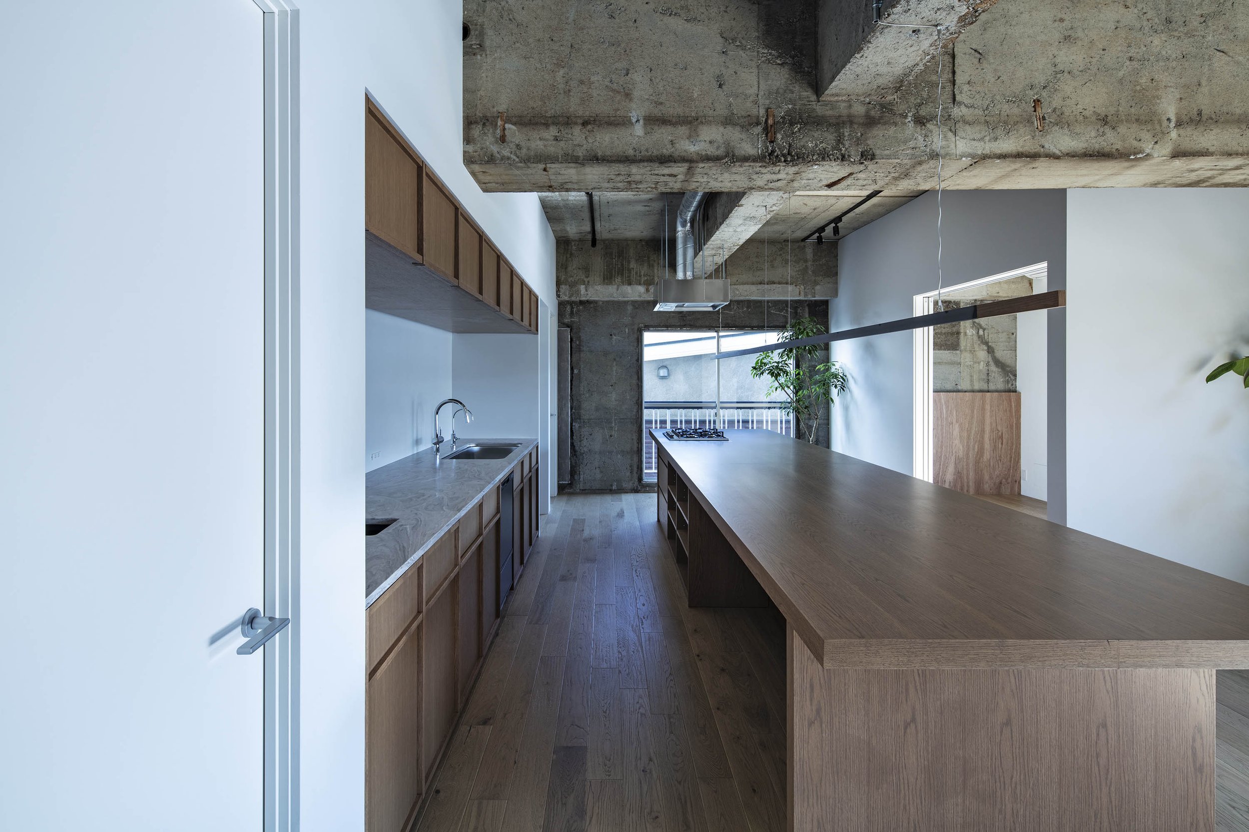
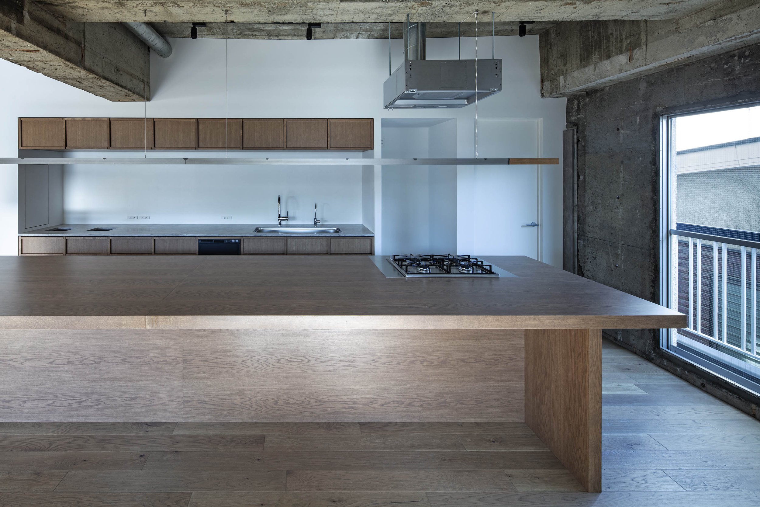
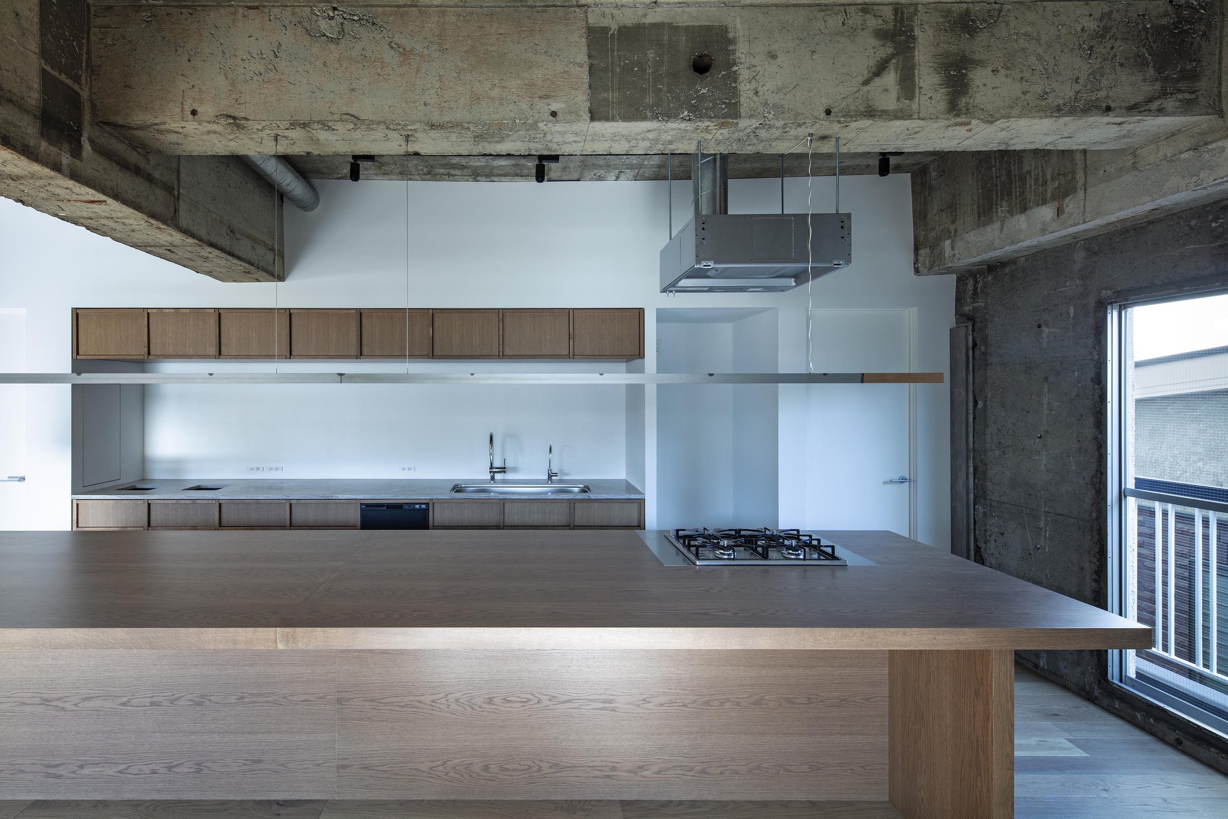
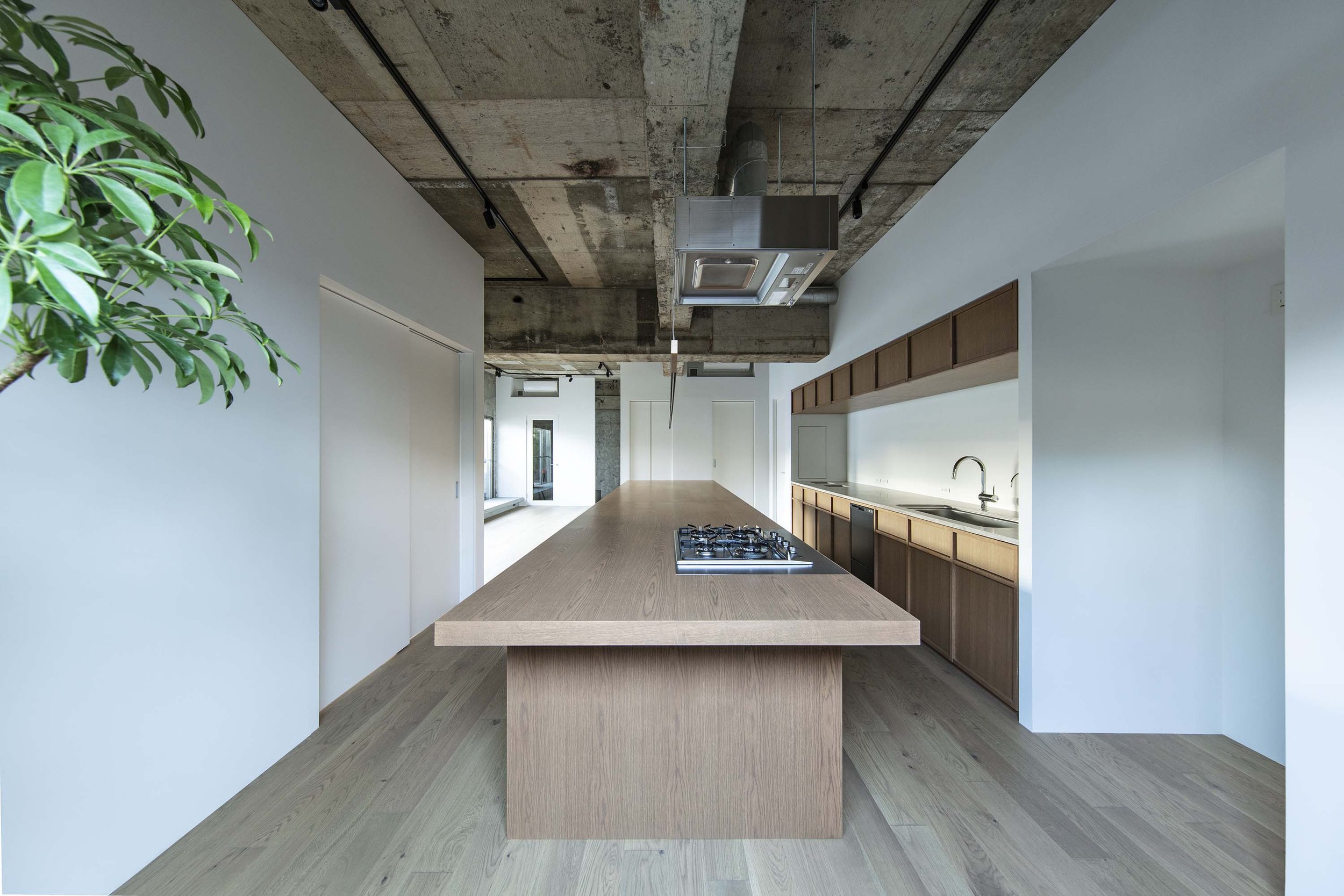
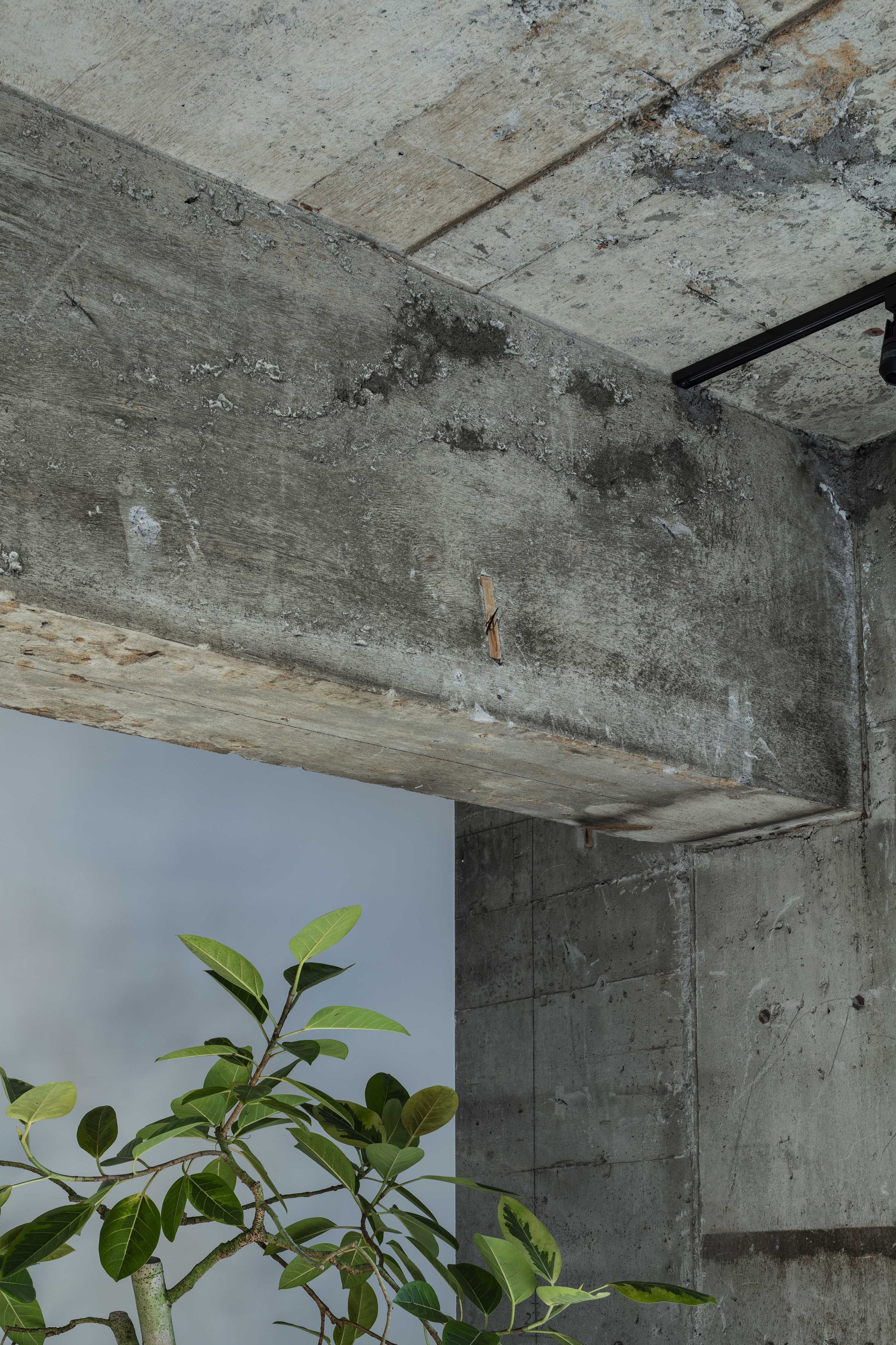
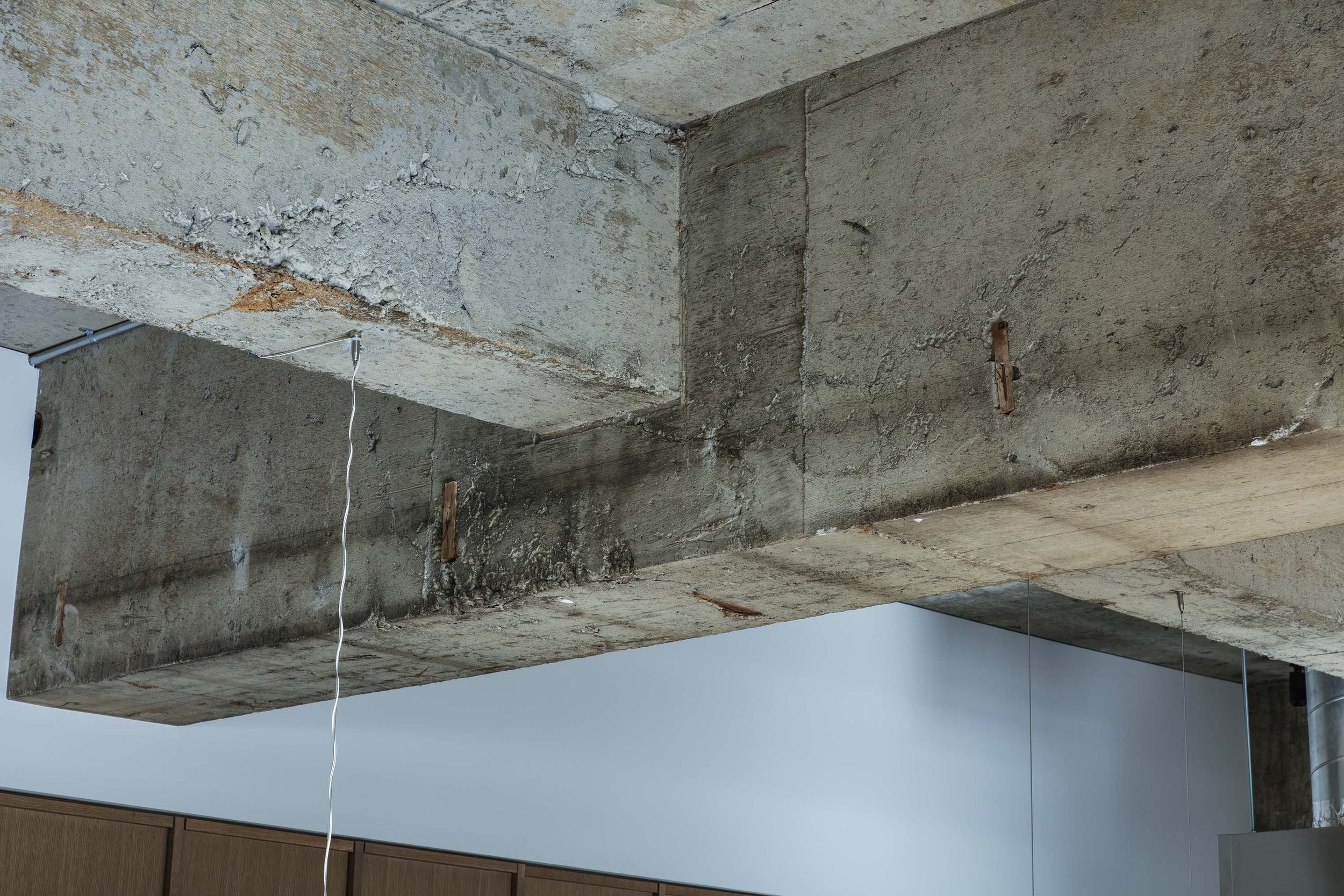
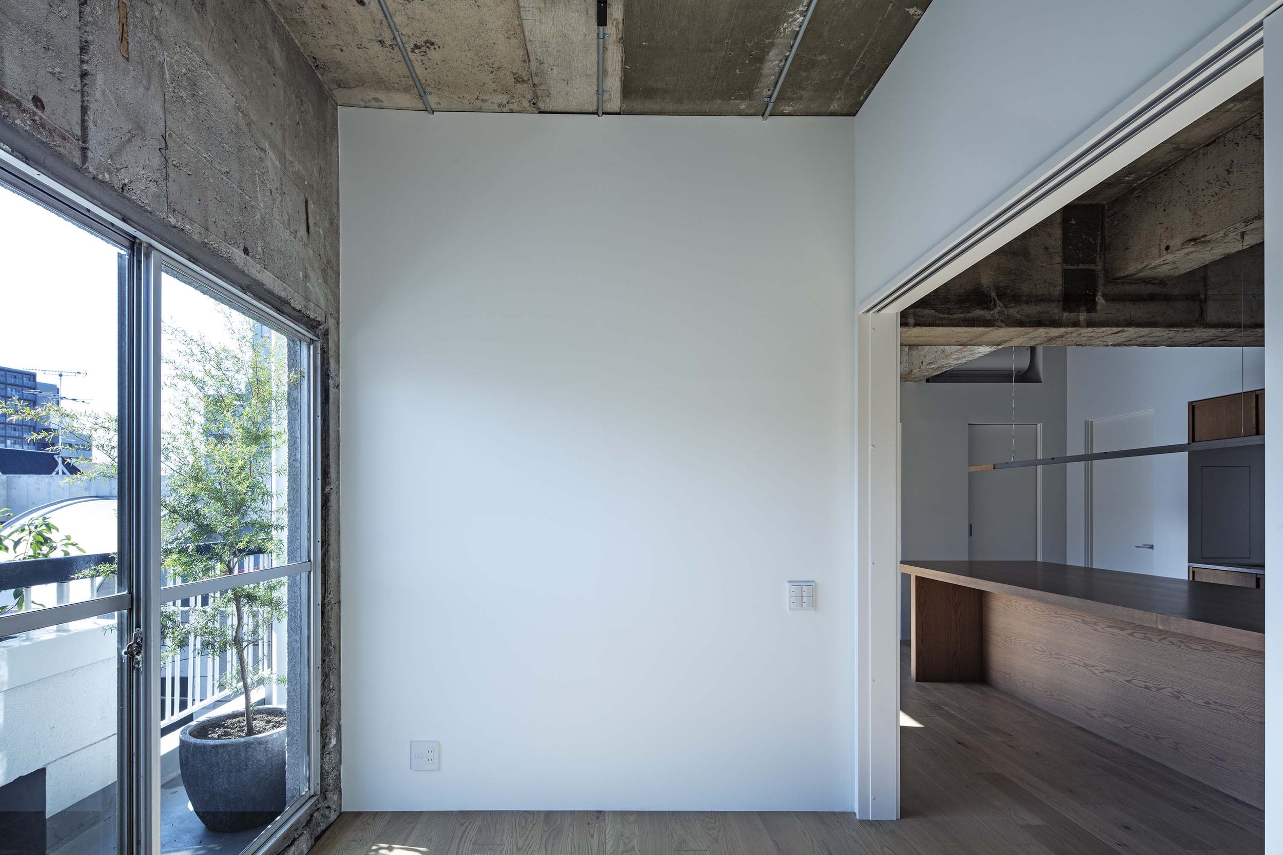
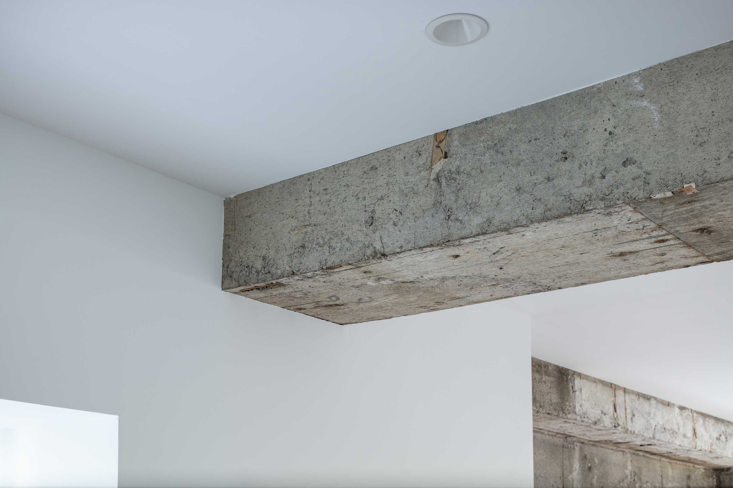
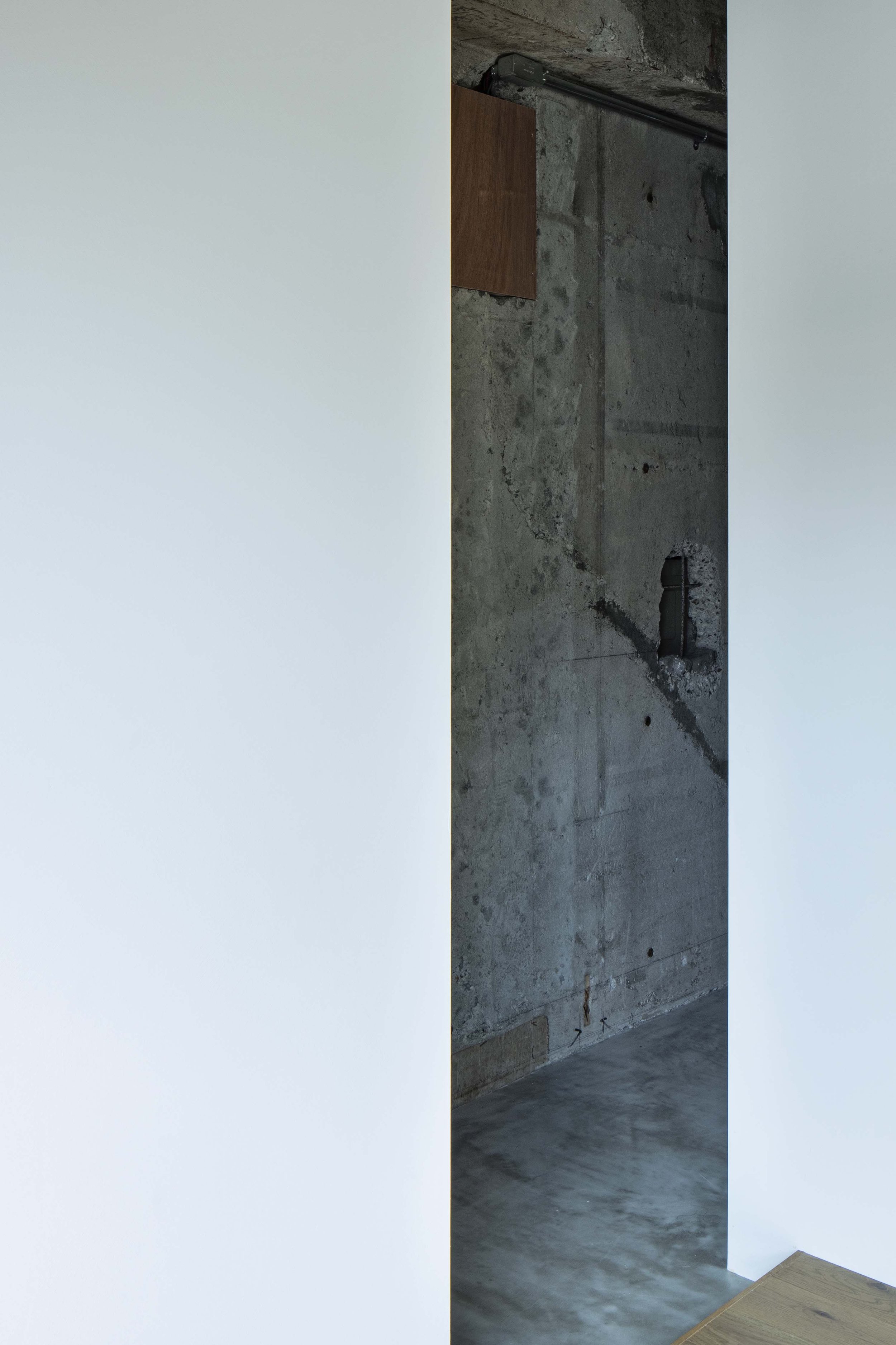
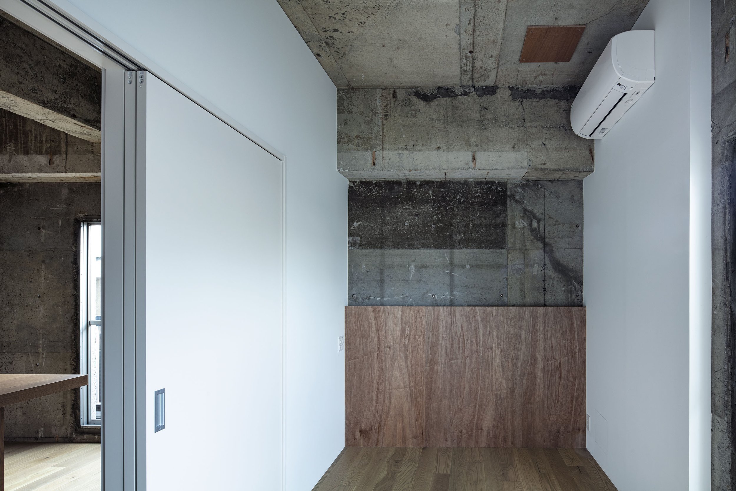
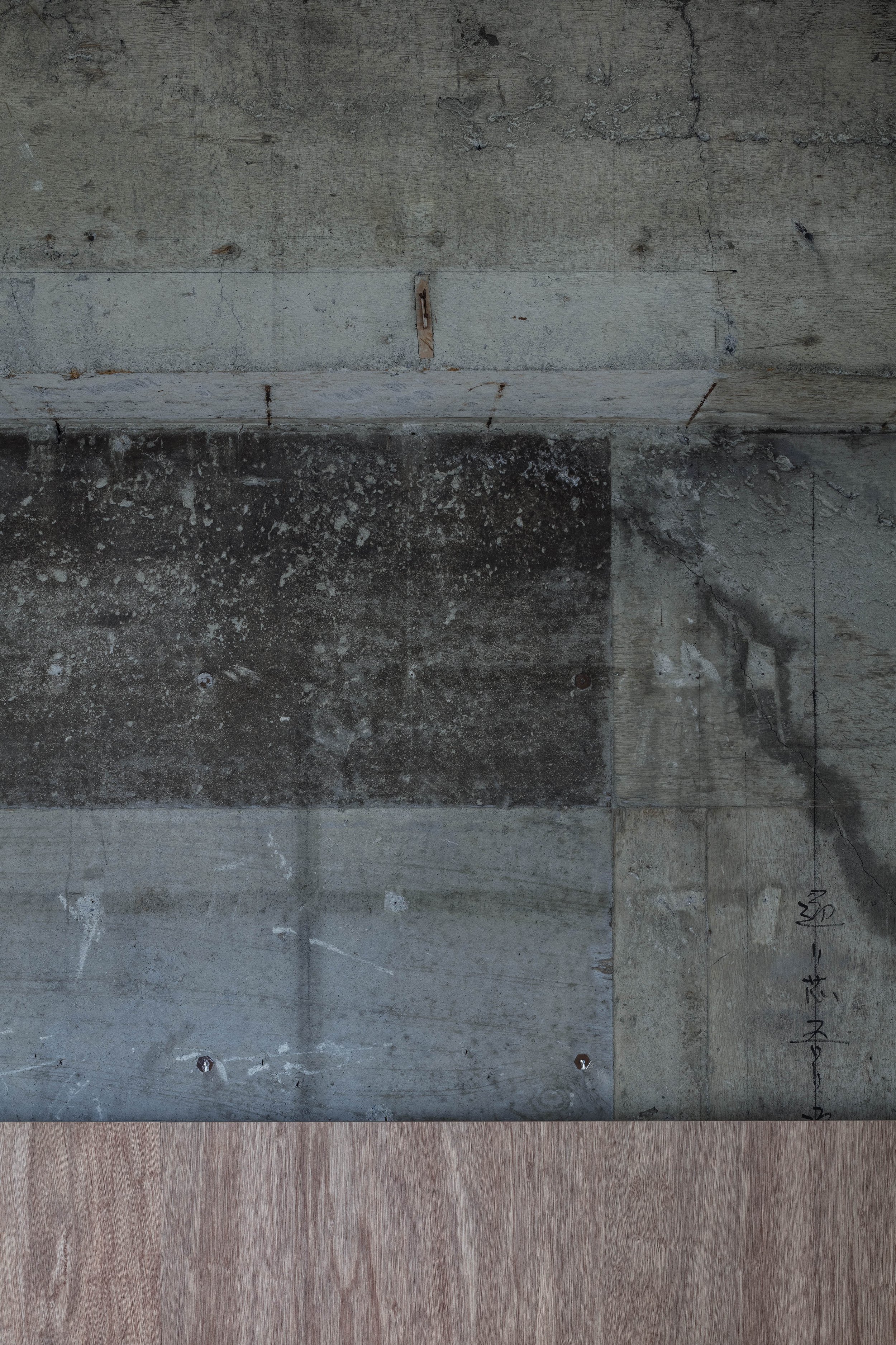
The designer, who has always been attracted to old structures, created a contrast between old and new by adding white volumes to the existing exposed ceilings and rough walls. The newly built white walls were custom painted with a mixture of sand to give a beautiful shadow. He also designed a beautiful custom-made pendant light above the living room counter with H-shaped steel LEDs underneath. The contrast between rugged weld steel and finely crafted wood is fascinating and also fits in the overall concept of the interior.

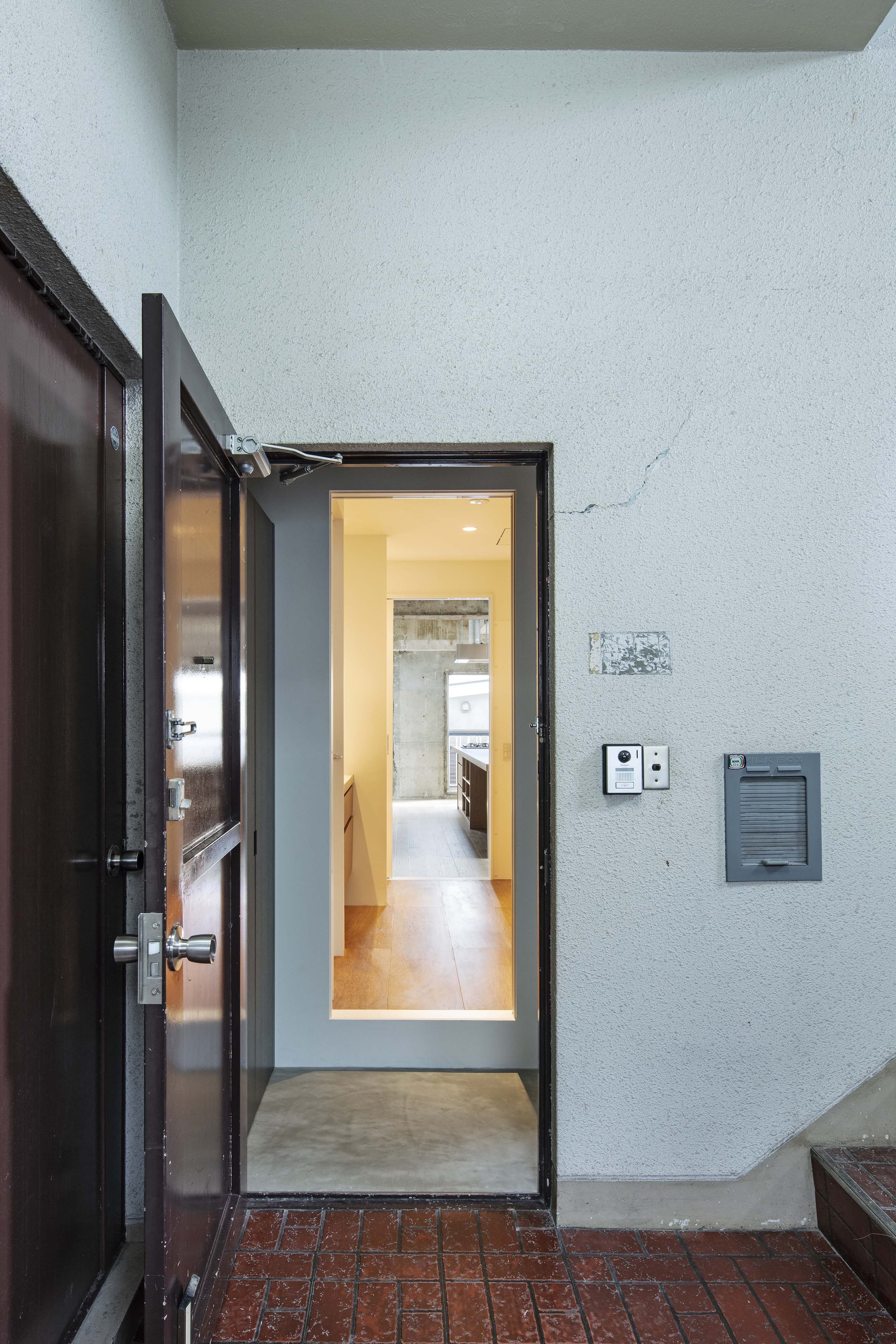
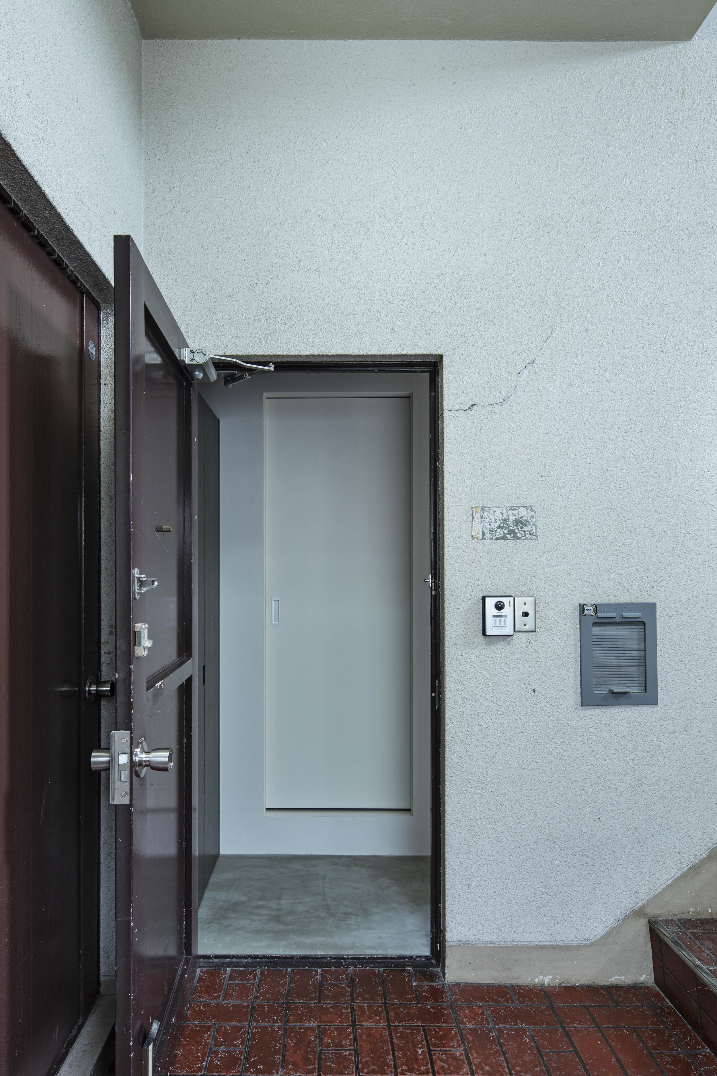
Old milk box next to the front door, which was installed in a hole in the exterior wall. The designer exposed the wall, so the pit can be seen.

The space next to the entrance has a display wall with low strage.
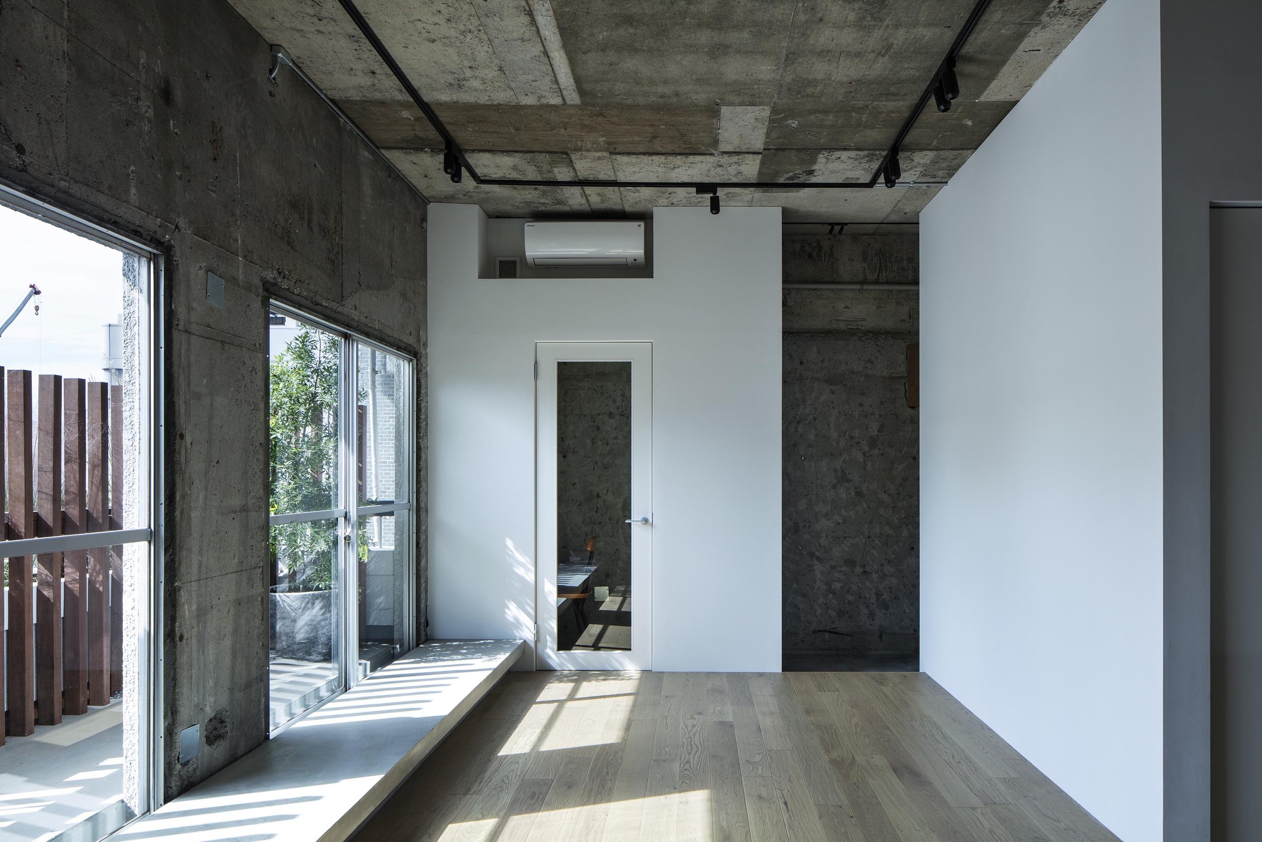
When we asked about the challenges during the design process, he replied, "To create a margin-like look and feel, it was necessary to eliminate extraneous elements on the ceiling and walls, and we thoroughly worked to ensure that pipes and wiring were invisible." In addition, beautiful details were created in the interior doors by covering them with boards to avoid showing the ready-made, ugly frames.
At the end of our interview, Takeuchi added, "The concept behind the design was that it would be better not to create too much here to give the residents more freedom. We also thought some people might find it difficult to use a space like a white margin and blank. However, after moving in, I was pleased to see how happy they were living there, with their art and other objects. The house looks much better and more comfortable now that it is lived in than when it was empty. At the design stage, we discussed with the client how to use the room as a sofa by placing cushions on the window sill and using the large counter for eating and studying instead of installing a dining table. The client was able to arrange the things they liked by themself, and I think that's why the unoccupied spaces are used so well."In addition to such unique design features, raw materials and distinctive details can be seen throughout, such as the exposed steel structure, industrial bracket lighting and storage units made of lauan plywood. Ikeda's approach to the existing building mutes the mass-produced look and gives the old architecture an appealing character.
DETAIL

Takeuchi designed the light fixture made of steel bars and solid oak. He left the welding marks unpainted.

A large counter in the kitchen can be used for meals or for children's studies.

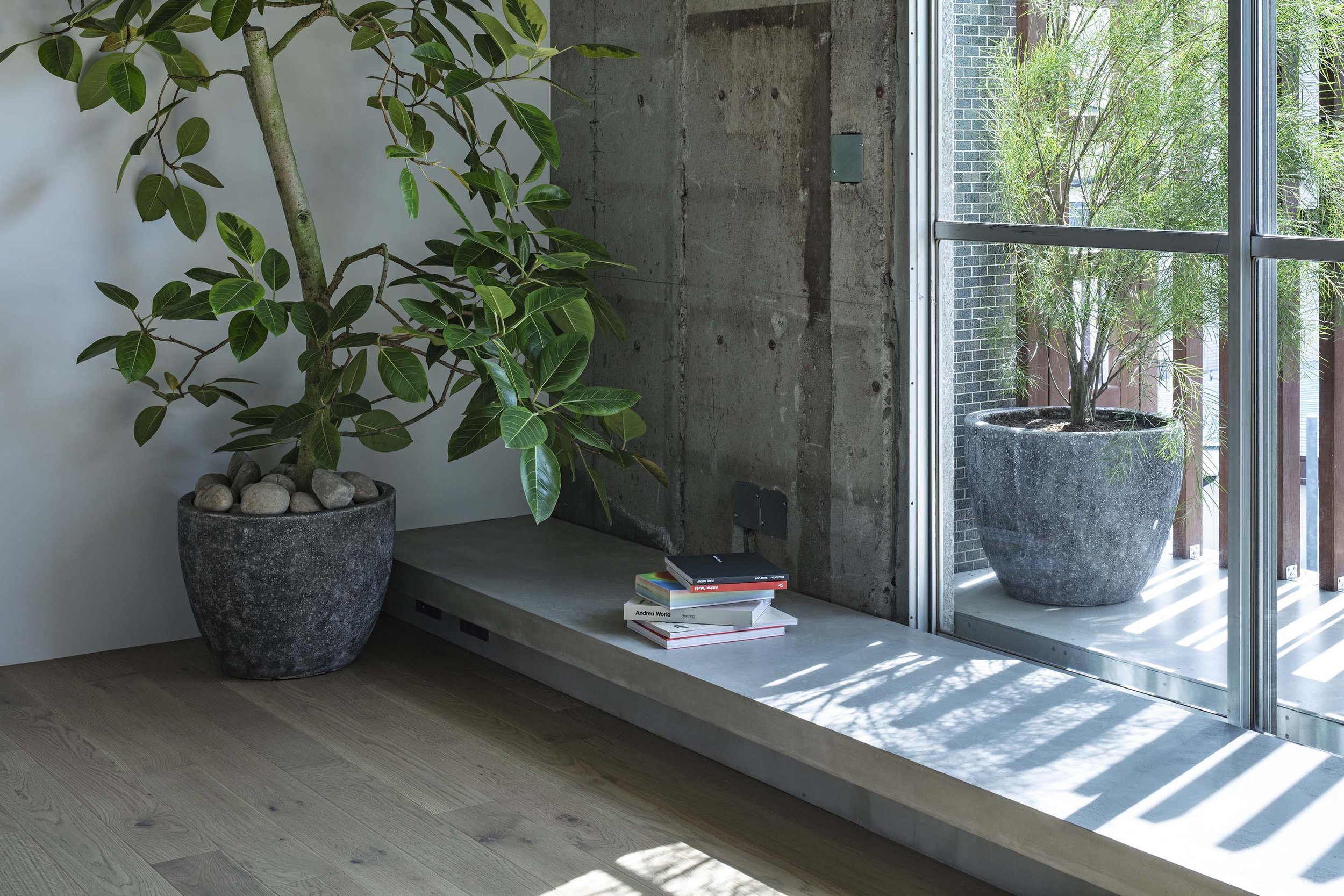
The designer created a bench-like space by the window. The floor of the balcony was also set at the same height as the bench. Also, the interior wiring was carefully concealed to achieve a minimalist look.

A beautiful detail was created by applying boards painted in the same colour to hide the ready-made door frames.

A tiny room built at the corner of the living room for work.

Children’s room
CREDIT
Name: House in Kitasando
Design: Masaki Takeushi / Permanent
Lighting Design: Filaments inc.
Plants: Tan
Steel work: Sano Iron Works
Fabrics: Manas Trading
Construction: Studio inc.
・
Location: Tokyo
Completion: October 2020
Floor area: 93.3 sqm
・
Material
floor: oak flooring, lauan veneer w300mm
wall: sand mixed EP
bathroom wall: mortar + water repellent coat
ceiling: exposed concrete
kitchen: oak veneer + solid oak t4mm (top)
custom-made pendant: welded steel + stained oak with urethane clear coat + LED
kitchen counter: engineered stone t20
window-side bench: metal trowel finished mortar + clear coat